

Now that we have the intro header styled let's look at the rest of the homepage.
There are two sections left here: the recent posts and the featured work section.
There are some things to note here:
- The section header is a recurring element
- The recent posts section has a different background
With that said, let's get started on the first one.
Styling the recent posts section
Let's start by adding a new component to keep things organized.
I added a recentPosts.js file in my components structure.
Let's bootstrap the main elements.
export default function RecentPosts() {
  return (
    <section className='bg-blue-100'>
      <div className='max-w-4xl mx-auto py-12'>header</div>
    </section>
  );
}
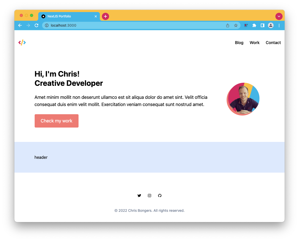
This will already render the blue section with a smaller container inside. We use the same max-width as we used for the intro header section.
It already looks like the image below:
As mentioned, the section header part is recurring, so let's make this component so we can easily re-use it.
Create the sectionHeader.js component and put the following markup inside.
export default function SectionHeader() {
  return (
    <div>
      <h2>Title</h2>
      <a href='#'>View all</a>
    </div>
  );
}
Let's add it to our recentPosts component.
import SectionHeader from './sectionHeader';

export default function RecentPosts() {
  return (
    <section className='bg-blue-100 px-6'>
      <div className='max-w-4xl mx-auto py-12'>
        <SectionHeader />
      </div>
    </section>
  );
}
Now head back to the section header, and we'll add the styling we need.
First of all, we need to make it a flexbox wrapper. With space between the two elements, and center them horizontally.
<div className="flex justify-between items-center MB-8"></div>
The h2 element should reflect the size of the design and be a bold type.
<h2 className="text-2xl font-bold"></h2>
And lastly, we can style the button to look neater.
<a className="text-red-400 font-bold" href="#"></a>
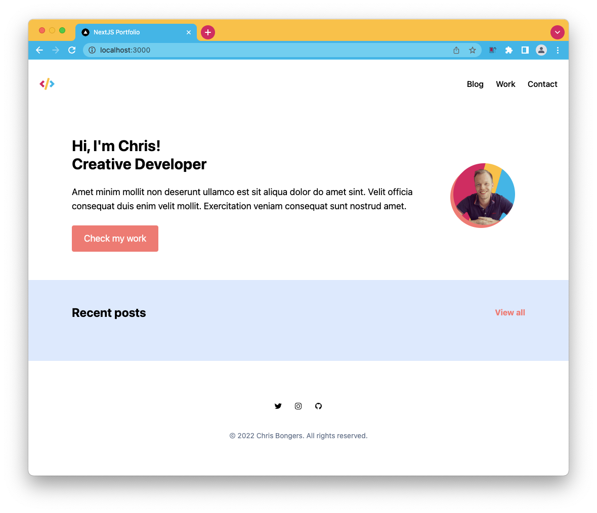
This will already look great. However, the components are still static. Let's ensure we can pass some data to this component.
export default function SectionHeader({ title, href }) {
  return (
    <div className='flex justify-between items-center MB-8'>
      <h2 className='text-2xl font-bold'>{title}</h2>
      <a className='text-red-400 font-bold' href={href}>
        View all
      </a>
    </div>
  );
}
And now, when we import this component, we can pass the title and href as props.
<SectionHeader title='Recent posts' href='#' />
Now let's work on the articles themselves. As we can see, there are two next to each other. The easy way to achieve this is to wrap them in a grid like this:
<div className='grid grid-cols-2 gap-6'></div>
Now let's add another component we'll call article.js.
For now, we will use static data so that each article will be the same.
export default function Article() {
  return (
    <article>
      <h3>Post Title</h3>
      <span>
        <date>12 Feb 21</date> | Design System
      </span>
      <p>
        Amet minim mollit non deserunt ullamco est sit aliqua dolor do amet
        sint. Velit officia consequat duis enim velit mollit. Exercitation
        veniam consequat sunt nostrud amet.
      </p>
    </article>
  );
}
Let's start by adding some styling to the main article element.
<article className="bg-white p-4 rounded-lg"></article>
Then on to the title element.
<h3 className="text-2xl mb-2 font-medium"></h3>
And for the date and tag element.
<span className="text-gray-600 mb-4 block"></span>
Now head back to your recent post component and add two article components.
<div className='grid grid-cols-2 gap-6'>
  <Article />
  <Article />
</div>
Let's see how far we are now.
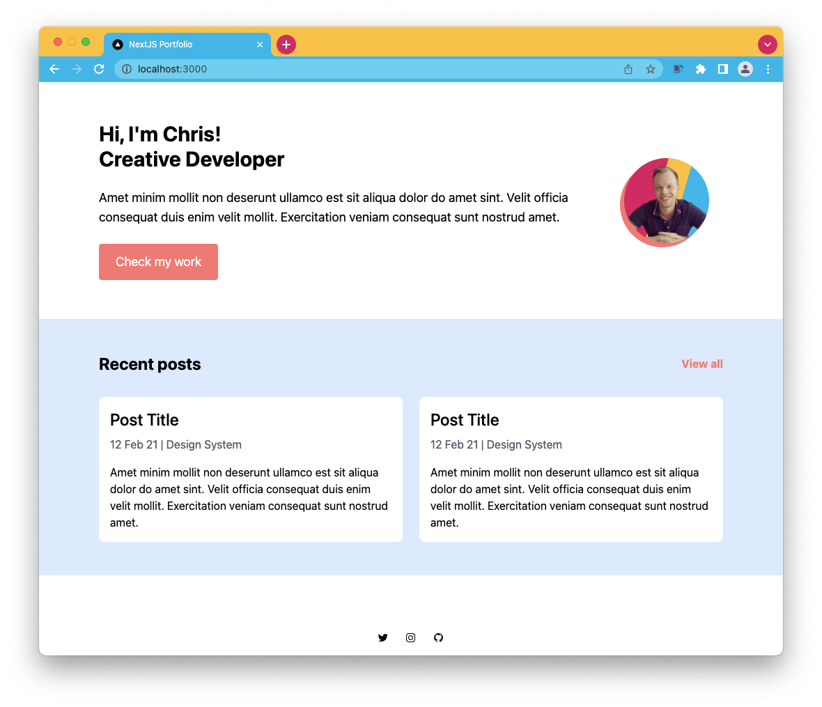
Wow, it's starting to look like the design, excellent!
You can find the code on GitHub.
Thank you for reading, and let's connect!
Thank you for reading my blog. Feel free to subscribe to my email newsletter and connect on Facebook or Twitter
About the author
I'm a full-stack developer from South Africa 🇿🇦. I love writing about JavaScript, HTML and CSS.
Comments
Join the discussionNo comments yet. Be the first to comment.



