
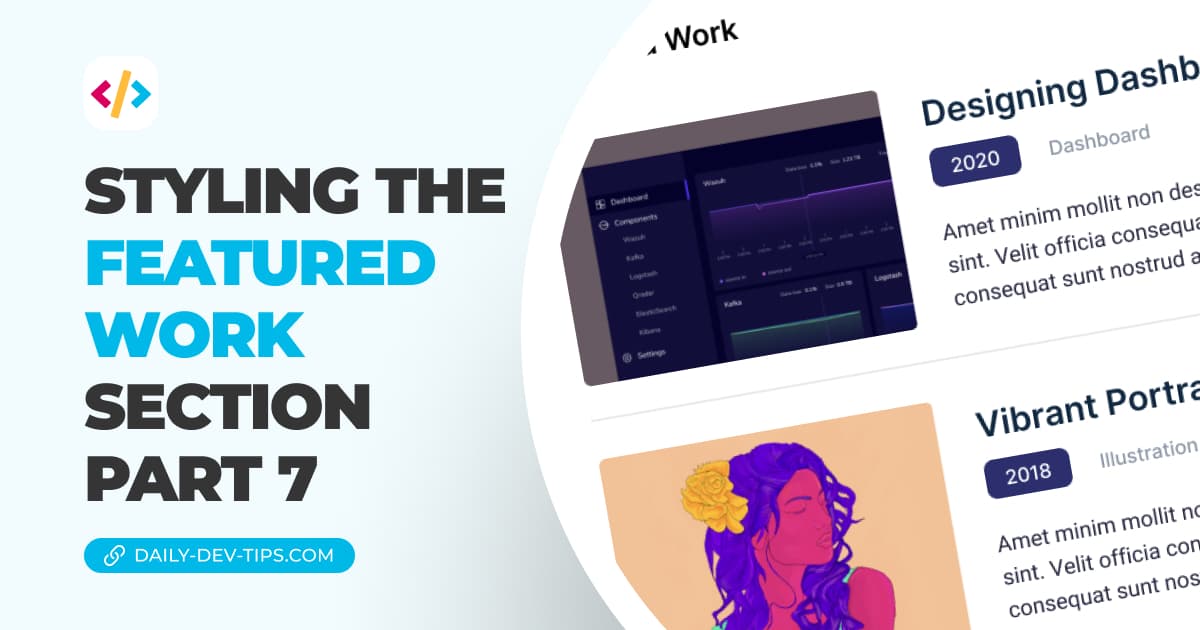
Styling the featured work section - part 7
I'm a full-stack developer from South Africa 🇿🇦. I love writing about JavaScript, HTML and CSS.
Now that we have the recent post section let's look at the last bit of the homepage. This will be the featured work section.
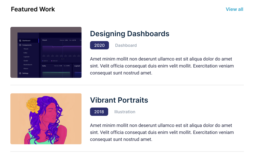
The design shows us the following element. We can see some outlined items here:
- The section header we created yesterday
- Work sections
Styling the featured work section
Let's start by creating a new component called featuredWork.js, and inside we can bootstrap a very generic component.
import SectionHeader from './sectionHeader';

export default function FeaturedWork() {
  return (
    <section className='px-6'>
      <div className='max-w-4xl mx-auto py-12'>
        <SectionHeader title='Featured work' href='#' />
      </div>
    </section>
  );
}
You can see we can reuse the header we made yesterday. Now that's convenience.
Let's import this file to our homepage.
import Head from 'next/head';
import IntroHeader from '../components/introHeader';
import RecentPosts from '../components/recentPosts';
import FeaturedWork from '../components/featuredWork';

export default function Home() {
  return (
    <div>
      <Head>
        <title>NextJS Portfolio</title>
        <meta name='description' content='Generated by create next app' />
        <link rel='icon' href='/favicon.ico' />
      </Head>
      <IntroHeader />
      <RecentPosts />
      <FeaturedWork />
    </div>
  );
}
From here, let's focus on adding the article components.
We'll create the work.js file and place the main markup inside.
export default function Work() {
  return (
    <article>
      <img src='https://via.placeholder.com/240' />
      <div>
        <h3>Work title</h3>
        <span>
          <date>2022</date> Tagname
        </span>
        <p>
          Amet minim mollit non deserunt ullamco est sit aliqua dolor do amet
          sint. Velit officia consequat duis enim velit mollit. Exercitation
          veniam consequat sunt nostrud amet.
        </p>
      </div>
    </article>
  );
}
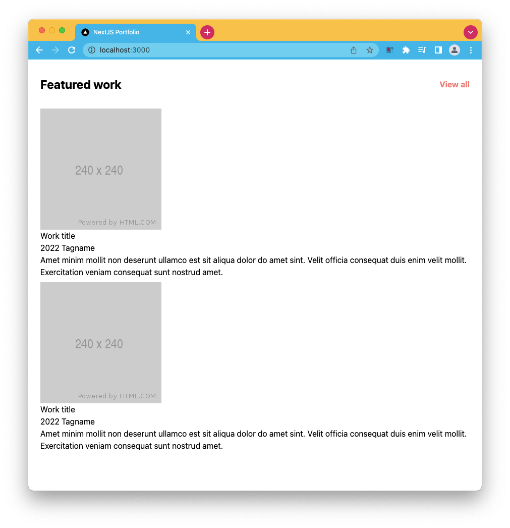
Let's start by adding two of these to our featuredWork component so we can see what's going on.
import SectionHeader from './sectionHeader';
import Work from './work';

export default function FeaturedWork() {
  return (
    <section className='px-6'>
      <div className='max-w-4xl mx-auto py-12'>
        <SectionHeader title='Featured work' href='#' />
        <div className='flex flex-col gap-2'>
          <Work />
          <Work />
        </div>
      </div>
    </section>
  );
}
I already added a wrapping div with some classes to space them out a bit better. Resulting in the following:
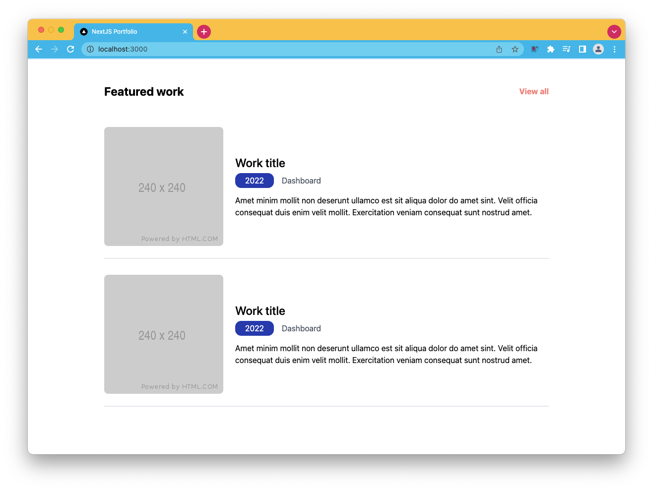
Let's start by adding some styling to this. First up is the wrapping element.
<article className="flex items-center border-b-2 py-6"></article>
As for the image, we can always set its width to be 1/3rd of the wrapper.
<img src="https://via.placeholder.com/240" className="w-1/3 mr-6 rounded-lg" />
Now on to the text elements starting with the title, which is the same as the one we used for the posts.
Note: You can also convert this into a custom heading component.
<h3 className="text-2xl mb-2 font-medium"></h3>
As for the date and text, we use the wrapping div to style the tag and the date tag to create the little pill-like year.
<span className="text-gray-600 mb-4 block">
  <date className="bg-blue-800 text-white px-5 py-1.5 mr-4 rounded-xl">
    2022
  </date>
  Dashboard
</span>
And that's it! Let's take a look at the result for today.
You can also find the completed code on GitHub.
Thank you for reading, and let's connect!
Thank you for reading my blog. Feel free to subscribe to my email newsletter and connect on Facebook or Twitter


