

We're already on part 5 of this Next.js portfolio series, and we'll be styling the homepage elements for this one.
We styled the header and footer in the previous article, so it's time to take it to the next level.
Analysing the design
And yet again, it's time to analyze the design to see what we can reuse.
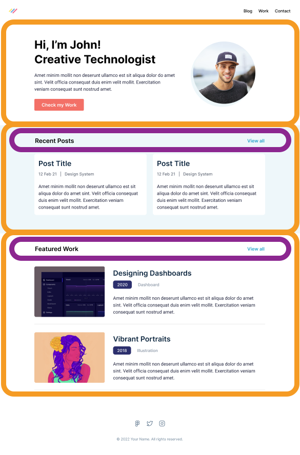
We can see the homepage has three sections:
- Intro header
- Recent posts
- Featured work
And we can also quickly spot a recurring element being the section header. (Marked with a purple line in the image below)
I like to tackle things section by section so let's get started on the header part.
Styling the intro header
First, it's good to note each section will get its own container, seeing it's different from the header one.
So let's create a new file called introHeader.js in your components.
We'll start by wireframing the elements like this.
export default function IntroHeader() {
  return (
    <header>
      <div>
        <div>
          <h1>
            Hi, I'm Chris!
            <br />
            Creative Developer
          </h1>
          <p>
            Amet minim mollit non deserunt ullamco est sit aliqua dolor do amet
            sint. Velit officia consequat duis enim velit mollit. Exercitation
            veniam consequat sunt nostrud amet.
          </p>
          <a href='#'>Check my work</a>
        </div>
        <span>
          <img src='profile.png' />
        </span>
      </div>
    </header>
  );
}
It won't look like much yet, as everything will be placed under each other and at the same font styling. But we have an excellent setup to start styling everything from.
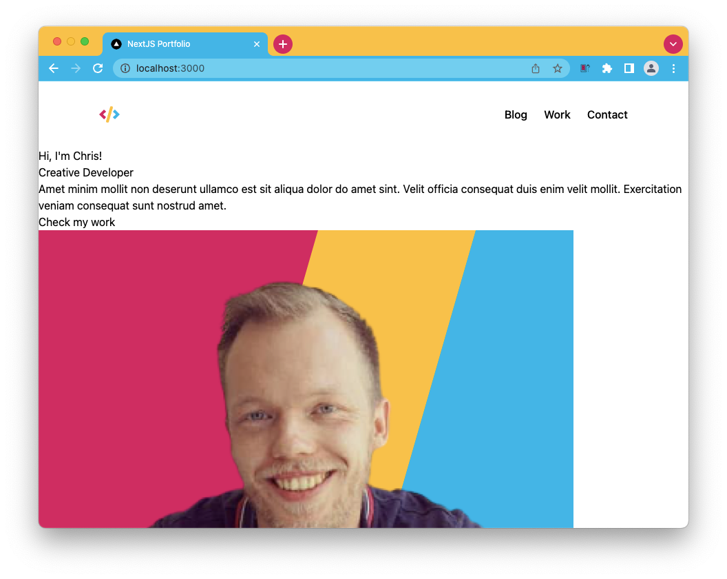
Let's start by converting the header into a flexbox. This way, the text div, and the image will be next to each other.
<div className="flex"></div>
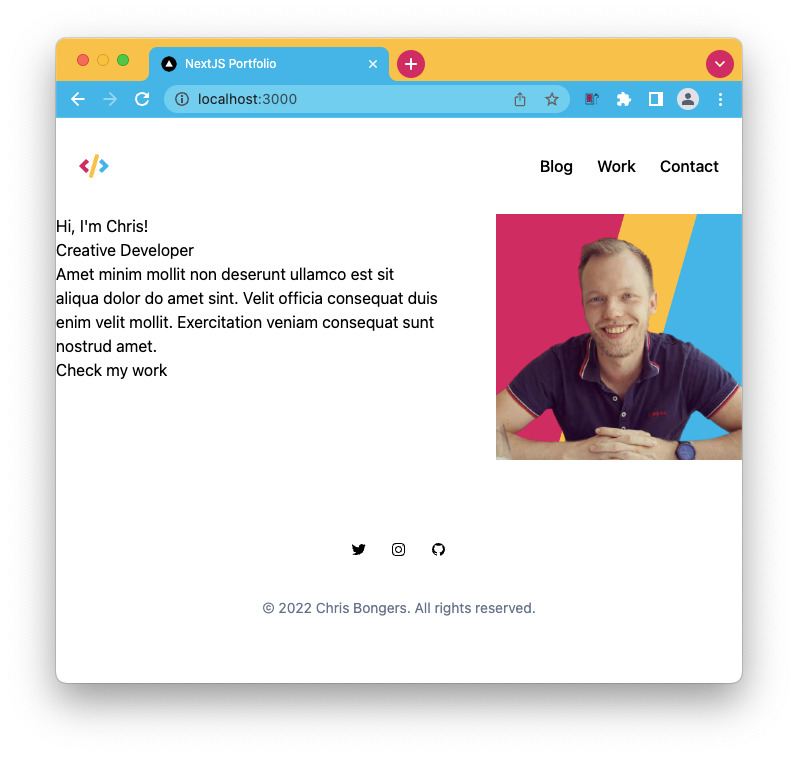
We can also spot a gap between the text and the image, which we can achieve like this:
<div className="flex gap-14"></div>
It's not perfect, but you can already see it becoming the right thing.
One thing we still need to do is ensure it has a max-width of 900 pixels and some spacing on the sides for mobile views.
<header className="px-6">
  <div className="max-w-4xl mx-auto flex gap-14"></div>
</header>
There are multiple ways of achieving this, and this is one where we give the header the padding for the smallest view and add the max width on the div inside to space it out.
Now let's start styling the text side. The first thing we can do is style the h1 header. I'll be using inline classes, but eventually, we can move this to a shared style.
<h1 className="text-3xl font-bold mb-6"></h1>
Then on to the paragraph below.
<p className="text-lg mb-6"></p>
And lastly, the button element.
<a href="#" className="bg-red-400 text-white px-6 py-3 text-lg rounded"></a>
Note: The button has no hover state, which I'll leave up to you 👀
With the left side done, we can focus on the image. It would be easy to make it rounded, but we also see it as a drop shadow effect. We'll have to add this effect on the wrapping span element.
<span
  className="m-5 inline-block before:w-full before:aspect-square before:-left-1.5 before:top-1.5 before:block before:absolute before:bg-red-400 relative z-0 before:rounded-full"
></span>
Quite a chunk of code, and this is where Tailwind gets a bit messy. It technically adds a before element, which we style to offset.
Then the image can we relative on top of this.
<img
  src="profile.png"
  width="240"
  height="240"
  alt="Image of Chris"
  className="z-10 relative rounded-full"
/>
Let's see how it looks now.
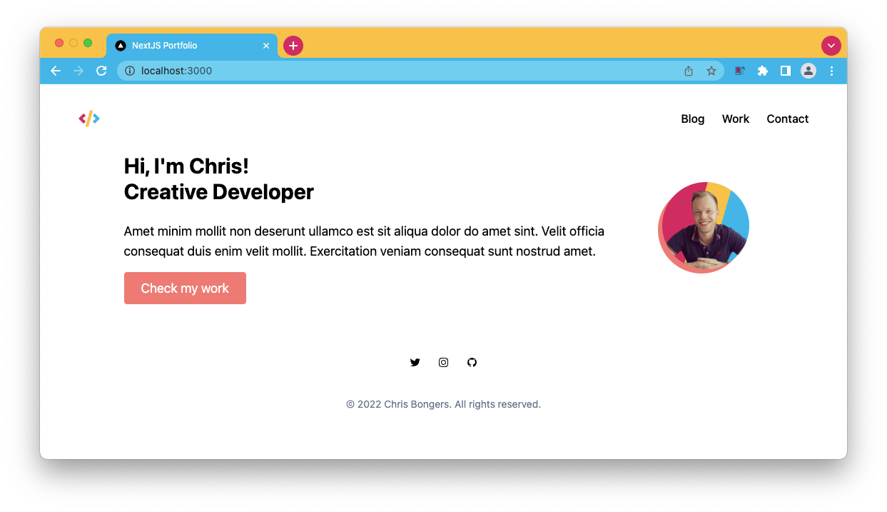
It looks pretty much like the design now!
If you want to look at the source code, I've uploaded it to Github.
Tomorrow we will look at the other homepage pieces and style them accordingly.
Thank you for reading, and let's connect!
Thank you for reading my blog. Feel free to subscribe to my email newsletter and connect on Facebook or Twitter
About the author
I'm a full-stack developer from South Africa 🇿🇦. I love writing about JavaScript, HTML and CSS.
Comments
Join the discussionNo comments yet. Be the first to comment.



