Now that we have our basic structure styled and working let's take some time to look at the responsive aspect.
We haven't considered it, so let's see what happens if we view the homepage on a mobile device.
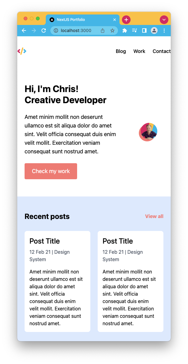
I'm surprised by how well it already looks. Some takeaways that we have to focus on.
- Header spacing left and right
- Pushing the profile image to its section
- Recent posts should show under each other
The rest is pretty much solid! So let's get started. If you wish to follow along for only the responsive part, use the following GitHub branch as your starting point.
Making the homepage responsive
We'll start with the header, which needs more spacing on the sides.
Since we only want the padding to be added on the mobile version, we can "unset" it on the desktop.
So open the header.js file and add the following classes to the header element class list.
<header className="px-6 md:px-0"></header>
Now let's move to the intro section, where we want the social image to be on its line. However, I want the image to be on top of the text. Luckily for us, flexbox comes with a reverse option.
For this one, we need to modify the introHeader.js file and add the following options to the first div inside the header.
<div className="flex-col-reverse md:flex-row"></div>
The last part we wanted to adjust was the recent post section. This simply needs to show the items under each other instead of next to each other.
Since we used a grid for this, we can define a different grid for the mobile view. Then on the desktop, we modify it to show in the 2-column grid.
Open the recentPosts.js and modify the div wrapping the articles.
<div className="grid grid-cols-1 md:grid-cols-2 gap-6">
  <article />
  <article />
</div>
Let's take another look at how it looks now.
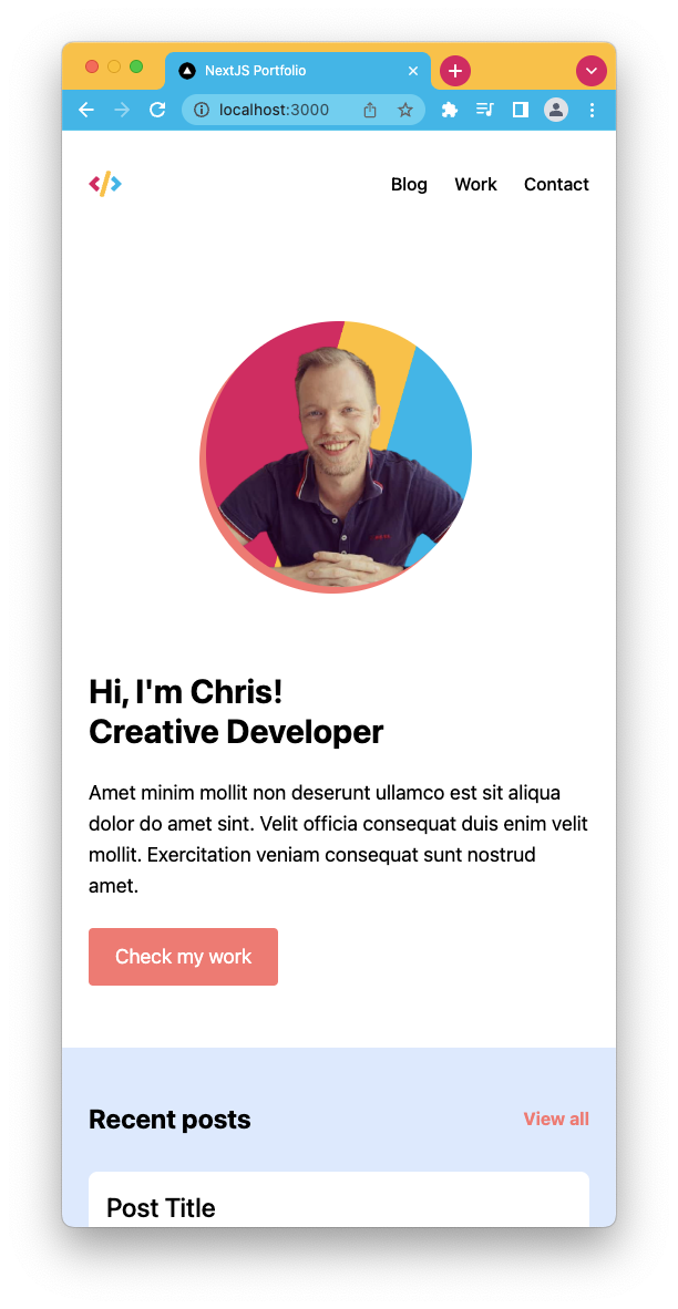
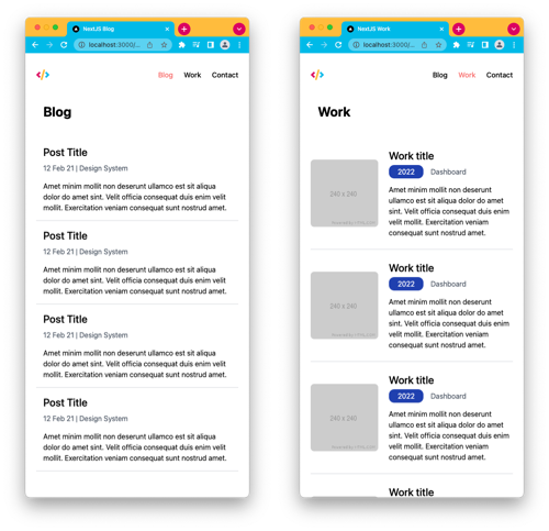
And the best part is that because of the changes we made here, all other pages automatically look fantastic on mobile!
If you want to see the completed code check it out on this GitHub branch
Thank you for reading, and let's connect!
Thank you for reading my blog. Feel free to subscribe to my email newsletter and connect on Facebook or Twitter
About the author
I'm a full-stack developer from South Africa 🇿🇦. I love writing about JavaScript, HTML and CSS.
Comments
Join the discussionNo comments yet. Be the first to comment.