
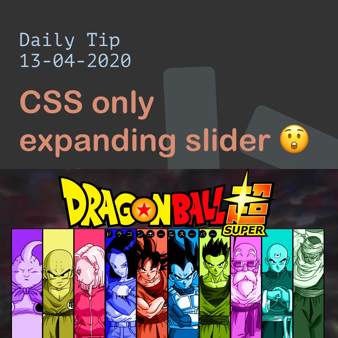
CSS only expanding slider 😲
I'm a full-stack developer from South Africa 🇿🇦. I love writing about JavaScript, HTML and CSS.
Sliders are amazing, a welcome addition to every website, but sometimes can become very complicated with text flying in and images animating from all sides.
Let's say we just want a simple expandable slider, we can achieve this with just css you heard me right, CSS only!
Making our CSS only slider
For our html we are going to use the following setup:
<div class="container">
  <div class="slider">
    <div class="slide">
      <img src="https://images.unsplash.com/photo-1533468432434-200de3b5d528?ixlib=rb-1.2.1&ixid=eyJhcHBfaWQiOjEyMDd9&auto=format&fit=crop&w=975&q=80" />
    </div>
    <div class="slide">
      <img src="https://images.unsplash.com/photo-1586254574632-55e4aaea7793?ixlib=rb-1.2.1&ixid=eyJhcHBfaWQiOjEyMDd9&auto=format&fit=crop&w=934&q=80" />
    </div>
    <div class="slide">
      <img src="https://images.unsplash.com/photo-1536536982624-06c1776e0ca8?ixlib=rb-1.2.1&ixid=eyJhcHBfaWQiOjEyMDd9&auto=format&fit=crop&w=934&q=80" />
    </div>
    <div class="slide">
      <img src="https://images.unsplash.com/photo-1502827186494-9f7976a04548?ixlib=rb-1.2.1&ixid=eyJhcHBfaWQiOjEyMDd9&auto=format&fit=crop&w=976&q=80" />
    </div>
    <div class="slide">
      <img src="https://images.unsplash.com/photo-1545559054-8f4f9e855781?ixlib=rb-1.2.1&ixid=eyJhcHBfaWQiOjEyMDd9&auto=format&fit=crop&w=934&q=80" />
    </div>
  </div>
</div>
Nothing fancy a container (optional) and a slider div with 5 slide divs inside, each slide contains a image in this case.
Now for the CSS we use the following:
.container {
  display: flex;
  align-items: center;
  justify-content: center;
  width: 100%;
  height: 100%;
}
.slider {
  width: 80vw;
  height: 80vh;
  display: flex;
}
.slide {
  position: relative;
  flex: 1 0 auto;
  overflow: hidden;
  transition: all 0.5s ease-in-out;
}
.slide:hover {
  flex: 5;
}
.slide img {
  position: absolute;
  max-height: 100%;
  left: 50%;
  transform: translateX(-50%);
}
.container the container is a wrapper because I didn't want the slider to be full with.
We give the container display: flex and align everything horizontal and vertical as we learned here.
.slider The slider just has 80vw (viewport width) and 80vh (viewport height) and display flex, you can read more about the viewport elements in this article.
.slide is where the fun begins, we tell it to be relative to center the image, later on, then we add a flex: 1 0 auto; which will distribute them equally. then we set overflow: hidden; to not show the extra image part. And we add some smooth animation with: transition: all 0.5s ease-in-out;.
Once you hover on the slide we set the flex to 5 which will make that element bigger and because our transition is in place it will look smooth.
Last we position the image inside, we make them absolute positioned to center them better.
We choose to align them 50% from the left and then return them back -50% with transform. This will make sure the absolute positioning is entered.
This looks like the following demo:
See the Pen CSS only expanding slider 😲 by Chris Bongers (@rebelchris) on CodePen.
CSS only slider with background images
In the previous example, we used images, but we can also use background images, that will look something like this:
<div class="container">
  <div class="slider">
    <div class="slide slide1"></div>
    <div class="slide slide2"></div>
    <div class="slide slide3"></div>
    <div class="slide slide4"></div>
    <div class="slide slide5"></div>
  </div>
</div>
Then for the CSS we can do the following:
.slider {
  width: 100vw;
  height: 100vh;
  display: flex;
}
.slide {
  position: relative;
  flex: 1 0 auto;
  transition: all 0.5s ease-in-out;
}
.slide:hover {
  flex: 5;
}
.slide1 {
    background-image: url('https://images.unsplash.com/photo-1533468432434-200de3b5d528?ixlib=rb-1.2.1&ixid=eyJhcHBfaWQiOjEyMDd9&auto=format&fit=crop&w=975&q=80');
  background-position: center center;
  background-size: cover;
}
//...repeat for all your slides
As you can see this is actually easier, but some people prefer to have the actual image element in place.
With this you can make this:
See the Pen Dragon Ball Super Slider CSS Only by Chris Bongers (@rebelchris) on CodePen.
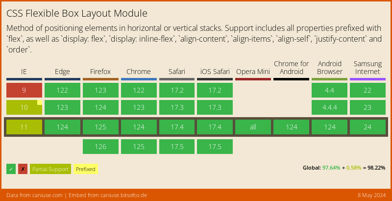
Browser support
Flex has really wide support and polyfills available, it also depends on the rest of your structure which ones you are going to need.
Thank you for reading, and let's connect!
Thank you for reading my blog, feel free to subscribe to my email newsletter and connect on Facebook or Twitter


