# CSS only expanding slider 😲
Sliders are amazing, a welcome addition to every website, but sometimes can become very complicated with text flying in and images animating from all sides.
Let's say we just want a simple expandable slider, we can achieve this with just `css` you heard me right, CSS only!
## Making our CSS only slider
For our `html` we are going to use the following setup:
```html
```
Nothing fancy a container (optional) and a slider `div` with 5 slide `divs` inside, each slide contains a image in this case.
Now for the CSS we use the following:
```css
.container {
display: flex;
align-items: center;
justify-content: center;
width: 100%;
height: 100%;
}
.slider {
width: 80vw;
height: 80vh;
display: flex;
}
.slide {
position: relative;
flex: 1 0 auto;
overflow: hidden;
transition: all 0.5s ease-in-out;
}
.slide:hover {
flex: 5;
}
.slide img {
position: absolute;
max-height: 100%;
left: 50%;
transform: translateX(-50%);
}
```
`.container` the container is a wrapper because I didn't want the slider to be full with.
We give the container `display: flex` and align everything horizontal and vertical as we learned [here](https://daily-dev-tips.com/posts/css-flexbox-most-easy-center-vertical-and-horizontal/).
`.slider` The slider just has 80vw (viewport width) and 80vh (viewport height) and display flex, you can read more about the viewport elements in [this article](https://daily-dev-tips.com/posts/how-to-work-with-css-viewport-units/).
`.slide` is where the fun begins, we tell it to be relative to center the image, later on, then we add a `flex: 1 0 auto;` which will distribute them equally. then we set `overflow: hidden;` to not show the extra image part. And we add some smooth animation with: `transition: all 0.5s ease-in-out;`.
Once you hover on the slide we set the `flex` to 5 which will make that element bigger and because our `transition` is in place it will look smooth.
Last we position the image inside, we make them absolute positioned to center them better.
We choose to align them 50% from the left and then return them back -50% with transform. This will make sure the absolute positioning is entered.
This looks like the following demo:
See the Pen
CSS only expanding slider 😲 by Chris Bongers (@rebelchris)
on CodePen.
## CSS only slider with background images
In the previous example, we used images, but we can also use background images, that will look something like this:
```html
```
Then for the CSS we can do the following:
```css
.slider {
width: 100vw;
height: 100vh;
display: flex;
}
.slide {
position: relative;
flex: 1 0 auto;
transition: all 0.5s ease-in-out;
}
.slide:hover {
flex: 5;
}
.slide1 {
background-image: url('https://images.unsplash.com/photo-1533468432434-200de3b5d528?ixlib=rb-1.2.1&ixid=eyJhcHBfaWQiOjEyMDd9&auto=format&fit=crop&w=975&q=80');
background-position: center center;
background-size: cover;
}
//...repeat for all your slides
```
As you can see this is actually easier, but some people prefer to have the actual image element in place.
With this you can make this:
See the Pen
Dragon Ball Super Slider CSS Only by Chris Bongers (@rebelchris)
on CodePen.
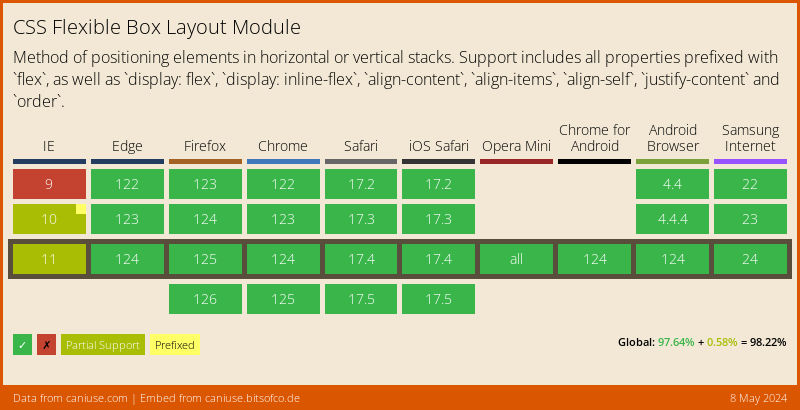
## Browser support
Flex has really wide support and polyfills available, it also depends on the rest of your structure which ones you are going to need.
### Thank you for reading, and let's connect!
Thank you for reading my blog, feel free to subscribe to my email newsletter and connect on [Facebook](https://www.facebook.com/DailyDevTipsBlog) or [Twitter](https://twitter.com/DailyDevTips1)


