
CSS Logos: Dribbble logo

I'm a full-stack developer from South Africa 🇿🇦. I love writing about JavaScript, HTML and CSS.
While looking for inspiration for logos to recreate, I browsed Dribbble (the designer social network). Then it hit me, why not create the Dribbble logo.
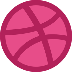
The one we will be recreating is this one:
Analysing the logo
We can see the logo represents a basketball, a reference to the product's name.
At first glance, we see it's a round shape, with three lines over it. If we look beyond the scope of the round shape, we can even see these three lines are more oversized round shapes sitting on top of it.
So to recreate this in CSS, we need to start with a round outline and use some child elements to place the three extra lines.
Our outer shape will then receive an overflow none to hide the excess rounds.
CSS Dribbble logo
Let's start by setting up our HTML. I want to keep this as clean as possible, so I'll only use one div and one extra element.
<div class="dribbble">
  <span></span>
</div>
Let's create some root variables to set the container size and the border styles, as we will need them more than once.
:root {
  --size: 15rem;
  --border: 1em solid #c32361;
}
Then let's create the main ball round outline.
.dribbble {
  position: relative;
  width: var(--size);
  height: var(--size);
  overflow: hidden;
  background-color: #ea4c89;
  border-radius: 50%;
  border: var(--border);
  border-radius: 100%;
}
This should give us a round surface to work with.
An important thing to note on this ball is the overflow: hidden. This property will make sure nothing outside of this shape will show.
Now you might wonder how we get the three overlapping shapes with only one element (span)?
And the question is pseudo elements. In our case, we'll use :before and :after to create the top and bottom lines. And the span for the middle one.
Let's start with setting selectors that are the same for all three. The following code is SCSS, so we don't have to copy-paste it often.
.dribbble {
  &:before,
  &:after,
  span {
    content: '';
    position: absolute;
    border: var(--border);
    border-radius: 100%;
  }
}
Here we set the position to absolute, the border to our border variable, and the radius to 100% to make these shapes round.
Note: Nothing will show up yet as we haven't set the sizes.
Let's quickly set the sizes for the top and bottom lines.
.dribbble {
  &:before,
  &:after {
    width: 125%;
    height: 60%;
  }
}
This should add two ellipsis shapes to our ball.
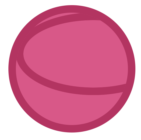
Now all that's left for the top and bottom is to position them correctly. I will also apply a rotation to make it look more perspective-like.
.dribbble {
  &:before {
    top: -24%;
    left: -32%;
    transform: rotate(349deg);
  }
  &:after {
    bottom: -30%;
    left: -5%;
    transform: rotate(332deg);
  }
}
This code ensures that the top and bottom are shown correctly.
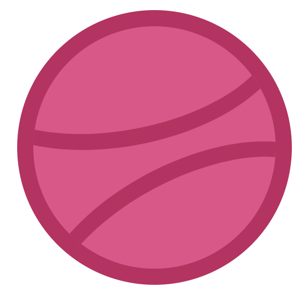
The next part is the middle line, for which we'll use the span element. This uses the same technique, but we adjust the height to be bigger than the width.
.dribbble {
  span {
    width: 80%;
    height: 150%;
    top: -26%;
    left: -26%;
    transform: rotate(340deg);
  }
}
And that's it. We should now have our Dribbble logo in CSS. You can see the completed result in this CodePen.
Thank you for reading, and let's connect!
Thank you for reading my blog. Feel free to subscribe to my email newsletter and connect on Facebook or Twitter



