CSS Logos: daily dev Logo

I'm a full-stack developer from South Africa 🇿🇦. I love writing about JavaScript, HTML and CSS.
Of course, I couldn't resist recreating my employer's logo in CSS. We are talking, of course, about daily.dev.
The logo itself looks like some basic shapes, as seen below.

Analysing the logo
Looking at the logo, we see three distinct parts to it.
- The square on the left
- The line in the middle
- The arrow on the right
Depending on how you look at it, you could see the left part as a `d', but that would make things even harder.
There are a couple of things with this setup that make it a bit tricky. The square has rounded corners and a square inside. The line in the middle has some trapezoid borders. The arrow is rounded, so we can't use an HTML arrow for this.
No worries, we'll make this work.
CSS daily.dev logo
Let's start by setting up all the elements we need.
<div class="dd">
  <div class="square"></div>
  <div class="stripe"></div>
  <div class="arrow"></div>
</div>
As you can see, I tried to reflect the naming in terms of what I described in the analyze section.
Alright, we also want to add some default CSS variables that we can re-use.
:root {
  --bg: #151618;
  --radius: 20px;
  --gray: #989899;
}
As for the body, we want to make this our background color and center everything inside.
body {
  background: var(--bg);
  display: grid;
  place-items: center;
  min-height: 100vh;
  margin: 0;
  padding: 0;
}
Then we want to address our wrapping div, and I want to make it one specific size. It won't be scaleable, but you could make it so by adjusting the size and border radius.
.dd {
  position: relative;
  width: 350px;
  aspect-ratio: 350/200;
  overflow: hidden;
}
Then let's move on to creating the square element. This is the easier one, as we need to add a square with rounded corners and use the :before pseudo element to overlay another square inside. We then rotate the whole square and position it accordingly.
Note: Throughout this article, I'll use SCSS since it's easier to make it visually explained.
.square {
  width: 42.857%;
  aspect-ratio: 1;
  background: white;
  border-radius: var(--radius);
  transform: rotate(45deg);
  top: 11.5%;
  position: absolute;
  left: 6.571%;
  z-index: 1;
  display: grid;
  place-items: center;
  &:before {
    content: '';
    width: 50%;
    aspect-ratio: 1;
    background: var(--bg);
    position: absolute;
  }
}
With this in place, we should get the following square.

The next element we need is the stripe in the middle. This can also be a rectangle shape that we rotate.
We also set the top left and bottom right border radius to reflect the logo.
.stripe {
  width: 11.429%;
  height: 130%;
  background: white;
  position: absolute;
  transform: rotate(45deg);
  border-radius: var(--radius) 0px var(--radius) 0px;
  left: 44.286%;
  top: -16%;
  z-index: 3;
}

The tricky part for this element is that we want the skewed triangles to cut out some pieces of the square and arrow later. I decided again to use pseudo elements. I created another rectangle shape but used the skew transform to make it look like a trapezoid shape.
.stripe {
  &:before,
  &:after {
    content: '';
    position: absolute;
    width: 35%;
    height: 100%;
    background: var(--bg);
  }
  &:before {
    left: -35%;
    bottom: 7%;
    transform: skewY(71deg);
  }
  &:after {
    right: -35%;
    top: 7%;
    transform: skewY(71deg);
  }
}
In the image below, I painted the shapes pink so you can see what's happening.
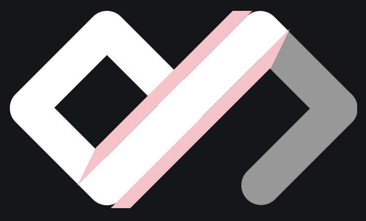
Perfect, if we paint those black, we have the shape we want. All that's left now is the arrow on the right.
As mentioned, this shape has rounded corners, making things a little more complicated.
(When working with straight corners, we could have the user a square box with only two borders visible)
However, no worries, our good friends, the pseudo elements come in handy again. For the arrow, we use two rounded rectangles that overlap each other.
.arrow {
  position: absolute;
  width: 11.429%;
  height: 150%;
  left: 78.286%;
  top: 31.5%;
  z-index: 2;
  &:before,
  &:after {
    content: '';
    position: absolute;
    background: var(--gray);
    border-radius: var(--radius);
    display: block;
    left: -5%;
    height: 50%;
    width: 100%;
    transform: rotate(45deg);
  }
  &:after {
    bottom: 76%;
    transform: rotate(-45deg);
  }
}
In the image below, I painted one red and one blue so you can see what's happening.
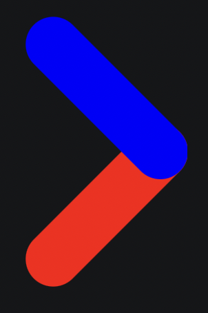
And that's it. Curious to see the result? Check out this CodePen.
Thank you for reading, and let's connect!
Thank you for reading my blog. Feel free to subscribe to my email newsletter and connect on Facebook or Twitter


