

In the second article of CSS Logos, we'll recreate one of the dev.to logos.
I choose the rainbow logo, as it has some pretty cool CSS effects we can explore.
This will be the one we are recreating:
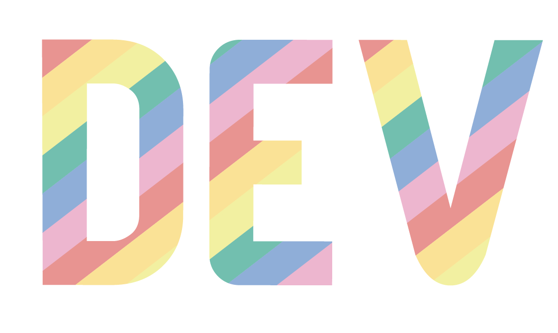
Note: I won't use this exact font as their logo is no font, but an SVG.
Analysing the Logo
We can quickly see this can be built using a font. I'll use a default font since their logo is an SVG symbol.
Then we see a gradient overlay on the text that consists of six colors.
Some things we have to work on:
- Overlap text with a CSS Gradient
- Repeating CSS Gradient
- Hard stop CSS Gradients
CSS DevTo logo
Let's get started on this logo. The first thing we'll do is add the text and make it nice and big.
<h1>DEV</h1>
h1 {
  margin: 0;
  padding: 0;
  line-height: 8rem;
  display: inline-block;
  font-family: arial;
  font-size: 10rem;
}
The next part I want to focus on is the hard-stop CSS because, by default, gradients kind of soft transition.
Let me show you what I mean by making two blocks that gradient from red-blue.
<div class="gradient box"></div>
<div class="gradient-hard box"></div>
For the default gradient we can use something like this:
.gradient {
  background-image: linear-gradient(red 0%, blue 100%);
}
And for the hard stop, we must define a second batch of the colors on the same percentage.
.gradient {
  background-image: linear-gradient(red 0%, red 50%, blue 50%, blue 100%);
}
We say, show red from 0-50%, then blue from 50-100%. This forces it to have no overflow or soft gradient transition.
You can see the result in this CodePen example:
The next step is to see how we can repeat a gradient. For this step, it's important not to have the gradient fill completely.
Meaning we currently used all of the 100%. We can say use 0-5% and 5-10% but then stop.
Then we can set the background as repeating-linear-gradient. This will make sure it gets repeated every time.
Let's try this on our hard-stop red-blue gradient.
.gradient-hard-repeat {
  background-image: repeating-linear-gradient(
    red 0%,
    red 5%,
    blue 5%,
    blue 10%
  );
}
You can already see the result in the above CodePen.
Then it's the task to show this on top of the text. It's as simple as setting the background for our text element.
h1 {
  ...
  background: repeating-linear-gradient(...);
}
However, this will show it as a big block, as we saw with our block example. To only cover the text, we can add the following two properties.
h1 {
    ...
  -webkit-background-clip: text;
  -webkit-text-fill-color: transparent;
}
This will make sure the background clips to the text and the fill of the text is transparent (so the gradient shows).
And tada! We now have our fantastic effect. The last step is to add the actual Dev.to colors.
And you can see the completed code on this CodePen.
Thank you for reading, and let's connect!
Thank you for reading my blog. Feel free to subscribe to my email newsletter and connect on Facebook or Twitter
About the author
I'm a full-stack developer from South Africa 🇿🇦. I love writing about JavaScript, HTML and CSS.
Comments
Join the discussionNo comments yet. Be the first to comment.



