
CSS Logos: Hashnode logo

I'm a full-stack developer from South Africa 🇿🇦. I love writing about JavaScript, HTML and CSS.
I wanted to start this CSS challenge a while ago by recreating some fantastic logos in CSS only.
I'll be starting with Hashnode, as I re-created this recently for the CSS Hashnode challenge.
See my result of the challenge here
Analysing the logo
While looking at the logo, we can quickly see a rounded square with a hole in it.

This sounds easy enough. However, one thing will make it a bit more complicated.
This is the fact that making the whole see-through can be pretty tricky.
So let's split this up into two sections, one in which we'll make it with a solid color and one that is see-through.
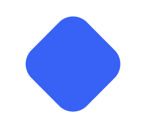
CSS Hashnode logo
We first have to start by creating the rounded square that is rotated a bit.
For the HTML, we'll be using one div with the class hashnode.
.hashnode {
  width: 5em;
  aspect-ratio: 1;
  border-radius: 1.25em;
  background: #2962ff;
  transform: rotate(45deg);
}
Using the aspect ratio, we make sure the logo is square. We also rotate it by 45 degrees, so it has the same position. At this point, you should have a block looking like this.
Now we can leverage the before element to add the white dot on top of this.
&:before {
  content: '';
  border-radius: 50%;
  background: white;
  height: 2em;
  aspect-ratio: 1;
}
And with this, we get a simple round shape. To center the round element, we can add the following two elements to our main wrapper div.
.hashnode {
  display: grid;
  place-items: center;
}
And there you go, you should now have the following result:
CSS see-through Hashnode logo
The main issue with the above solution is that we can't have anything in the background as it would not show through.
So let's try and change that.
The main setup will be the exact same as the above solution:
.hashnode {
  width: 5em;
  aspect-ratio: 1;
  border-radius: 1.25em;
  background: #2962ff;
  transform: rotate(45deg);
}
Then we can leverage a mask to mask out the middle section.
-webkit-mask: radial-gradient(#0000 28%, #000 28%);
mask: radial-gradient(#0000 28%, #000 28%);
This will mask out the center element, so we can add a background and see what happens.
As you can see in the CodePen above, the background shows through the logo, excellent! The mask option is a powerful tool to mask out parts of your elements.
Thank you for reading, and let's connect!
Thank you for reading my blog. Feel free to subscribe to my email newsletter and connect on Facebook or Twitter


