CSS Logos: Instagram logo

I'm a full-stack developer from South Africa 🇿🇦. I love writing about JavaScript, HTML and CSS.
I'm pretty sure everyone has seen this one before, the Instagram logo.
For reference, it's the modern one that looks like this:

Analysing the logo
I'll be honest that the logo looked way easier to create than it was.
You might wonder what's so tricky about it? And it's all in the background, you'll see that even my version is not perfect, but every sample image out on the internet has a different background gradient.
When you look closely, you see it's not one particular gradient. It's kind of overlapping gradients.
Let's dive into it, and I'll show you how I created my version.
CSS Instagram logo
I make it extra challenging by only using one div and doing everything from that one element.
<div class="instagram"></div>
Let's start by setting some variables we'll use.
:root {
  --size: 50vmin;
  --white: #fff;
  --blue: #3051f1;
  --purple: #c92bb7;
  --red: #f73344;
  --orange: #fa8e37;
  --yellow: #fcdf8f;
  --yellow_to: #fbd377;
}
Then let's move to creating the basic outline of the box. I'll use em units as they allow for better scaling of the borders.
.instagram {
  font-size: var(--size);
  width: 1em;
  aspect-ratio: 1;
  border-radius: 0.2em;
  background: var(--purple);
}
I've temporarily set the background to purple so you can see what we have so far.
Now let's dive into these gradients. It's a bit tricky as there is an overlapping gradient.
Luckily for us, CSS gradients allow for multiple instances that can overlap in one background. For example, this is valid code:
background: linear-gradient(45deg, blue, transparent), radial-gradient(red, transparent);
This would give us something like this:
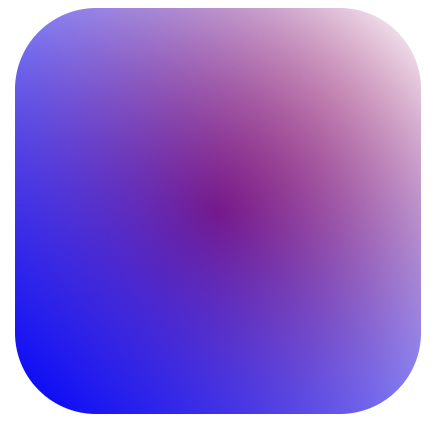
Now let's see how we can start. I decided to start with the blue/purple background gradient.
linear-gradient(145deg, var(--blue) 10%, var(--purple) 70%)
This result in the following output.

Now the tricky part is to have the yellow, orange, and red gradients overlap. To achieve that, we must ensure that the gradient sits on top of the linear one we just created.
background: radial-gradient(
    circle farthest-corner at 28% 100%,
    var(--yellow) 0%,
    var(--yellow_to) 10%,
    var(--orange) 22%,
    var(--red) 35%,
    transparent 65%
  ), linear-gradient(145deg, var(--blue) 10%, var(--purple) 70%);
With this in place, we should get the following result.

And that's it, to me, that looks super close to the actual logo.
Note: You could enhance this by using multiple radial gradients stacked on top of each other.
The next thing we need is the camera outline icon, and since we are out of elements, we have to use the :before and :after selector again.
Let's start with the outline.
.instagram:before {
  content: '';
  color: var(--white);
  position: absolute;
  border-radius: inherit;
  aspect-ratio: 1;
  border: 0.05em solid;
  width: 65%;
}

Then for the inside, we simply use the after selector.
.instagram:after {
  content: '';
  color: var(--white);
  position: absolute;
  border-radius: inherit;
  aspect-ratio: 1;
  border-radius: 50%;
  border: 0.05em solid;
  width: 35%;
}

As you can see, both the before and after are very similar. We simply make the one more rounded and smaller.
I hear you wonder, but what about the little dot? We don't have any selectors left. And that's true, but we have our good friend the box-shadow we can use for this.
.instagram:after {
  box-shadow: 0.22em -0.22em 0 -0.18em;
}
With that in place, we should see the result you see in this CodePen.
Thank you for reading, and let's connect!
Thank you for reading my blog. Feel free to subscribe to my email newsletter and connect on Facebook or Twitter