
Angular 10 Transclusion: When and Why You`ll Need It

If you are into Angular there was a time you had a component that could hold multiple other components.
In my latest use case this was actually a basic styled component, meet the card component.
It has a border, box-shadow, title, and icon if needed.
Inside this card component, multiple items could be rendered, a blog post, a podcast, a content page, etc.
If you are thinking but huh I can add this card styling to each component? Yes, but imagine the card layout changes, you now have to edit component using that styling. Creating a top-level component and transcluding the components inside you only have to update the piece of code once.
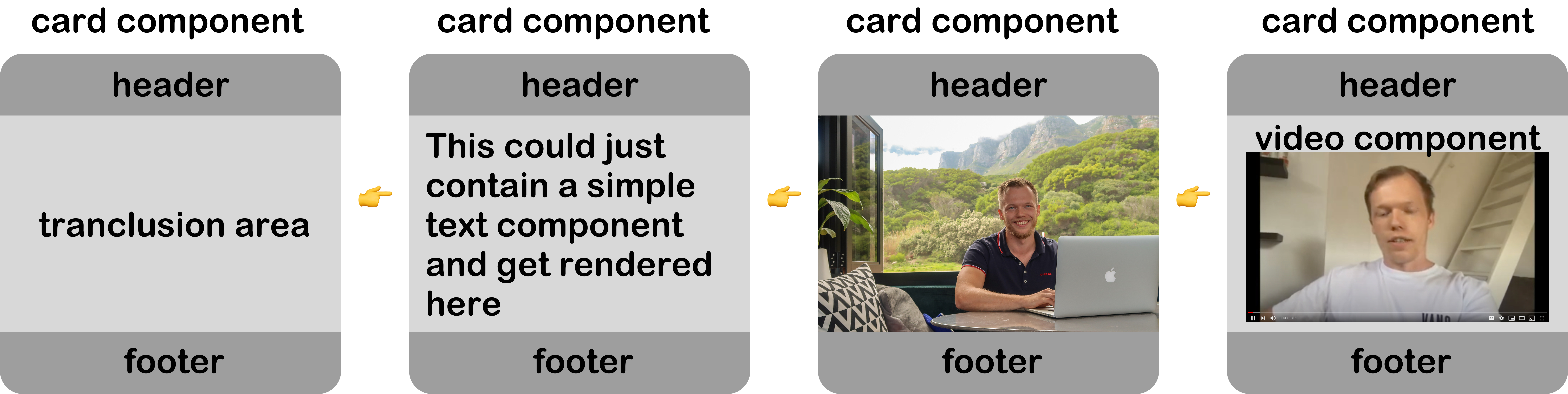
So this is where Angular transclusion comes in, it means we have a swappable piece in our component.
A super high-level visual representation.
Creating our transclusion component
In this article, we will use our master Angular 10 Tailwind application from GitHub.
Now let's start by generating this card component.
ng generate component Card
This will generate our basic component, let's open up the TS file and make the following changes.
import {Component, Input} from '@angular/core';

@Component({
  selector: 'app-card',
  templateUrl: './card.component.html'
})
export class CardComponent {
  @Input() title: string;
  @Input() icon: string;

  constructor() {}
}
Here you can see we have two Angular @Input attributes, which will be able to add a title and optional icon to our card.
Now we can add our HTML.
<div class="flex flex-row mb-5 overflow-hidden bg-white rounded-lg shadow-lg">
  <div class="flex flex-col w-full p-6 text-dark-gray-600">
    <div class="flex justify-between mb-4">
      <span class="uppercase">{{ title }}</span>
      <i *ngIf="icon">{{ icon }}</i>
    </div>
    <ng-content></ng-content>
  </div>
</div>
This is where the magic comes in, you see that <ng-content> element, that will render anything inside our card component.
Let's try it out.
Open up the welcome.component.html and add the following code:
<div class="container p-6 m-auto">
  <app-card title="Welcome" icon="✌️">
    <h1>Anything in here is content!</h1>
  </app-card>
</div>
So, here we add a new app-card with a static title and icon for this example.
Note: You could make this dynamic by using [title]="dynamicProp"
And inside the app-card, we specify what is rendered inside the ng-content. In our case, a simple header for now.
The result so far:
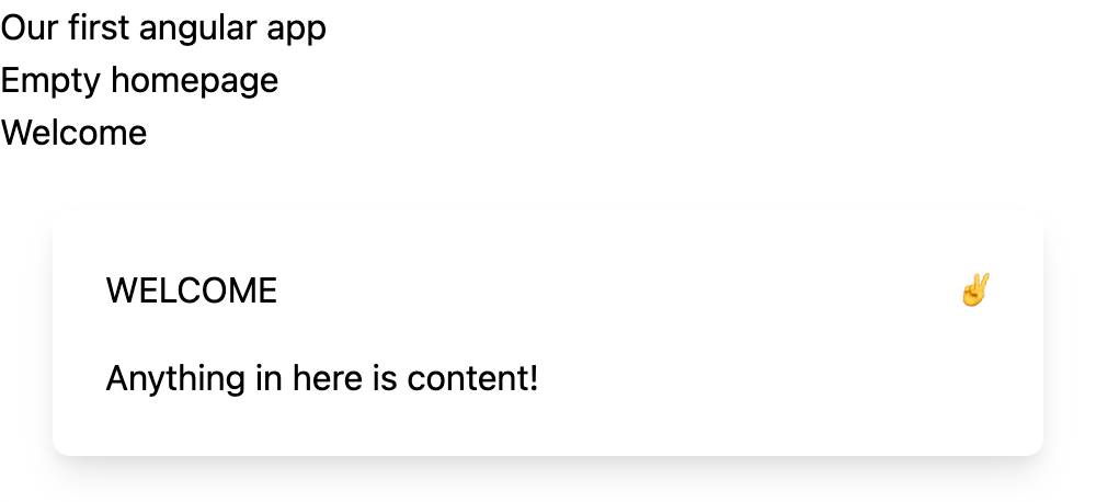
Rendering a component inside another Angular component
This use-case was fun, but we want to render some other component in it most of the time.
Let's generate a podcast component.
ng generate component Podcast
For now, let's add some static HTML for this demo purpose.
<div
  class="w-full h-24 mb-3 bg-center bg-cover rounded-lg"
  [style.background-image]="'url(' + img + ')'"
></div>
<strong class="block mb-2">Episode 142: Ionic vs Flutter</strong>
<p>
  In todays episode we are talking to Michael about how Flutter compares to Ionic.
</p>
<audio controls class="w-full mt-4">
  <source src="podcast.ogg" type="audio/ogg" />
  <source src="podcast.mp3" type="audio/mpeg" />
  Your browser does not support the audio tag.
</audio>
Just a simple setup. For now, the image is loaded from the Typescript:
img: string =
  'https://images.unsplash.com/photo-1606592641978-bbfa15596820?ixlib=rb-1.2.1&ixid=MXwxMjA3fDB8MHxwaG90by1wYWdlfHx8fGVufDB8fHw%3D&auto=format&fit=crop&w=1950&q=80';
Now let's add this component to our card:
<app-card title="Podcast" icon="🎧">
  <app-podcast></app-podcast>
</app-card>
This will now render as:
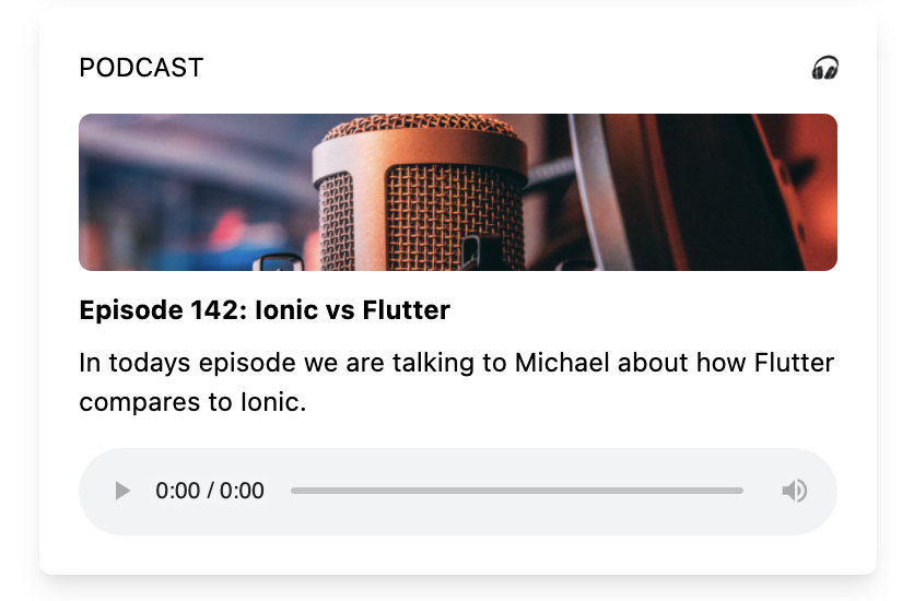
Naming the transclusion section
One cool thing we can do is name the transclusion slot.
Open your card-component.html file and change the ng-content to include this:
<ng-content select="[body]"></ng-content>
Now we can change our welcome.component.html to look as such:
<app-card title="Podcast" icon="🎧">
  <app-podcast body></app-podcast>
</app-card>
Angular multiple-slot transclusion
The power of naming these slots comes in the ability to add more than one to a component.
Let's say we want a body and a footer part that could be dynamic.
We already have this body part now, but let's make it possible to add a footer.
Change the card.component.html:
<div class="flex flex-row mb-5 overflow-hidden bg-white rounded-lg shadow-lg">
  <div class="flex flex-col w-full p-6 text-dark-gray-600">
    <div class="flex justify-between mb-4">
      <span class="uppercase">{{ title }}</span>
      <i *ngIf="icon">{{ icon }}</i>
    </div>
    <ng-content select="[body]"></ng-content>
    <ng-content select="[footer]"></ng-content>
  </div>
</div>
As you can see, we added a second ng-content section called footer.
Now let's also modify our welcome.component.html to add some data to it.
<app-card title="Podcast" icon="🎧">
  <app-podcast body></app-podcast>
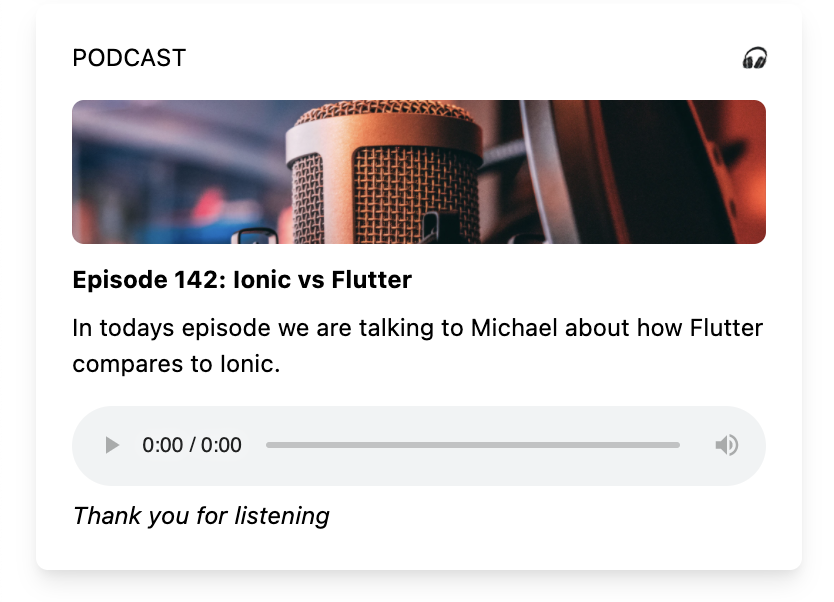
  <div class="mt-2 italic" footer>Thank you for listening</div>
</app-card>
So this example is a bit weird, but you can see we have two transclusion slots.
This will result in the following result:
Rendering different components
As mentioned, the real power is to render multiple component types into one card component.
Let's define another component for a podcast.
ng generate component Video
Let's make some changes to the video.component.html file.
<strong class="block mb-2">6 everyday JavaScript tips you must know</strong>
<p>In this video i'll guide you to create a super cool Todo list</p>
<iframe
  width="100%"
  height="250px"
  src="https://www.youtube.com/embed/svFffyg_m0M"
  frameborder="0"
  allow="accelerometer; autoplay; clipboard-write; encrypted-media; gyroscope; picture-in-picture"
  allowfullscreen
></iframe>
Now we can add this block to our welcome.component.html.
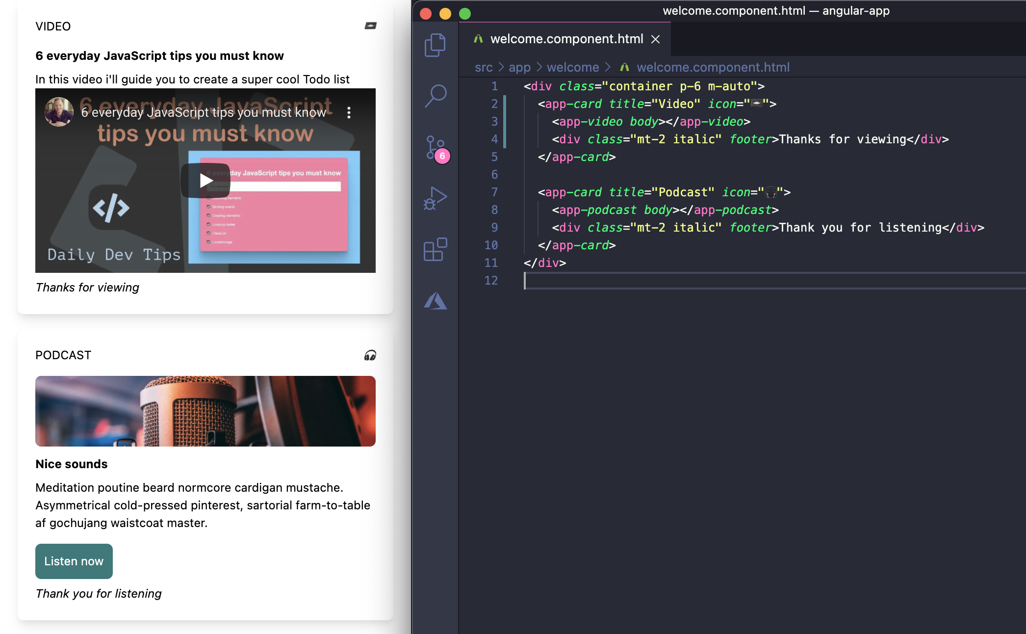
<app-card title="Video" icon="📼">
  <app-video body></app-video>
  <div class="mt-2 italic" footer>Thanks for viewing</div>
</app-card>
The result
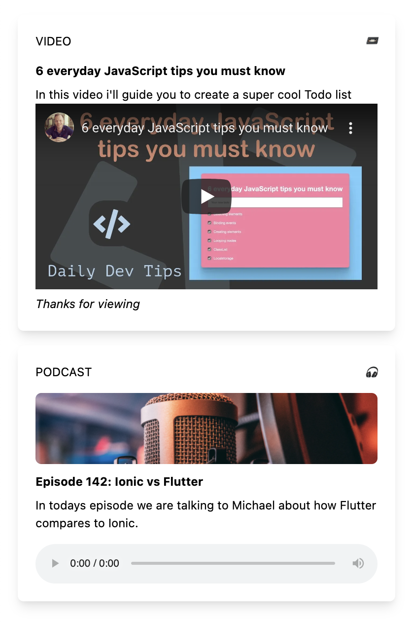
In the image above, you can see that the card styling is the same. We have the title, icon, and a new podcast component in the middle.
I hope you've seen the massive good use-cases of using transclusion to make our lives easier.
You can find the finished result on the following GitHub repo.
Thank you for reading, and let's connect!
Thank you for reading my blog. Feel free to subscribe to my email newsletter and connect on Facebook or Twitter
About the author
I'm a full-stack developer from South Africa 🇿🇦. I love writing about JavaScript, HTML and CSS.
Comments
Join the discussionAmazing, thanks for sharing! 🚀👏
You're welcome Rafael, thanks for the comment 🤟



