# Angular 10 Transclusion: When and Why You`ll Need It
If you are into Angular there was a time you had a component that could hold multiple other components.
In my latest use case this was actually a basic styled component, meet the card component.
It has a border, box-shadow, title, and icon if needed.
Inside this card component, multiple items could be rendered, a blog post, a podcast, a content page, etc.
If you are thinking but huh I can add this card styling to each component?
Yes, but imagine the card layout changes, you now have to edit component using that styling.
Creating a top-level component and transcluding the components inside you only have to update the piece of code once.
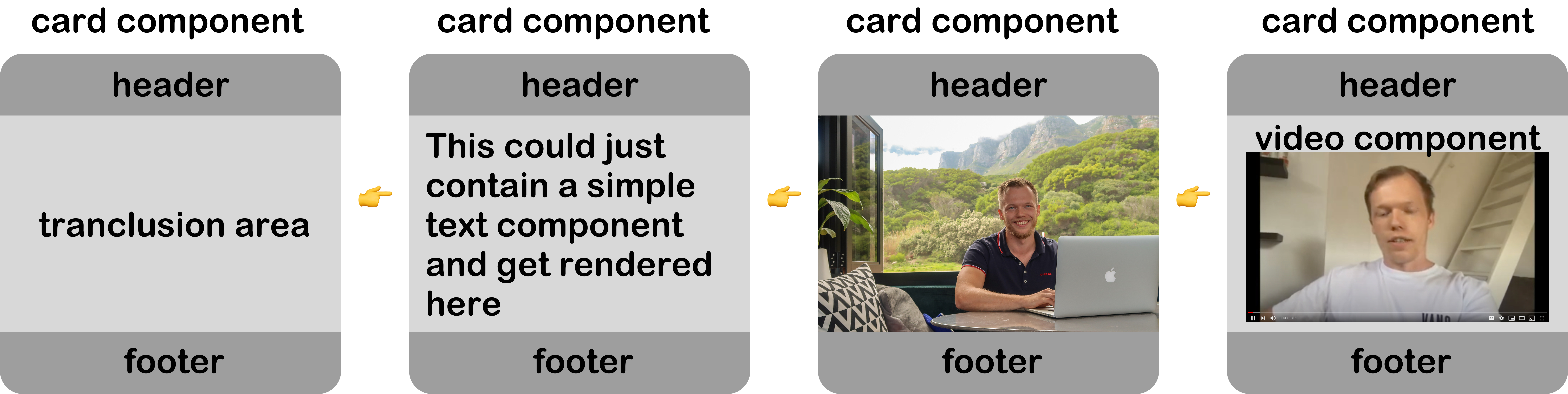
So this is where Angular transclusion comes in, it means we have a swappable piece in our component.
A super high-level visual representation.
## Creating our transclusion component
In this article, we will use our master [Angular 10 Tailwind](https://github.com/rebelchris/angular-starter-demo/tree/feature/tailwind) application from GitHub.
Now let's start by generating this card component.
```bash
ng generate component Card
```
This will generate our basic component, let's open up the TS file and make the following changes.
```js
import {Component, Input} from '@angular/core';
@Component({
selector: 'app-card',
templateUrl: './card.component.html'
})
export class CardComponent {
@Input() title: string;
@Input() icon: string;
constructor() {}
}
```
Here you can see we have two [Angular @Input attributes](https://daily-dev-tips.com/posts/angular-component-interaction-using-input-and-output/), which will be able to add a title and optional icon to our card.
Now we can add our `HTML`.
```html
{{ title }}{{ icon }}
```
This is where the magic comes in, you see that `` element, that will render anything inside our card component.
Let's try it out.
Open up the `welcome.component.html` and add the following code:
```html
Anything in here is content!
```
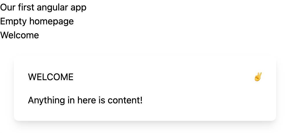
So, here we add a new app-card with a static title and icon for this example.
> Note: You could make this dynamic by using [title]="dynamicProp"
And inside the app-card, we specify what is rendered inside the `ng-content`. In our case, a simple header for now.
The result so far:
## Rendering a component inside another Angular component
This use-case was fun, but we want to render some other component in it most of the time.
Let's generate a podcast component.
```bash
ng generate component Podcast
```
For now, let's add some static `HTML` for this demo purpose.
```html
Episode 142: Ionic vs Flutter
In todays episode we are talking to Michael about how Flutter compares to Ionic.
```
Just a simple setup. For now, the image is loaded from the Typescript:
```js
img: string =
'https://images.unsplash.com/photo-1606592641978-bbfa15596820?ixlib=rb-1.2.1&ixid=MXwxMjA3fDB8MHxwaG90by1wYWdlfHx8fGVufDB8fHw%3D&auto=format&fit=crop&w=1950&q=80';
```
Now let's add this component to our card:
```html
```
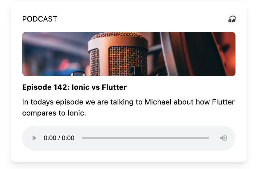
This will now render as:
## Naming the transclusion section
One cool thing we can do is name the transclusion slot.
Open your `card-component.html` file and change the `ng-content` to include this:
```html
```
Now we can change our welcome.component.html to look as such:
```html
```
## Angular multiple-slot transclusion
The power of naming these slots comes in the ability to add more than one to a component.
Let's say we want a body and a footer part that could be dynamic.
We already have this body part now, but let's make it possible to add a footer.
Change the `card.component.html`:
```html
{{ title }}{{ icon }}
```
As you can see, we added a second `ng-content` section called `footer`.
Now let's also modify our `welcome.component.html` to add some data to it.
```html
Thank you for listening
```
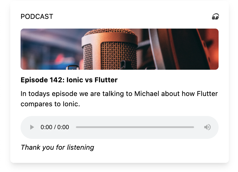
So this example is a bit weird, but you can see we have two transclusion slots.
This will result in the following result:
## Rendering different components
As mentioned, the real power is to render multiple component types into one card component.
Let's define another component for a podcast.
```bash
ng generate component Video
```
Let's make some changes to the `video.component.html` file.
```html
6 everyday JavaScript tips you must know
In this video i'll guide you to create a super cool Todo list
```
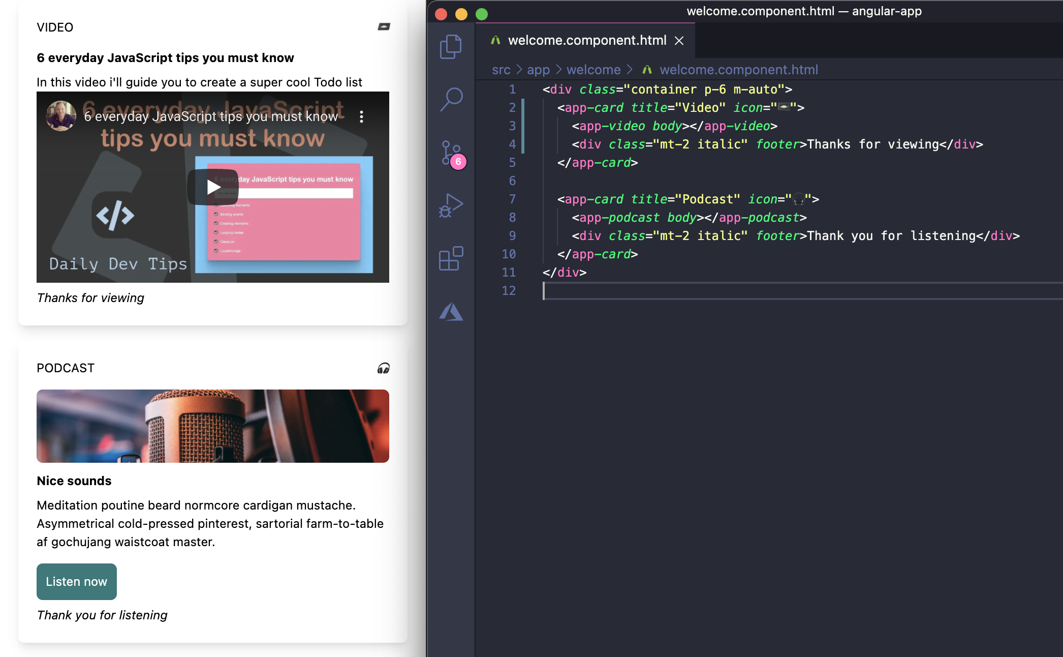
Now we can add this block to our `welcome.component.html`.
```html
Thanks for viewing
```
The result
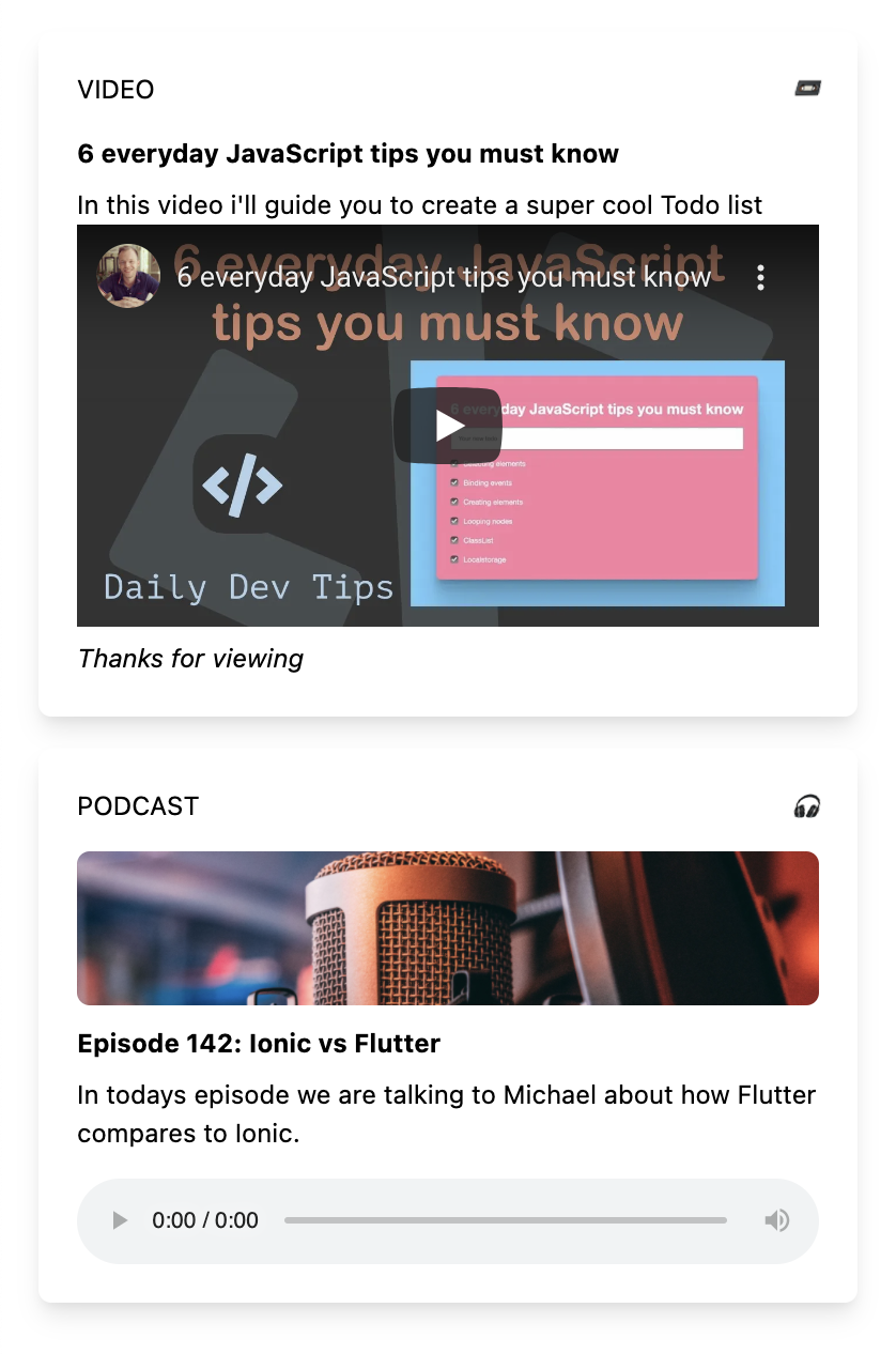
In the image above, you can see that the card styling is the same. We have the title, icon, and a new podcast component in the middle.
I hope you've seen the massive good use-cases of using transclusion to make our lives easier.
You can find the finished result on the following [GitHub repo](https://github.com/rebelchris/angular-starter-demo/tree/feature/transclusion).
### Thank you for reading, and let's connect!
Thank you for reading my blog. Feel free to subscribe to my email newsletter and connect on [Facebook](https://www.facebook.com/DailyDevTipsBlog) or [Twitter](https://twitter.com/DailyDevTips1)