Using min-width Media query for Mobile first design

I'm a full-stack developer from South Africa 🇿🇦. I love writing about JavaScript, HTML and CSS.
This is a guest post written by Simon Ramsay. Simon is an amazing frontend developer, be sure to check him out on Twitter as well!
In this article, we will look at media queries for screen and the width feature, in particular min-width, to turn a one-column layout into a two-column layout. We will make this happen at 768px wide, a common width of a tablet device, but you can use any width you like. This point where our layout goes from one column to two columns is called a breakpoint.
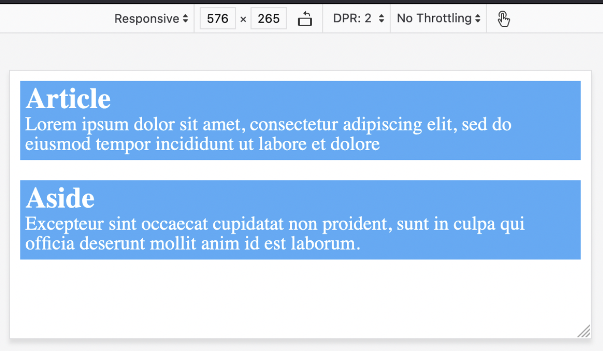
Our setup is two HTML elements, an article and an aside inside the main element. We are using flexbox to make our elements stack as a column. We can use flex-direction: column; to achieve this. We will also add some margin to our items and background color.
Here is our code:
main {
  display: flex;
  flex-direction: column;
}
main > * {
  padding: 5px;
  background-color: #0fadff;
  margin: 10px;
}
<main>
  <article>
    <h1>Article</h1>
    <p>
      Lorem ipsum dolor sit amet, consectetur adipiscing elit, sed do eiusmod tempor
      incididunt ut labore et dolore
    </p>
  </article>
  <aside>
    <h1>Aside</h1>
    <p>
      Excepteur sint occaecat cupidatat non proident, sunt in culpa qui officia deserunt
      mollit anim id est laborum.
    </p>
  </aside>
</main>
Moreover, this is what it looks like.
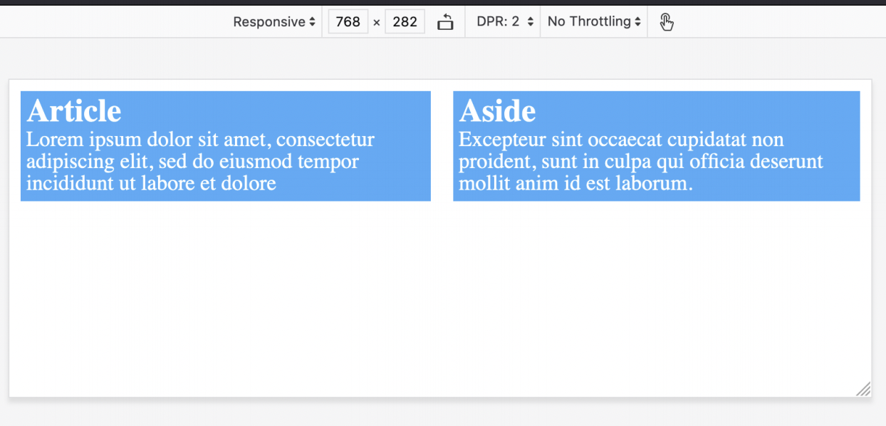
For wider screens, we want to have 2 columns. To do this we can add the @media screen media query with a min-width feature with a value of 768px. This means that the minimum width of this rule effect will be 768px wide, which is any width 768px and over. We will place a new flex-direction rule inside the media query. The media query with the overridden main element looks like this:
media screen and (min-width: 768px) {
  main {
    flex-direction: row;
  }
}
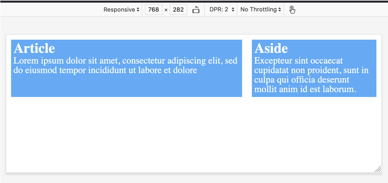
To tidy things up a bit we can then add some widths using flex-basis for article and aside of 65% and 35% respectively and we have built our first mobile-first responsive layout.
@media screen and (min-width: 768px) {
  main {
    flex-direction: row;
  }
  main > article {
    flex-basis: 65%;
  }
  main > aside {
    flex-basis: 35%;
  }
}
This is what it will look like.
So that how you can control the layout of a simple website. Thanks for reading.
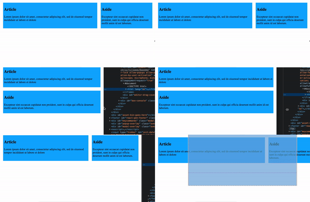
You can also play around with this demo yourself on this Codepen.
Thank you for reading, and let's connect!
Thank you for reading my blog. Feel free to subscribe to my email newsletter and connect on Facebook or Twitter