
Tailwind grid responsive 4 column blocks

When it comes to tailwind layouts we have basically two main options.
- Flexbox
- Grid
If you know me, I use Flex for a lot of things. It's one of these things you start with and end up using for a lot of elements.
Today however I want to explore some grid action in Tailwind and see just how easy it can be.
We'll be creating a 4 column block layout for large devices, on tablet size they should stack 2-2 and on mobile, it should be 1 column.
The end result is as the following:
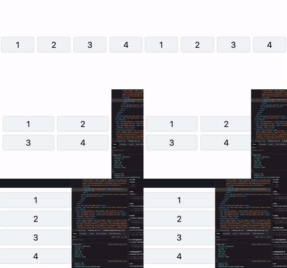
4 Column grid blocks in Tailwind
Let's start with our basic structure and style from there.
<div>
  <div>
    <div>1</div>
    <div>2</div>
    <div>3</div>
    <div>4</div>
  </div>
</div>
As you can see, I choose a double wrapper, the top div will be our container and the inner one will be the actual grid.
Let's add some basic styles for the containers first.
<div class="container mx-auto">
  <div class="grid grid-cols-4 gap-6">
    <div>1</div>
    <div>2</div>
    <div>3</div>
    <div>4</div>
  </div>
</div>
This will already give us quite a good column space.
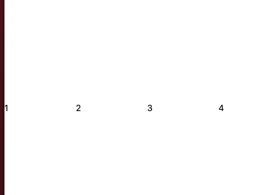
Let's quickly add some styling for our blocks.
<div class="container mx-auto">
  <div class="grid grid-cols-4 gap-6">
    <div
      class="flex justify-center text-6xl border-2 border-gray-300 rounded-xl p-6 bg-gray-100"
    >
      1
    </div>
    <div
      class="flex justify-center text-6xl border-2 border-gray-300 rounded-xl p-6 bg-gray-100"
    >
      2
    </div>
    <div
      class="flex justify-center text-6xl border-2 border-gray-300 rounded-xl p-6 bg-gray-100"
    >
      3
    </div>
    <div
      class="flex justify-center text-6xl border-2 border-gray-300 rounded-xl p-6 bg-gray-100"
    >
      4
    </div>
  </div>
</div>
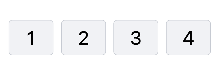
Pretty solid right?
However, this is not yet responsive, luckily for us, the Tailwind grid is super easy to make responsive.
All we have to do is add the breakpoints on our grid element.
Remember: Tailwind is mobile-first so that will be the mobile view.
<div class="grid grid-cols-1 md:grid-cols-2 lg:grid-cols-4 gap-6"></div>
You can find the full demo on this Codepen.
Thank you for reading, and let's connect!
Thank you for reading my blog. Feel free to subscribe to my email newsletter and connect on Facebook or Twitter
About the author
I'm a full-stack developer from South Africa 🇿🇦. I love writing about JavaScript, HTML and CSS.
Comments
Join the discussionNo comments yet. Be the first to comment.



