
Tailwind CSS equal height columns

I'm a full-stack developer from South Africa 🇿🇦. I love writing about JavaScript, HTML and CSS.
A while ago, I showed you how to create CSS equal height columns, and today it's time to revisit this in Tailwind CSS.
I love to explore Tailwind, and see how easy things have gotten.
The main idea for today is that we'll have three columns that have different height texts. These columns, however should be spanned to be the same size (as the biggest column)
The end goal should look like this:
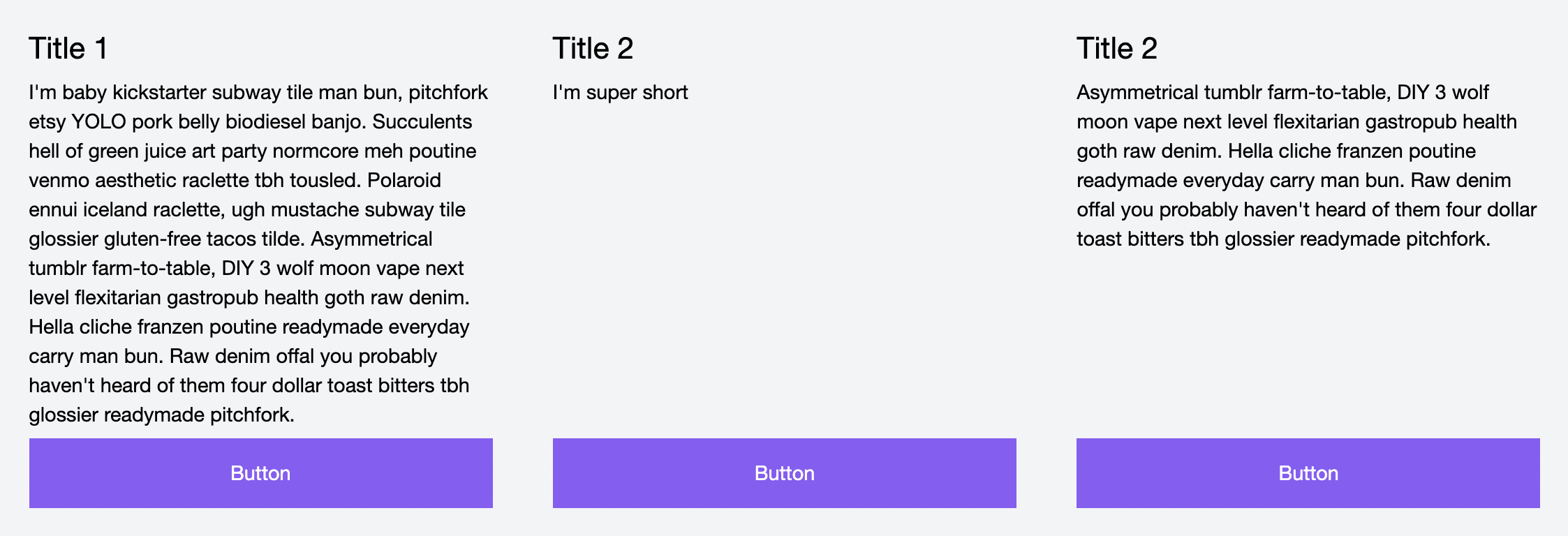
Tailwind CSS equal height columns
To achieve these columns, we should start with a wrapper for our three columns. This wrapper can be a single div having a flex class.
<div class="flex">
  <!-- Our three columns -->
</div>
Then let's have a look at how our column should look.
<div class="w-1/3 p-6 bg-gray-100 flex flex-col">
  <h3 class="text-2xl mb-2">Title 1</h3>
  <p class="flex-1">Content</p>
  <a href="#" class="bg-purple-500 mt-2 text-center p-4 text-white">Button</a>
</div>
Let me explain what's going on here.
The wrapping div is one of our columns and holds the following classes.
w-1/3: Which makes it one-third of our wrapping divp-6: Adds some padding for this divbg-gray-100: Adds a light gray backgroundsflex: This makes this item a flex item as well. This is a big part since we will make magic using thepelementflex-col: Make sure the flex flows vertically
Then we add some basic styling for the title and button, but the real magic comes from the p class.
The flex-1 makes sure this element spans across the remaining space for that column, so if it has less text than the other ones, it will force it to be a bigger one.
Which results in the following Codepen.
Thank you for reading, and let's connect!
Thank you for reading my blog. Feel free to subscribe to my email newsletter and connect on Facebook or Twitter



