
SVG animateTransform

This week we have been playing around with SVG a lot. We learned how to use SVG Sprites, colour a path, and today we'll look into animateTransform!
I've used this method in my Loading button article and thought it would be good to check this function on its own.
The animateTransform is an element we can use inside an SVG, and it can animate our SVG for us!
HTML Structure
We start by defining our symbol sprite set:
<svg
  aria-hidden="true"
  style="position: absolute; width: 0; height: 0; overflow: hidden;"
  version="1.1"
  xmlns="http://www.w3.org/2000/svg"
  xmlns:xlink="http://www.w3.org/1999/xlink"
>
  <defs>
    <symbol id="icon-spinner" viewBox="0 0 32 32">
      <path
        d="M12 4c0-2.209 1.791-4 4-4s4 1.791 4 4c0 2.209-1.791 4-4 4s-4-1.791-4-4zM20.485 7.515c0-2.209 1.791-4 4-4s4 1.791 4 4c0 2.209-1.791 4-4 4s-4-1.791-4-4zM26 16c0-1.105 0.895-2 2-2s2 0.895 2 2c0 1.105-0.895 2-2 2s-2-0.895-2-2zM22.485 24.485c0-1.105 0.895-2 2-2s2 0.895 2 2c0 1.105-0.895 2-2 2s-2-0.895-2-2zM14 28c0 0 0 0 0 0 0-1.105 0.895-2 2-2s2 0.895 2 2c0 0 0 0 0 0 0 1.105-0.895 2-2 2s-2-0.895-2-2zM5.515 24.485c0 0 0 0 0 0 0-1.105 0.895-2 2-2s2 0.895 2 2c0 0 0 0 0 0 0 1.105-0.895 2-2 2s-2-0.895-2-2zM4.515 7.515c0 0 0 0 0 0 0-1.657 1.343-3 3-3s3 1.343 3 3c0 0 0 0 0 0 0 1.657-1.343 3-3 3s-3-1.343-3-3zM1.75 16c0-1.243 1.007-2.25 2.25-2.25s2.25 1.007 2.25 2.25c0 1.243-1.007 2.25-2.25 2.25s-2.25-1.007-2.25-2.25z"
      ></path>
    </symbol>
  </defs>
</svg>
And then we use our SVG sprite:
<svg aria-hidden="true" focusable="false" class="icon icon-spinner">
  <use xlink:href="#icon-spinner" />
</svg>
This will now render out icon (Loading icon), but let's add the animateTransform element.
<svg aria-hidden="true" focusable="false" class="icon icon-spinner">
  <use xlink:href="#icon-spinner" />
  <animateTransform
    attributeName="transform"
    attributeType="XML"
    type="rotate"
    from="0 0 0"
    to="360 0 0"
    dur="3s"
    repeatCount="indefinite"
    begin="0s"
  />
</svg>
SVG animteTransform Options
As you can see we have several options:
- type:
translate,scale,rotate,skewX,skewY - from: The initial from state
- to: To where it transforms
- begin: When the animation must begin in seconds
- dur: How long the animation takes to complete
- repeatCount: How often it must repeat.
Other examples
So let's say we want to animate the scale:
<svg aria-hidden="true" focusable="false" class="icon icon-spinner">
  <use xlink:href="#icon-spinner" />
  <animateTransform
    attributeName="transform"
    type="scale"
    from="1 1"
    to="2 2"
    begin="0s"
    dur="2s"
    repeatCount="indefinite"
  />
</svg>
Or the position:
<svg aria-hidden="true" focusable="false" class="icon icon-spinner">
  <use xlink:href="#icon-spinner" />
  <animateTransform
    attributeName="transform"
    type="translate"
    from="0 0"
    to="150 20"
    begin="0s"
    dur="2s"
    repeatCount="indefinite"
  />
</svg>
Combining Transforms
So what if we want to use a combination of transforms?
<svg
  version="1.1"
  width="100%"
  height="100%"
  xmlns="http://www.w3.org/2000/svg"
  xmlns:xlink="http://www.w3.org/1999/xlink"
  xmlns:sketch="http://www.bohemiancoding.com/sketch/ns"
>
  <g>
    <rect
      id="Rectangle-1"
      fill="#3C81C1"
      sketch:type="MSShapeGroup"
      x="0"
      y="0"
      width="100"
      height="125"
    >
      <animateTransform
        attributeName="transform"
        type="scale"
        from="1 1"
        to="3 1.25"
        begin="0s"
        dur="2s"
        repeatCount="indefinite"
      />
    </rect>
    <animateTransform
      attributeName="transform"
      type="translate"
      from="0 0"
      to="150 20"
      begin="0s"
      dur="2s"
      repeatCount="indefinite"
    />
  </g>
</svg>
As you can see we can't just place animateTransform twice under the same element, so we can use a <g> tag to wrap our element in and because of this use two animations!.
You can view all these animations on the following Codepen.
Browser Support
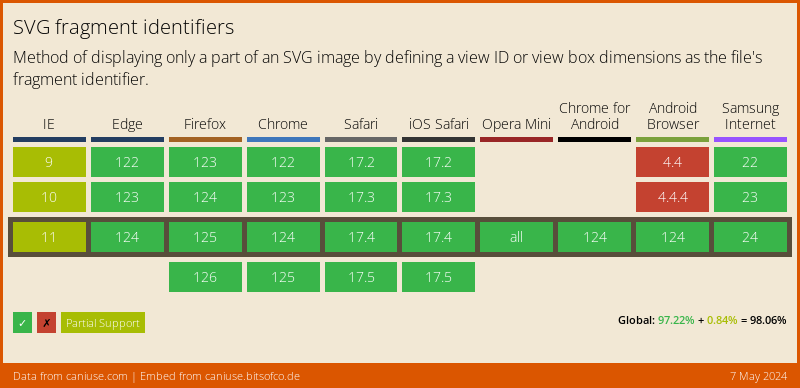
The support is pretty strong!
Thank you for reading, and let's connect!
Thank you for reading my blog. Feel free to subscribe to my email newsletter and connect on Facebook or Twitter
About the author
I'm a full-stack developer from South Africa 🇿🇦. I love writing about JavaScript, HTML and CSS.
Comments
Join the discussionNo comments yet. Be the first to comment.



