
Storybook - Using decorators

In the previous article, we looked at args and parameters. In this one, we'll take a closer look at decorators.
Decorators are a way to wrap your story in an extra rendering definition.
One example of using a decorator could be to wrap your components so they have a margin around them inside Storybook.
Another could be to wrap it so we can mock specific contexts, for instance, a theme provider.
Using story decorators
Let's start by looking at story-wide decorators. These can be used to wrap a singular component with a parent component.
Let's take our button component primary story and wrap it with some margin.
export const Primary = Template.bind({});
Primary.decorators = [
  (Story) => (
    <div style={{ margin: '3em' }}>
      <Story />
    </div>
  ),
];
And now, if we visit our Storybook, we'll see the component wrapped with more space.
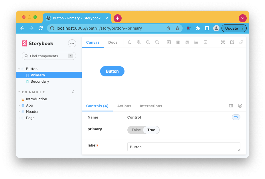
Using component decorators
However, in some cases, you'll probably want to decorate every story in the button component rather than just one.
We can use the decorators on the component level like this to achieve that.
export default {
  title: 'Button',
  component: Button,
  decorators: [
    (Story) => (
      <div style={{ margin: '3em' }}>
        <Story />
      </div>
    ),
  ],
};
Now every story for this component will have the margin applied to it.
Using global decorators
As a third option, we can use global decorators. These will apply to all of our stories. This could be helpful when using the context, but you can technically use it for anything.
You'll have to modify the .storybook/preview.js file and add the following line.
export const decorators = [
  (Story) => (
    <div style={{ margin: '3em' }}>
      <Story />
    </div>
  ),
];
Using context decorators
So far, we've seen the global decorator wrapping a simple div, but as mentioned, we can also wrap context providers. A good example could be a theme provider.
import { ThemeProvider } from 'styled-components';

export const decorators = [
  (Story) => (
    <ThemeProvider theme='default'>
      <Story />
    </ThemeProvider>
  ),
];
This is still a static setup. The following article will look at how to make it dynamic.
Thank you for reading, and let's connect!
Thank you for reading my blog. Feel free to subscribe to my email newsletter and connect on Facebook or Twitter
About the author
I'm a full-stack developer from South Africa 🇿🇦. I love writing about JavaScript, HTML and CSS.
Comments
Join the discussionNo comments yet. Be the first to comment.



