
Multi-colored text in CSS

I'm a full-stack developer from South Africa 🇿🇦. I love writing about JavaScript, HTML and CSS.
In this article, we will be creating a super cool effect where we can have multi-colored text in CSS.
I saw this effect a while ago on Twitter done by Adam Argyle and was blown away by how easy this can be achieved in CSS.
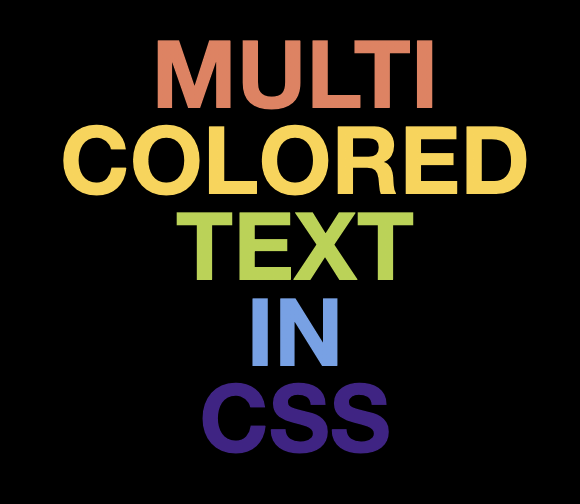
Below is a demo of what we'll be creating today!
CSS Multi-colored gradient text
To create this effect, let's first start with our HTML structure. This is super easy as we only need one element!
<h1>multi colored text in css</h1>
Then it's off to our CSS file to magic some magic 🪄.
Let's start by defining our five colors and our starting angle.
:root {
  --color-1: #442288;
  --color-2: #6ca2ea;
  --color-3: #b5d33d;
  --color-4: #fed23f;
  --color-5: #eb7d5b;
  --angle: 0deg;
}
We are using the root to define variables as this is valid syntax in basic CSS. No need for SCSS here.
Then let's add some styling to our body. This is used to center our text and make our background black. The effect works better on black but will also work on different colors.
body {
  display: flex;
  justify-content: center;
  align-items: center;
  background: #000;
}
Then let's start on styling our h1 element.
I'm breaking these up into a couple of steps to give more of an idea of what's happening.
1. Basic heading styling
For our basic styling, we want a relatively big heading.
h1 {
  color: #fff;
  text-align: center;
  font-family: Roboto, 'Helvetica Neue', Arial, sans-serif;
  font-size: 6.5vw;
  font-weight: 900;
  line-height: 6vw;
  text-transform: uppercase;
}
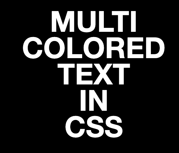
This will give us the following output.
2. Each word on its own line
As you can see above, it's just one big line. To get each word on its own line, we can use the following CSS hack.
word-spacing: 100vw;
Making each word space on a single line
3. CSS Text Gradient background
Now we can move to add the gradient effect. We'll start by splitting the gradient into 5 steps, resulting in each word being one color.
background: linear-gradient(
  var(--angle),
  var(--color-1) 19%,
  transparent 19%,
  transparent 20%,
  var(--color-2) 20%,
  var(--color-2) 39%,
  transparent 39%,
  transparent 40%,
  var(--color-3) 40%,
  var(--color-3) 59%,
  transparent 59%,
  transparent 60%,
  var(--color-4) 60%,
  var(--color-4) 79%,
  transparent 79%,
  transparent 80%,
  var(--color-5) 80%
);
background-clip: text;
-webkit-background-clip: text;
color: transparent;
Here you can see we define the colors we have in our :root element definition. As well as the basic angle of 0.
We add a transparent border between each color for our animation later on.
As well as set the clipping mode to text.
Animating a linear background gradient in CSS
To animate the gradient is quite tricky.
The main hack we are applying is by defining the --angle variable.
Then we can go ahead and add an animation to our h1 element.
animation: 10s rotate linear infinite;
This animation looks as follows:
@keyframes rotate {
  to {
    --angle: 360deg;
  }
}
However, this doesn't do much yet, because the browser doesn't know 360deg is a value.
We can fix this by defining a @property for the --angle variable.
@property --angle {
  syntax: '<angle>';
  initial-value: 0deg;
  inherits: false;
}
Note: This idea was taken from this cool CSS-Tricks article
And there we go! A super cool CSS text animation effect. I hope you enjoyed this article.
Thank you for reading, and let's connect!
Thank you for reading my blog. Feel free to subscribe to my email newsletter and connect on Facebook or Twitter


