
Making scrollable sections snap

A while ago, I created this cool section scroll in Tailwind. However, as a user, I would almost expect the sections to snap while I'm close to them.
So today, I'll show you how to make the sections snap!
You can try it out on the following Codepen.
Making the sections snap with CSS
Let's use the code as we had previously. There are, however, a couple of things we will need to change.
First of all, our current wrapping container for the sections has an infinite height, meaning it will become as big as the children are.
For the scroll-snap to work, it must be as big as the screen.
Change the following:
<div class="w-full md:w-5/12 ml-auto">
Into:
<div class="w-full h-screen md:w-5/12 ml-auto overflow-y-auto">
You can see we add the h-screen class, which will make this section exactly our viewport height. We also add overflow on the y-axis to auto.
That's already half the work. Now let's add the scroll-snap magic.
Unfortunately, Tailwind does not come with these classes. For the ease of this tutorial, I'll add two custom classes.
First, on the element we modified above, let's add a scroll-snap class.
<div class="w-full h-screen md:w-5/12 ml-auto overflow-y-auto scroll-snap">
This scroll-snap class will have the type of snap.
.scroll-snap {
  scroll-snap-type: y proximity;
}
I'm using proximity, but you can use mandatory if you want it to perfectly snap.
You can see I'm using the y-axis since we scroll vertically.
Then we need to add a snap class to each section in there.
<div class="bg-red-200 h-screen flex justify-center items-center flex-col p-10 snap">
  <h2 class="text-4xl mb-5">Meet Benny</h2>
  <p class="mb-5">I was born 20 May 2020</p>
</div>
Add this snap class to each element in there.
This class will have the following CSS.
.snap {
  scroll-snap-align: start;
}
This tells the scroll-snap where to snap to. In most cases, you'd like the start. It will snap the element to the top of the scroll-snap container.
And that's as simple as it gets.
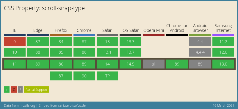
Browser support
Surprisingly enough, scroll snap has really good support and can be safely used!
Thank you for reading, and let's connect!
Thank you for reading my blog. Feel free to subscribe to my email newsletter and connect on Facebook or Twitter
About the author
I'm a full-stack developer from South Africa 🇿🇦. I love writing about JavaScript, HTML and CSS.
Comments
Join the discussionNo comments yet. Be the first to comment.



