
Making CSS perspective text

Today I wanted to create a fun CSS effect and try and figure out how it's done.
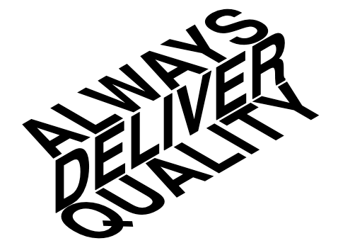
Today we are making CSS perspective text to make text look like stairs. In essence, we will use some skew transforms and position offsets to create this effect.
The end result for today:
HTML Structure
As for the HTML goes, we don't need that much fancy stuff.
<h1>
  <span>Always</span>
  <span>deliver</span>
  <span>quality</span>
</h1>
In my case, I want to have three words to use as our effect. You could alter the codebase to work with paragraphs as well.
CSS Perspective text
Now on to the magic element, CSS.
We'll start by styling the main h1 element. The goal is to make it look sans-serif and quite big.
This works best for this effect.
h1 {
  font-family: Helvetica, Arial, sans-serif;
  font-size: 70px;
  font-weight: 900;
  text-transform: uppercase;
  position: relative;
  margin-left: -350px;
  margin-top: -150px;
}
As you can see, I use quite a big font and transform everything too uppercase. Then I offset the whole element. Since we will be using absolute positions, it's hard to position the whole element at once. You might have to change these positions based on the words you want to use.
Then each span element inside our h1 should be absolute.
h1 {
  span {
      position: absolute;
  }
}
The next rule will be to make the step skew in opposite directions. I'm using an odd/even child pseudo-selector.
h1 {
  span {
    &:nth-child(odd) {
      transform: skew(60deg, -30deg) scaleY(0.66667);
    }
    &:nth-child(even) {
      transform: skew(0deg, -30deg) scaleY(1.33333);
    }
  }
}
That brings us very close, but all the elements are on top of each other now. We need to modify the offset position for every second and above element.
With my words, that comes down to the following:
h1 {
  span {
    &:nth-child(2) {
      left: 27px;
      top: 52px;
    }
    &:nth-child(3) {
      left: 54px;
      top: 105px;
    }
    }
}
And that is it. You now have this super cool stair-looking perspective text.
Thank you for reading, and let's connect!
Thank you for reading my blog. Feel free to subscribe to my email newsletter and connect on Facebook or Twitter
About the author
I'm a full-stack developer from South Africa 🇿🇦. I love writing about JavaScript, HTML and CSS.
Comments
Join the discussionNo comments yet. Be the first to comment.



