
Making a post slider in Eleventy with Tailwind

I'm a full-stack developer from South Africa 🇿🇦. I love writing about JavaScript, HTML and CSS.
Yesterday we finished the blog newsletter layout using Tailwind grid. Today we will be focussing on making the slider part.
This will essentially be a list with blog articles in it. You can then horizontally scroll through this list.
We won't be adding the next/previous button at this stage. Perhaps we will do that in the finishing touch session.
The end result will look similar to the design:
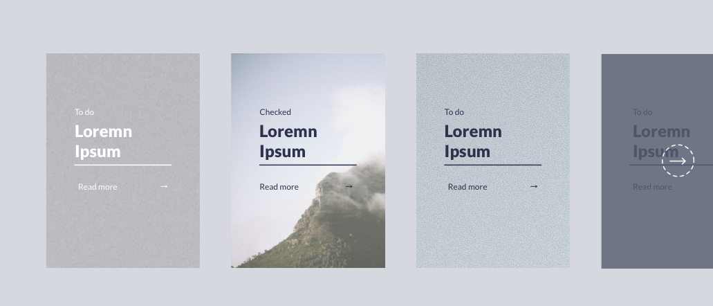
Note: We won't be doing the visible section at the end since we are working with offset grids.
Defining the structure
As mentioned, it should function as a list since that will be the correct markup to use in this case.
Let's change our blog template to use a new post-slider instead of the post-list.
Create the post-slider.njk file inside the src/_includes/partials/components folder.
Then link this file in the blog.njk file:
<div class="container m-auto">
  {% include "partials/components/post-slider.njk" %}
</div>
Then we can modify this post-slider.njk and define our necessary checks if the data exists.
{% if postListItems.length %}
<ul>
  {% for item in postListItems %}
  <li>
    <!-- ITEM HERE -->
  </li>
  {% endfor %}
</ul>
{% endif %}
This is still much like the post-list we had before, so let's make some changes to render the articles correctly.
We will first focus on styling the list items.
<li class="mr-6 w-72 h-96">
  <a
    href="{{ item.url }}"
    title="{{ item.data.title }}"
    class="relative flex justify-center w-full h-full align-center"
  >
    <img src="https://via.placeholder.com/800x600" class="object-cover w-full h-full" />
  </a>
</li>
This will create the rectangle list item where the whole element is clickable. Inside of that, we have the image.
This looks like this:
That looks like the right size. Let's add the inner content, which consists of:
- The category
- The title with an underline
- A button with an arrow on the right
<li class="mr-6 w-72 h-96">
<a
href="{{ item.url }}"
title="{{ item.data.title }}"
class="relative flex justify-center w-full h-full align-center"
>
<img src="https://via.placeholder.com/800x600" class="object-cover w-full h-full" />
<div
class="absolute flex flex-col justify-center w-1/2 transform -translate-x-1/2 -translate-y-1/2 top-1/2 left-1/2 h-1/2"
>
<p class="mb-2 text-purple">To do</p>
<h3 class="w-full mb-4 text-3xl font-bold border-b-2 text-purple border-purple">
This is {{ item.data.title }}
</h3>
<button class="flex justify-between text-xs text-purple font-small">
Read more <i>→</i>
</button>
</div>
</a>
</li>
Since we want this box to be on top of the image, we make it absolute. Then we make sure it's 50% of the element's width and height and center it using the left/top and translate offset values.
For the button, we use flexbox to add space between the text and the arrow icon.
The result is now:
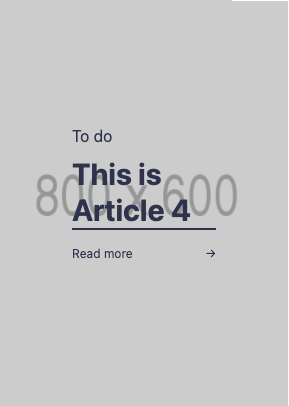
Pretty solid effort, only they are still showing under each other. How can we now make them flow horizontally?
<ul class="flex mt-24 mb-24 overflow-x-auto overflow-y-visible"></ul>
We add flex to the <ul> element and add overflow-x-auto and overflow-y-visible, so we can scroll through them.
However, when we now render, we get this result:
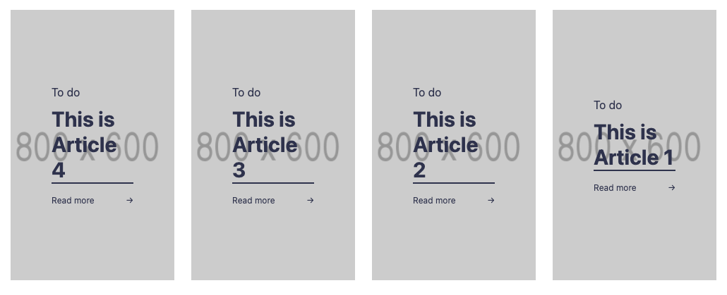
Almost there!
But somehow, our cards are being squished inside the ul, so if we add more, the cards get smaller like this:
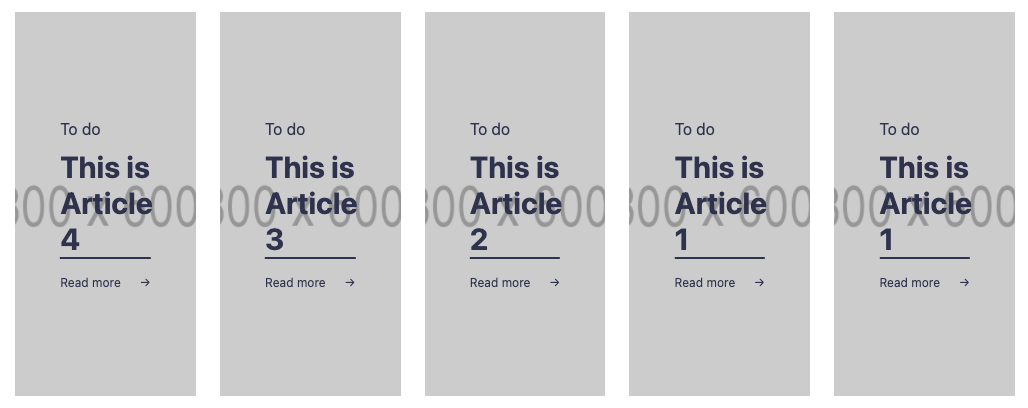
To fix this, let's add the following classes to our <li> element.
<li class="flex-grow-0 flex-shrink-0 ..."></li>
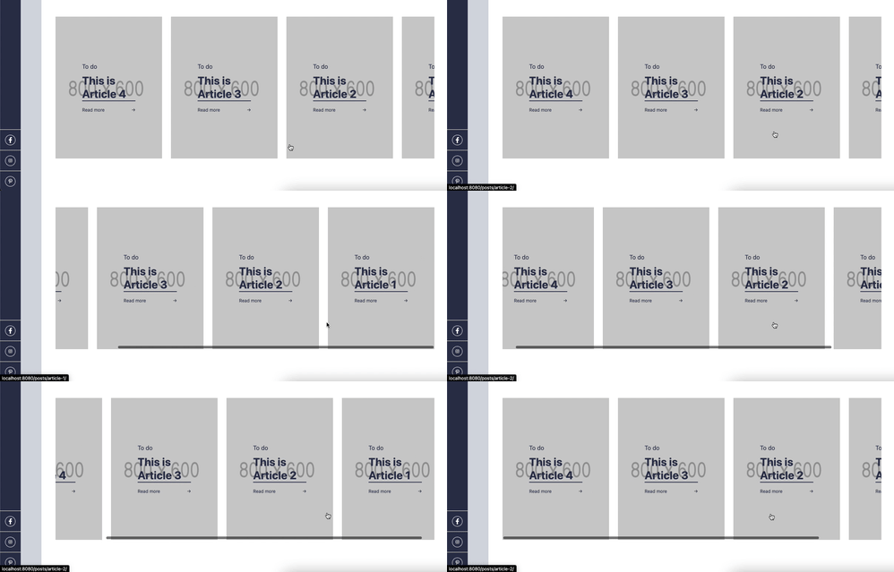
That looks cool!
You can find today's code on GitHub.
Thank you for reading, and let's connect!
Thank you for reading my blog. Feel free to subscribe to my email newsletter and connect on Facebook or Twitter



