
Making a footer stick to the bottom with CSS

I'm a full-stack developer from South Africa 🇿🇦. I love writing about JavaScript, HTML and CSS.
Ever wanted to have a footer that's stuck to the bottom, but will push down if the content is bigger?
To demonstrate I've created this image.
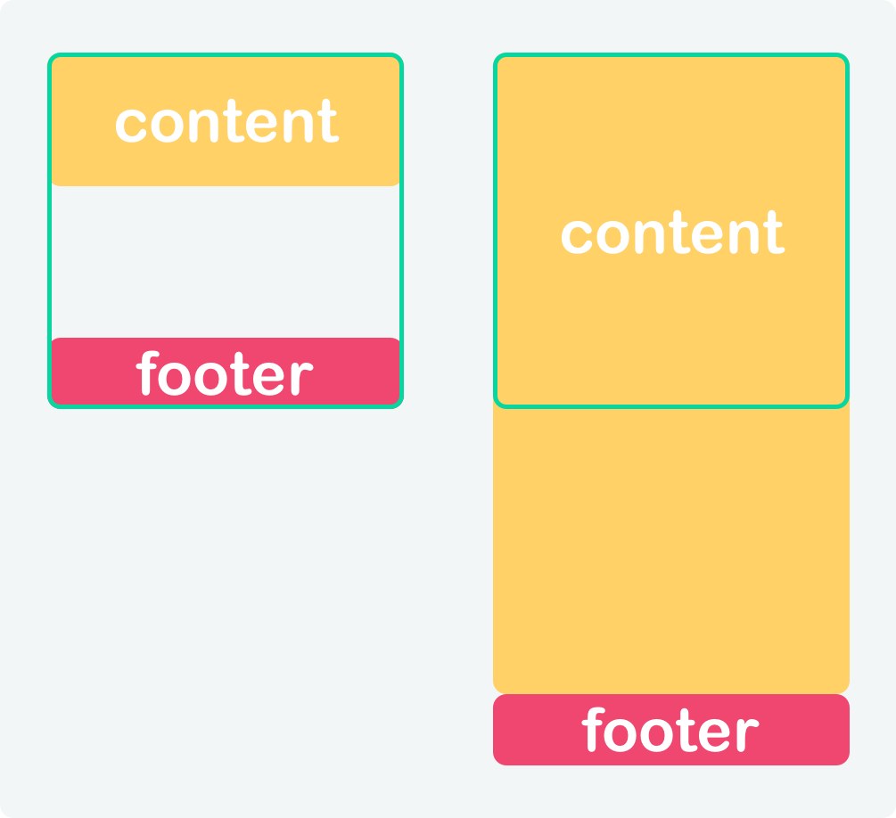
What this illustrates is the following:
- left: Green box is the viewport, yellow is the content which is very small, and the pink footer is stuck to the bottom
- right: Content is larger than the viewport so it pushed the footer down as well.
For this specific problem, there are quite a few solutions, which all have their pros and cons.
I'll just be demonstrating two of them since I think they are the most mainstream ones.
Those will be:
CSS flexbox sticky footer
With flex, we can easily achieve this sticky footer effect by expanding our content section.
What this means is that we set our body to be a flex element, and the content part will have the flex: 1 0 auto value.
This value forces the content to expand as the biggest element, so if we have a small content area it will auto expand to fill the space.
The HTML structure we will be using for this:
<div class="content">
  Content goes here
</div>
<footer>
  I'm a sticky footer
</footer>
Now let's first add a flex property to our body:
body {
  display: flex;
  flex-direction: column;
  min-height: 100vh;
}
This tells our body to become a flex element, which flexes elements vertically. Then we make the minimum height based on the viewport.
Then all we have to do is add the following property to our content div.
.content {
  flex: 1 0 auto;
}
That line will force the content block to space out between the content and the footer.
You can see this method in action on the following Codepen. You can use the button to toggle between no text and a lot of text.
CSS grid sticky footer
Now for the grid is a very similar setup, we can actually use the same HTML for this method.
<div class="content">
  Content goes here
</div>
<footer>
  I'm a sticky footer
</footer>
Now for our body we can use the following setup:
body {
  display: grid;
  grid-template-rows: 1fr auto;
  min-height: 100vh;
}
This will tell our body to behave like a grid and have 2-row setups where the first one will use 1fr which means 1 fraction unit.
It comes down to the content expanding whatever it needs or can fill, and the footer being auto, which means it will take how the size of the copy in the footer.
Then we don't even need any styling for our content div.
This result in the following:
Again you can click the button to toggle the copy.
Thank you for reading, and let's connect!
Thank you for reading my blog. Feel free to subscribe to my email newsletter and connect on Facebook or Twitter



