
Make the web fast again

I'm a full-stack developer from South Africa 🇿🇦. I love writing about JavaScript, HTML and CSS.
As some of you loyal readers might know, I'm a big fan of optimizing the web.
As mentioned in the article, it's a never-ending battle. And when I decided to switch my website from Eleventy to Astro, I knew this battle would start again.
While rebuilding my website, I took speed into account and optimized the HTML structure.
What's already done
With the redesign, I focussed on only using the bare minimum, meaning no useless divs, span, and classnames that wouldn't be used.
As well as using semantic HTML elements that help define the correct website structure.
Let's run a lighthouse test to see how it's performing as a baseline.
Note: It's essential to run the lighthouse test incognito as plugins and cache might affect it
First up is the mobile view.
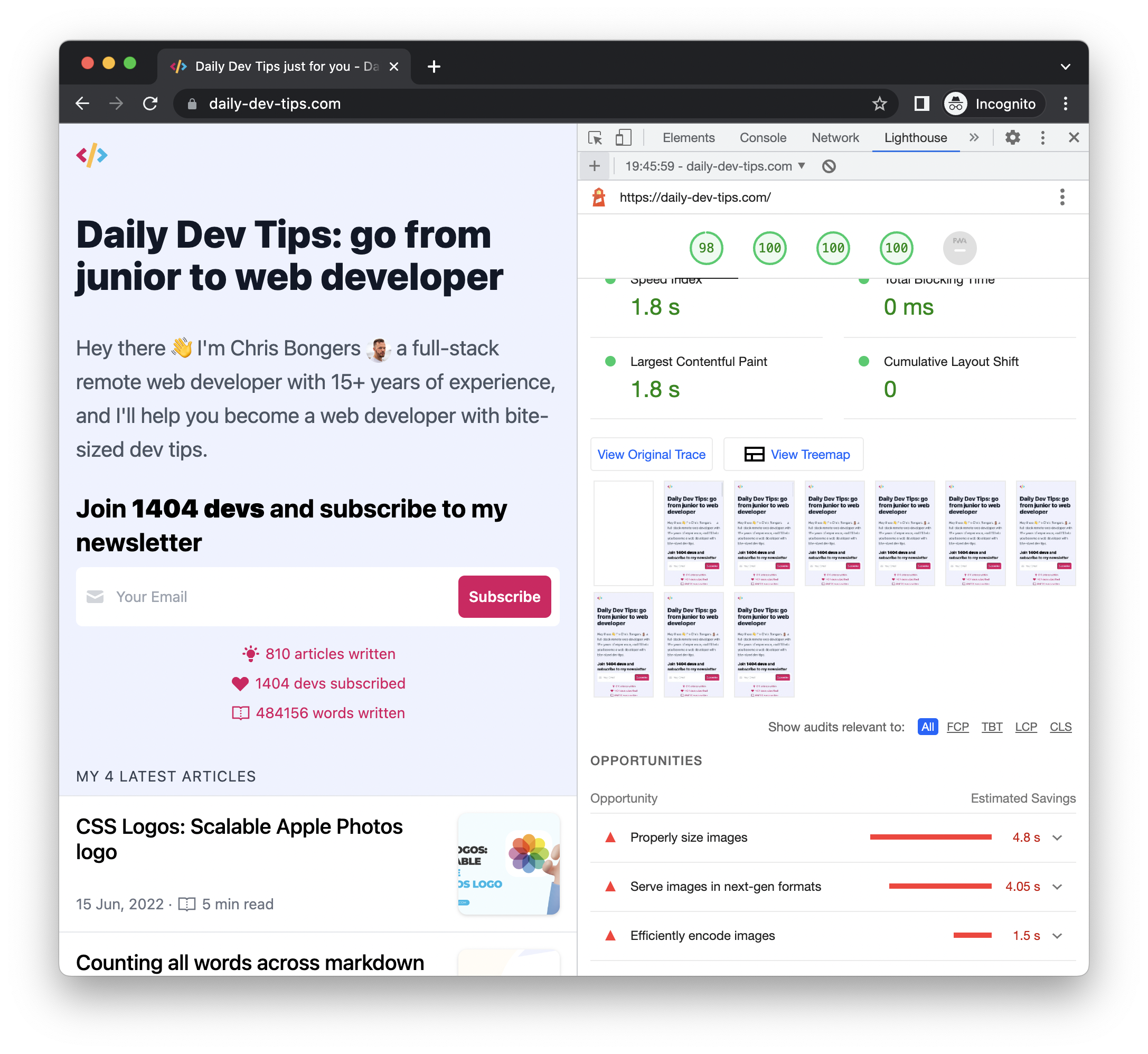
98 on performance and 100 on accessibility, best practices, and SEO.
You always have to take these scores with a grain of salt. 100 doesn't mean it's perfect. It's simply that your technical test succeeds. You should always opt to do more tests and evaluate other criteria manually.
However, not a bad start!
We can see that we have three points of improvement:
- Properly size images
- Serve images in next-gen formats
- Efficiently encode images
Before fixing these, let's run our test on the desktop variant.
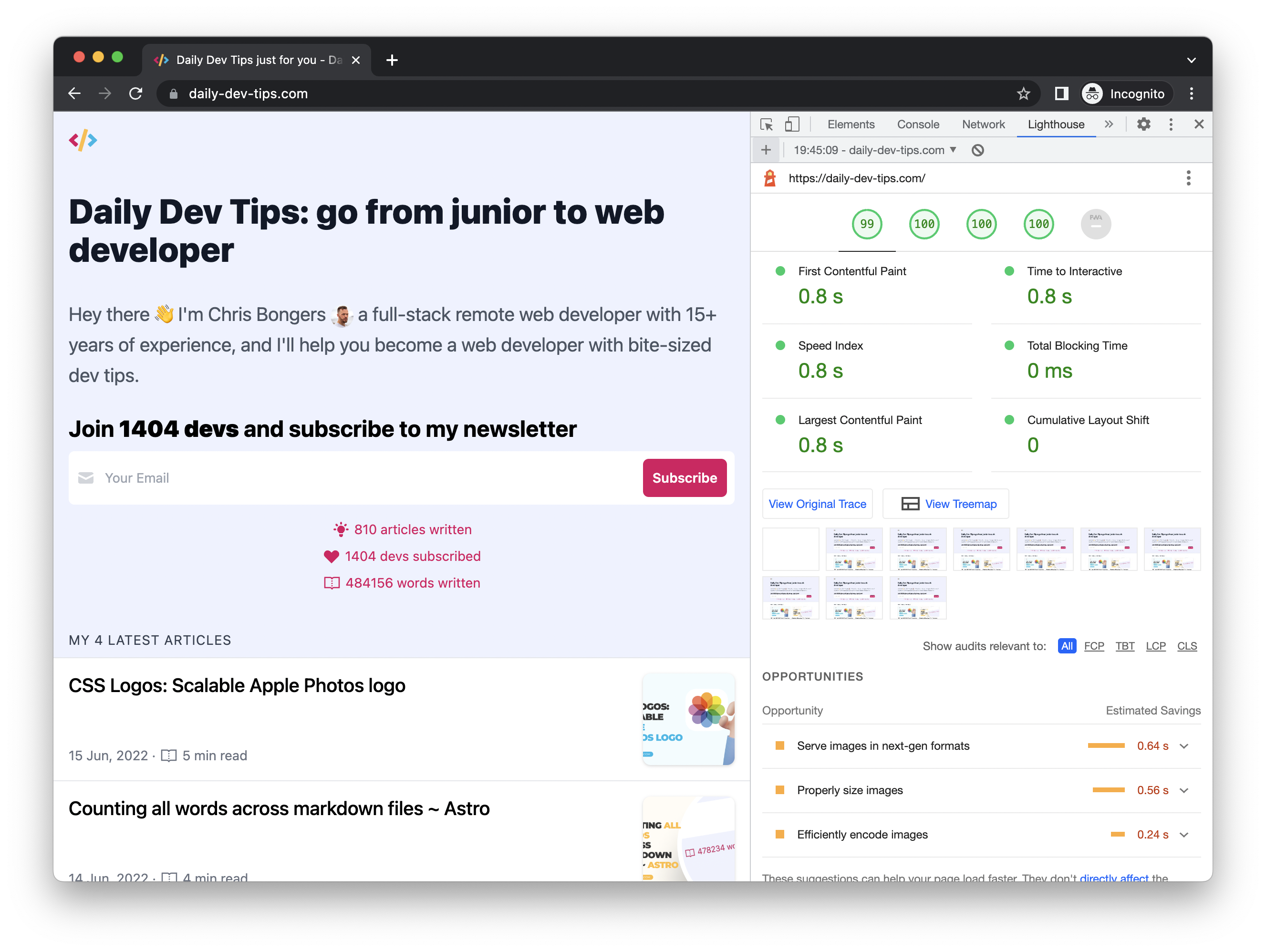
Here we even get 99 on performance and 100 on the other ones. That's an excellent start.
We can see the same three points of improvement.
Analyse the issue
Everything has to do with the images on the website. So what's wrong with them?
- They are served in
JPGformat - They are server 1200x630 and only show 368x193
- They still have some encoding on them
So what can we do to fix this?
We could change the format and serve a different format. However, we always need a fallback. I don't have the resources to host multiple variants of each image.
Then the sizing brings us back to the same issue. I can't host multiple sizes and render them back on demand.
I can, however, remove the encoding by using free software. Some examples are Imgoptim or an online tool like: exif remover.
The solution
All of this screams to use of an image delivery service. They can provide multiple formats on the fly and sizes and even remove the encoding.
There are numerous options, but I decided to go with Cloudflare images.
My main reason behind choosing Cloudflare is that I'm super happy with their page setup and wanted to see how easy the images tool is.
It's a super easy interface. You can drag and drop images, create multiple free transformations and choose what should be removed from the images.
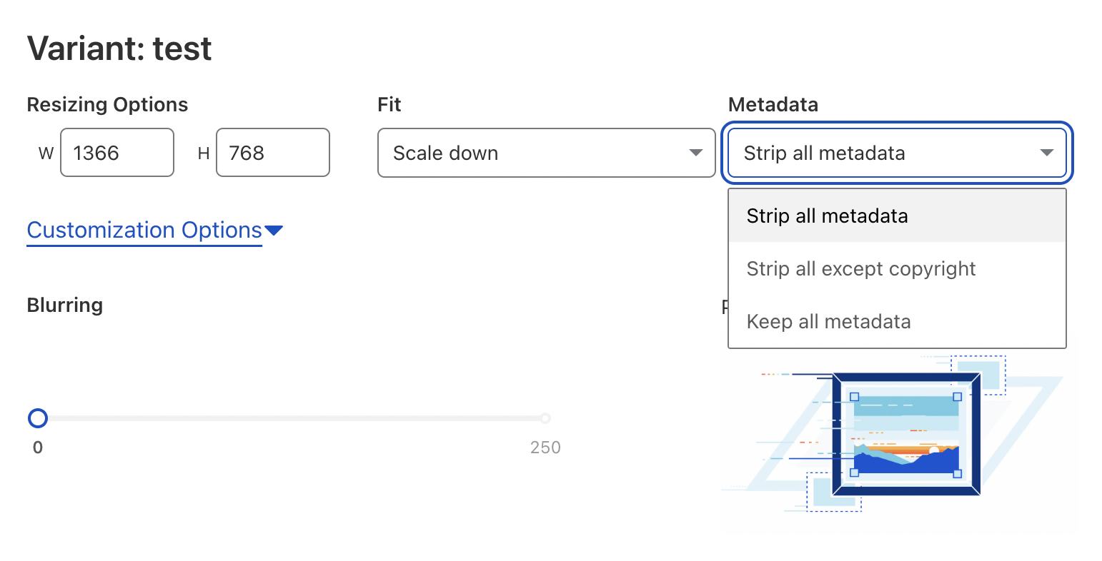
That's pretty cool! And to top it off, we don't need to specify the formats we want. Cloudflare can determine the best format for a user based on their request! 🤯
To start, I only focussed on the eight images on the homepage. I upload them to Cloudflare and make one variant to begin with.
This was the public size, and I set it to be two times the desktop size to support retina screens.
My images are shown in 368x193, so the size I convert to is 736x385.
The results
I then changed the image URLs to the Cloudflare ones and re-ran the tests.
The first test was on mobile again.
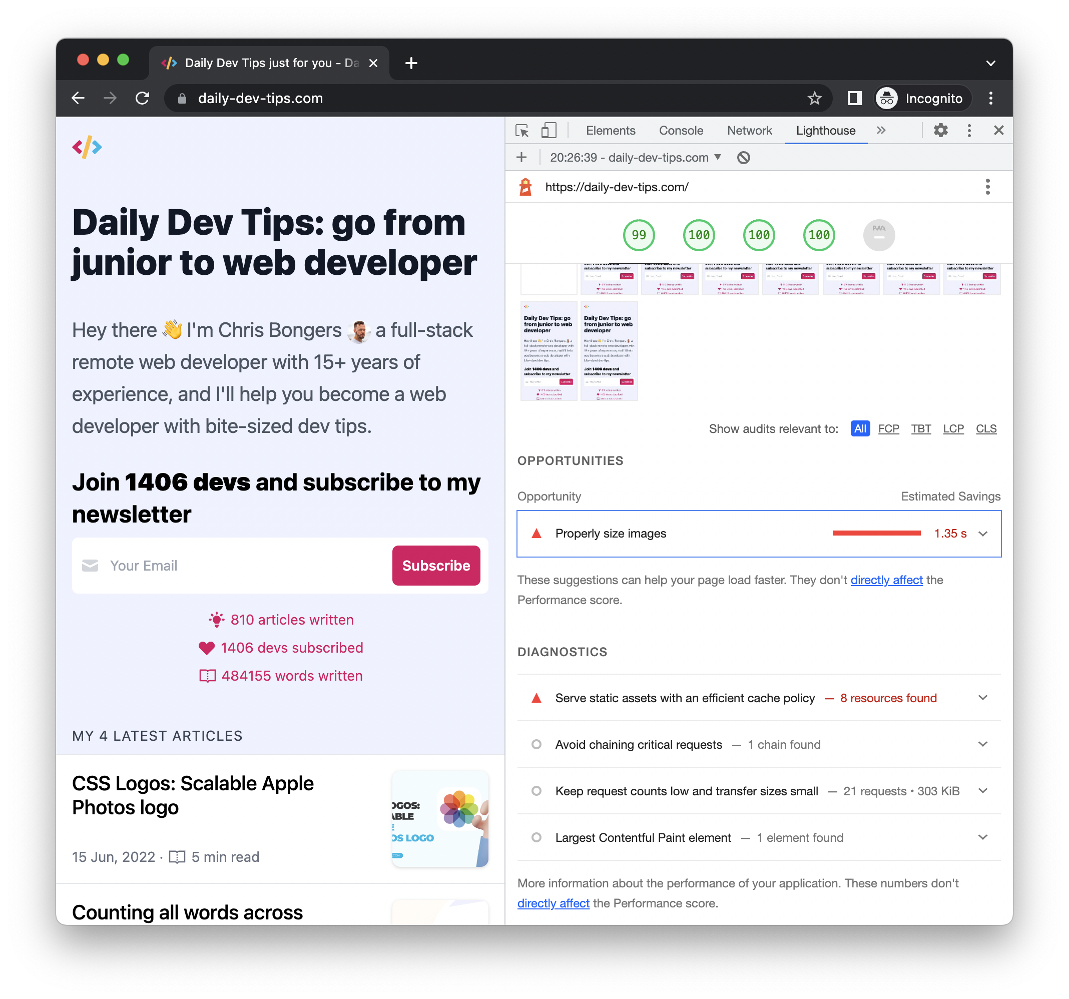
Almost there! We improved the score by one point and only have one item left to work on:
- Properly size images
Now let's test the desktop variant and see what happens:
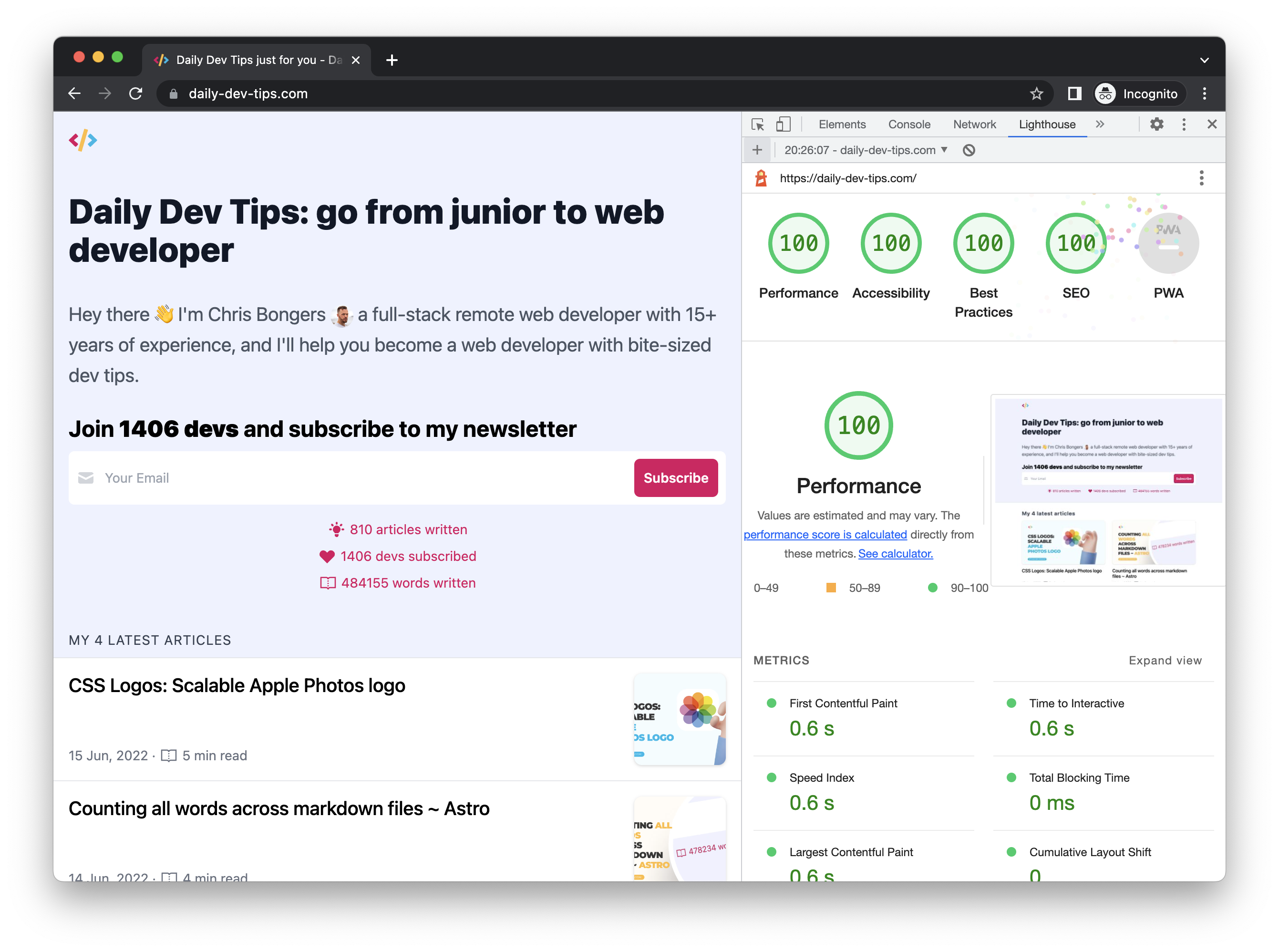
We did it, 100 points and no items left.
You might wonder, why is the mobile version not perfect? And the answer is, you can even see it in the image above.
I render the images in square sizes on mobile, but we still serve them in the desktop size. So to fix this, we need to add some more variants and switch them based on a media query. More on that in the following article.
Thank you for reading, and let's connect!
Thank you for reading my blog. Feel free to subscribe to my email newsletter and connect on Facebook or Twitter



