
HTML Picture Element Responsive Images

I'm a full-stack developer from South Africa 🇿🇦. I love writing about JavaScript, HTML and CSS.
Today we'll be looking at the HTML Picture element. It can be used to have native responsive image support.
So how it works is we wrap our normal img tag inside a picture element and add srcset images.
This will then be defining on media queries which image it shows.
HTML Picture Element
Ok, let's get started!
For this example, we will be using extreme cases, normally you would just use a modified version of your original image but in a smaller size or different orientation.
<picture>
  <source
    media="(min-width: 650px)"
    srcset="https://images.unsplash.com/photo-1589965716319-4a041b58fa8a?ixlib=rb-1.2.1&ixid=eyJhcHBfaWQiOjEyMDd9&auto=format&fit=crop&w=1867&q=80"
  />
  <source
    media="(min-width: 465px)"
    srcset="https://images.unsplash.com/photo-1534235261404-7625cd79bdb9?ixlib=rb-1.2.1&ixid=eyJhcHBfaWQiOjEyMDd9&auto=format&fit=crop&w=1950&q=80"
  />
  <img
    src="https://images.unsplash.com/photo-1537151608828-ea2b11777ee8?ixlib=rb-1.2.1&ixid=eyJhcHBfaWQiOjEyMDd9&auto=format&fit=crop&w=939&q=80"
    alt="A amazing corgi dog"
  />
</picture>
Now on we should see the following:
- Screen above 650px - Corgi on a mountain
- Screen between 465 and 650px - Corgi on the stairs
- Screen smaller then 465 - Puppy Corgi!
Now isn't that amazing!
To make this function even better, add loading="lazy".
Feel free to view these Corgis on Codepen.
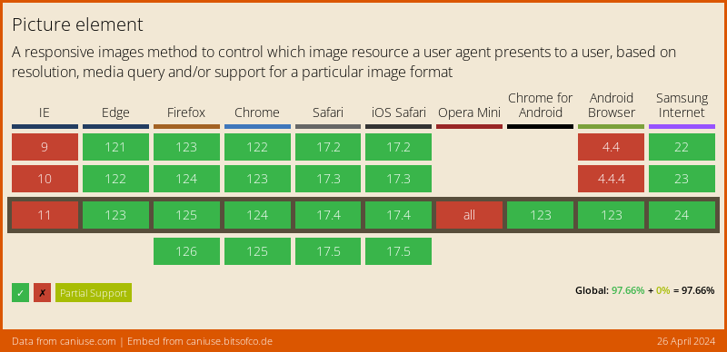
Browser Support
A super cool feature, but not supported by IE and Opera mini as expected. However! They will fallback to the default image! So no real objection to using it!
Thank you for reading, and let's connect!
Thank you for reading my blog. Feel free to subscribe to my email newsletter and connect on Facebook or Twitter



