Exploring :visited state possibilities

I'm a full-stack developer from South Africa 🇿🇦. I love writing about JavaScript, HTML and CSS.
Yesterday, we looked at the :visited selector how we can use it to enhance our website.
However, it doesn't exactly have the best options out of the box.
It comes down to color change.
And that kind of sucks. As mentioned, this visited state has been on my list back from my initial blog, "The Todoist" where it would showcase as a checkbox before each blog item.
Generally something like this:
☑️ You still have to read this ✅ You've read this article
However, I quickly learned this was not possible using nothing by CSS.
I've been doing some research, and came across these two amazing articles, to whom I want to give a shout-out for exploring the options before me:
So let's see how far we can go using only CSS.
Showing a read flag based on :visited state
First, let's try to achieve a read flag, the one you can see on my blog's homepage.
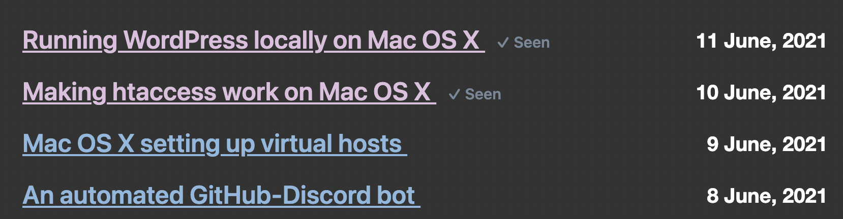
So let's start from where we left off yesterday with our basic :visited color example.
Let's start by adding a [read] label to our HTML. I'll be using a span with aria-hidden so screen readers won't read this out loud.
Change the HTML for each item to look like this:
<a href="https://daily-dev-tips.com/?new"
  >Daily dev tips <span aria-hidden="true"></span
></a>
Now let's use the :after pseudo element to add some text to the span.
a {
  text-decoration: none;
  color: #8bb8df;
  span {
    &:after {
      content: '(Read)';
      color: #778899;
    }
  }
}
This will place the (Read) text behind each element. However, it doesn't do anything with the visited state yet.
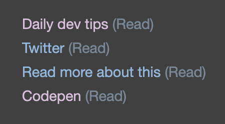
So now we need to find a way to hide the element that we have not yet read, right?
If we think about that, we should do the following:
- Always hide the after selector
- Show the after selector when visited
If we then think back on the options we have at hand (color only) we can "hide" the items by making the color the same as the background.
Let's put that in action:
ul {
  background: #404040;
}
a {
  text-decoration: none;
  color: #8bb8df;
  &:visited {
    color: #debfde;
    span:after {
      color: #778899;
    }
  }
  span {
    &:after {
      content: '(Read)';
      color: #404040;
    }
  }
}
Do you see what's happening here?
The background of the UL is #404040, so we make the span:after the same color, which makes it disappear.
Then on the visited selector, we modify the span:after again to make it the color we want to show!
And this gives us the following:
Showing an unread flag based on :visited state
Now that we know how to leverage the visited state by offsetting the color let's turn it around and show an unread flag when people still need to visit a link!
ul {
  background: #404040;
}
a {
  text-decoration: none;
  color: #8bb8df;
  &:visited {
    color: #debfde;
    span:after {
      color: #404040;
    }
  }
  span {
    &:after {
      content: '(Unread!)';
      color: #f89283;
    }
  }
}
In this case, we decided to offset the visited state and show disappeared by using the background color.
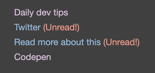
The normal one, we change the after text to "(Unread!)" and a slightly brighter color.
Now the user will see which articles haven't been opened!
Thank you for reading, and let's connect!
Thank you for reading my blog. Feel free to subscribe to my email newsletter and connect on Facebook or Twitter