
Enhancing images with srcset and picture
I'm a full-stack developer from South Africa 🇿🇦. I love writing about JavaScript, HTML and CSS.
In the previous article, we moved the images to Cloudflare images to serve them in modern formats.
However, on mobile, we would still get the issue that the size was too big, this also happened on desktop, but the size difference is too low to notice.
Analyse the problem
The problem here is that we are serving one image all the time.
This source image is 1200x630px and only show 368x193px at best. That's just for the desktop screen. On mobile, I render it as a square that's only 96x96px.
And then, if we take retina and other high-density screens into account, we need multiple-sized images!
For now, I settled on two sizes for each view, coming down to four variants.
| Variant | Device |
| m: 96x96 | mobile (non retina) |
| mr: 192x192 | mobile (retina) |
| d: 368x192 | desktop (non retina) |
| dr: 736x385 | desktop (retina) |
You could add another layer for 3x screens, but this looked perfect on high-density screens for me.
Loading different images
We have a couple of techniques when it comes to showing these different images.
I'll use two techniques in this article, but you can also opt only to use the srcset one.
The srcset attribute is a comma-separated list of image filenames and the width they represent.
So if we want to show two different variants we can use the following syntax:
<img srcset="img-small.jpg 480w, img-large.jpg 1080w" />
All this does is tell the browser what the width of each image is, so the browser doesn't have to download them in advance.
When the browser knows an image of max 480px is enough, it will decide only to download that one. Otherwise, it will take the bigger one.
What's important to note is that we should always add the regular src element to be our default image. This is a fallback mechanism when browsers don't support the srcset.
Alternatively, we can use pixel densities to state which image to show.
<img srcset="img.jpg 1x, [email protected] 2x, img@3x 3x" />
This can be used to show high-quality pictures to devices with higher pixel ratios.
A 2.0-pixel density would be the 2x size.
Note: You cannot mix these pixel densities and widths in the srcset.
Another thing to note about the srcset is that once it loads the biggest possible image, it will never load the smaller ones.
It knows it's easier to serve that one instead as it's already cached.
Different images for different sizes
Regarding different-sized images, we have two options to choose from.
We can use the sizes attribute on the image. This attribute can be used to describe which image shows on which width.
Let's take the above example:
<img
  srcset="img-small.jpg 480w, img-large.jpg 1080w"
  sizes="(max-width: 480px) 100vw, (max-width: 1024px) 50vw, 800px"
/>
This tells the browser how big the image is displayed for each media query.
- max-width = 480px: We show the image 100% of the viewport width
- Between 480 and 1024px: We show the image only 50% of the viewport
- Wider than 1024px: The image is always 800px
This is a different way of helping the browser understand which image size we will render.
The main pain point here is that the browser will consider pixel density, so it could load the bigger image on a small screen because the device has a 3.0-pixel density.
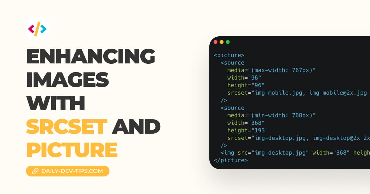
As an alternative way, we can use the picture tag. This tag can add different images depending on these media queries.
<picture>
  <source
    media="(max-width: 767px)"
    width="96"
    height="96"
    srcset="img-mobile.jpg, [email protected] 2x"
  />
  <source
    media="(min-width: 768px)"
    width="368"
    height="193"
    srcset="img-desktop.jpg, img-desktop@2x 2x, img-desktop@3x 3x"
  />
  <img src="img-desktop.jpg" width="368" height="193" />
</picture>
The main pro with this method is that you can specify a different image for a certain responsive view.
However, in my case, it's a combination of ensuring the mobile image loads while supporting the high-density versions.
The big downside is that when users resize their screen, it will download the different images based on the size you described.
Conclusion
Using the srcset is a fantastic addition to help browsers understand which image you are showing and which one they should download.
It's important to note that the srcset will settle for one image. As soon as the highest possible image is downloaded, it will never load the smaller ones, as it's easier to serve that one!
If you have different artworks for responsive images, you should use the picture element to define multiple sources.
You might also be wondering what this brought me regarding page speed score for mobile?
And it scores 100!
Thank you for reading, and let's connect!
Thank you for reading my blog. Feel free to subscribe to my email newsletter and connect on Facebook or Twitter


