
Double-click to like Instagram effect in JavaScript ❤️

I'm a full-stack developer from South Africa 🇿🇦. I love writing about JavaScript, HTML and CSS.
Today we are going to recreate the famous Instagram double-tap to like effect!
And the surprise, we only need 12 lines of JavaScript!
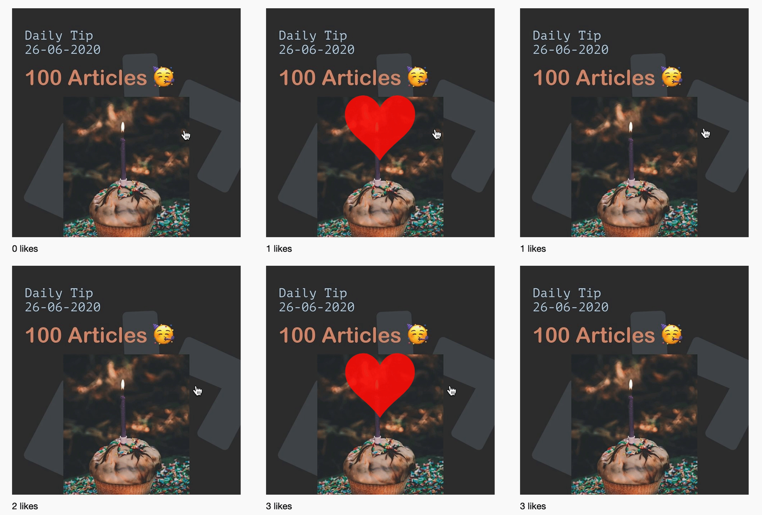
For this effect, we will bind a double-click handler to our image show the heart animation plus the counter below the post.
This is how it is going to look:
HTML Structure
<svg aria-hidden="true" style="position: absolute; width: 0; height: 0; overflow: hidden;" version="1.1" xmlns="http://www.w3.org/2000/svg" xmlns:xlink="http://www.w3.org/1999/xlink">
  <defs>
    <symbol id="icon-heart" viewBox="0 0 32 32">
      <path d="M23.6 2c-3.363 0-6.258 2.736-7.599 5.594-1.342-2.858-4.237-5.594-7.601-5.594-4.637 0-8.4 3.764-8.4 8.401 0 9.433 9.516 11.906 16.001 21.232 6.13-9.268 15.999-12.1 15.999-21.232 0-4.637-3.763-8.401-8.4-8.401z"></path>
    </symbol>
  </defs>
</svg>

<div class="post">
  <svg class="icon icon-heart">
    <use xlink:href="#icon-heart"></use>
  </svg>
  <img src="https://instagram.fcpt4-1.fna.fbcdn.net/v/t51.2885-15/sh0.08/e35/s640x640/105986995_880679399008682_4786248831928918923_n.jpg?_nc_ht=instagram.fcpt4-1.fna.fbcdn.net&_nc_cat=102&_nc_ohc=ZI2jfIEB-tUAX8MMD58&oh=4cc88009309dbc5b223b8334408ac213&oe=5F78F3A2" />
  <p><span>0</span> likes</p>
</div>
As for our HTML, we are make us of our SVG sprites. Then we create our post div, with the hearth SVG in it. Under that we render the actual instagram post. And last we have our number of likes.
As you can see, we are using singer elements, so I didn't bother to add classes for this example.
CSS Structure
.post {
  margin: auto;
  position: relative;
  display: flex;
  align-items: center;
  justify-content: center;
  flex-direction: column;
}
.post img {
  width: 400px;
  cursor: pointer;
}
.post .icon {
  position: absolute;
  display: inline-block;
  width: 128px;
  opacity: 0;
  fill: red;
}
.post .icon.like {
  animation: 2s like-heart-animation ease-in-out forwards;
}
.post p {
  align-self: baseline;
  margin-top: 10px;
}
We make use of Flex to center the post. Next, we make the icon (heart) absolute and give it an opacity of 0, so it's not visible on load.
Then we say if this icon also has the class like add the animation like-heart-animation.
This animation looks like this, and it's exactly the animation as how Instagram does it. They scale it up and to the end scale it a little down to give it a bounce effect.
@keyframes like-heart-animation {
  0%,
  to {
    opacity: 0;
    -webkit-transform: scale(0);
    transform: scale(0);
  }
  15% {
    opacity: 0.9;
    -webkit-transform: scale(1.2);
    transform: scale(1.2);
  }
  30% {
    -webkit-transform: scale(0.95);
    transform: scale(0.95);
  }
  45%,
  80% {
    opacity: 0.9;
    -webkit-transform: scale(1);
    transform: scale(1);
  }
}
JavaScript Instagram Like
For our actual effect to add place, we need to get the like class added to our icon svg.
const img = document.querySelector("img");
const icon = document.querySelector(".icon");
const countEl = document.querySelector("span");
let count = 0;
img.addEventListener("dblclick", () => {
  count++;
  icon.classList.add("like");
  countEl.innerHTML = count;
  setTimeout(() => {
    icon.classList.remove("like");
  }, 1200);
});
We add an event listener called dblclick (double click).
If that happens, we tell our counter to increase by one.
Then we add the like class to our icon and update the number of likes.
After 1200 milliseconds, we remove the like class again.
That's it! We now have the following Instagram like effect in Codepen:
Thank you for reading, and let's connect!
Thank you for reading my blog. Feel free to subscribe to my email newsletter and connect on Facebook or Twitter



