
CSS Styling the link underline

Styling the link underlines was always quite a mission. I would often remove the underline and use a border to achieve the effect.
Why? It was hard to offset the underline position. But luckily, browsers and CSS keeps improving to make things like this more accessible.
Today we will be looking into two pretty cool CSS property that addresses the underline effect;
- text-underline-offset: How far the underline from the text is
- text-decoration-thickness: How thick the underlined link is
The result of today you can see by having a play with this Codepen. (Move the sliders to adjust the elements)
CSS text-underline-offset property
The text-underline-offset property can be used to define how far the line is from the initial text.
You can use a variety of values, as you might find in most CSS properties.
auto: The browser will determine it for us.{length}{unit}: The CSS units as 1px, 1em, 1rem, 1%.initial: What it was before (auto).inherit: Whatever the parent element hasunset: Remove any set offset.
To use it we can simple use the following syntax:
a {
    text-underline-offset: 0.5em;
}
You can have a play around with the demo on the following Codepen.
CSS text-decoration-thickness property
As for the text-decoration-thickness, this property is used to tell how big the underline is.
We do need the full text-decoration attribution to make changes to it.
a {
  text-decoration-line: underline;
  text-decoration-style: solid;
  text-decoration-color: purple;
  text-decoration-thickness: 0;
}
It uses the same value properties as the offset.
auto: The browser will determine it for us.{length}{unit}: The CSS units as 1px, 1em, 1rem, 1%.initial: What it was before (auto).inherit: Whatever the parent element hasunset: Remove any set offset.
You can have a play with it on this Codepen.
Browser support
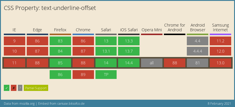
As for the text-underline-offset, the support is very summer. It's stating that Chrome doesn't have the full support, but it seems to work since 88.
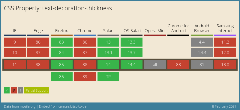
And for the text-decoration-thickness, the support is about the same. Let's hope they'll both get full support soon!
Thank you for reading, and let's connect!
Thank you for reading my blog. Feel free to subscribe to my email newsletter and connect on Facebook or Twitter
About the author
I'm a full-stack developer from South Africa 🇿🇦. I love writing about JavaScript, HTML and CSS.
Comments
Join the discussionNo comments yet. Be the first to comment.



