
CSS Shapes - The basics

I'm a full-stack developer from South Africa 🇿🇦. I love writing about JavaScript, HTML and CSS.
When it comes to CSS, we can make cool shapes. They are often used for some web design elements. But some people love to even make art with them!
We'll start with the basics of some shapes you can make with CSS. Throughout this series, we'll look at some more advanced shapes and how you can create them.
In todays article:
Squares with CSS
Let's start with the shape of all shapes. The square is used for a lot of other shapes.
It's as simple as having an element that has an equal width/height.
<div class="square"></div>
.square {
  width: 200px;
  height: 200px;
  background: #3e92cc;
}
This will result in a basic square:

Rectangles with CSS
From the square, we can make a rectangle by adjusting the width or height. Making one of those bigger will give us a rectangle.
<div class="rectangle"></div>
.rectangle {
  width: 300px;
  height: 200px;
  background: #3e92cc;
}

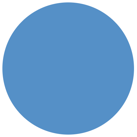
Circles with CSS
Now for one of my favorites, a circle. It's a versatile element to use for avatars or buttons.
It can be created by using the square but adding a border-radius to it.
<div class="circle"></div>
.circle {
  width: 200px;
  height: 200px;
  background: #3e92cc;
  border-radius: 50%;
}
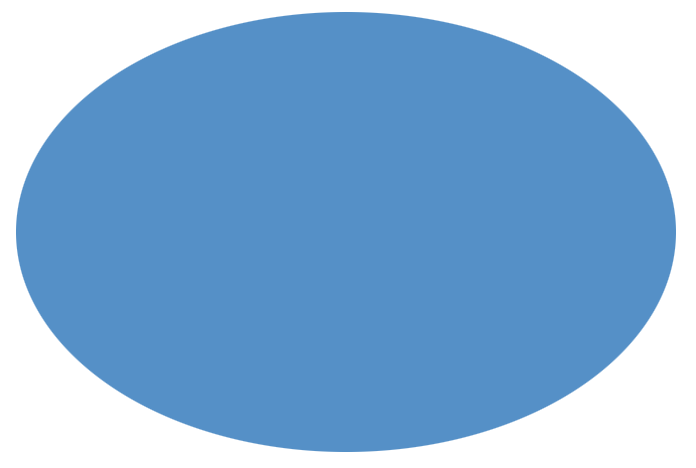
Ovals with CSS
And equally, we can add a border-radius to our rectangle to make oval shapes.
<div class="oval"></div>
.oval {
  width: 300px;
  height: 200px;
  background: #3e92cc;
  border-radius: 50%;
}
Demonstration of CSS Shapes
I also made this Codepen for you to play around with, have some fun exploring these basic shapes, and already think about how other shapes will work.
Thank you for reading, and let's connect!
Thank you for reading my blog. Feel free to subscribe to my email newsletter and connect on Facebook or Twitter


