

In this article, we'll be recreating the Spotify logo. I won't be making a pixel-perfect representation because I like this older app icon. (A bit more rounded version)

Note: The above image is the current logo
Analysing the logo
We first see that the logo has a big rounded button in the background and three rounded lines.
These rounded lines seem simple at first, but thinking about it, we don't have a "line" in CSS, nor can we apply rounded corners to these kinds of bent lines.
The closest we could get would be to do a square and add a border radius, but in that case, we would not be able to curve it.
So my approach will be to use rounded ellipses, only color the top border, then use pseudo-elements we can add the round ends to it.
Alright, let's do this thing.
Making the Spotify logo in CSS
First, let's start with the HTML we are going to need. I'll be using one container div, which will hold the rounded button, then three divs inside for each line.
<div class="spotify">
  <div class="line top"></div>
  <div class="line middle"></div>
  <div class="line bottom"></div>
</div>
We can leverage the aspect-ratio and a border radius of 50% to make it fully round.
.spotify {
  position: relative;
  width: 8rem;
  aspect-ratio: 1;
  border-radius: 50%;
  background: #00db4d;
  box-shadow: 0 0 4px rgba(0, 0, 0, 0.5);
  display: grid;
  place-items: center;
  transform: rotate(9deg);
}
I also added a small box shadow to give it that deeper look. Then I transform the whole div to rotate ever so slightly. This gives it the skew effect the logo needs. Lastly, we use a grid to center the line elements as a starting point.
I wanted to make sure they were reusable in code for the lines, although each one has its own set of properties. For this, I'll be using CSS vars
Let's start with the general idea. We'll make quite a big box and only color in the top border.
.line {
  border: var(--line) solid transparent;
  border-top: var(--line) solid #fff;
  border-radius: 50%;
  height: 2rem;
  width: var(--width);
  position: absolute;
  margin-top: var(--margin-top);
}
You might already have spotted the variables here. There are a couple of things that can change for each line:
- The border: Basically, the size of each line
- The width: How wide the line should stretch
- The margin-top: How far we should offset from the top
But let me quickly show you what I meant by only adding color to the top line. Let's make all other borders blue to see what happens.
.line {
  border: var(--line) solid blue;
  border-top: var(--line) solid #fff;
}
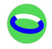
As you can see, the line shows perfect for the white part, and since we set the blue part to be transparent, nobody will see that.
But as you might see in the image above, we want to round the corners.
To set the variables we need for each line. We can use the following code.
.top {
  --width: 5rem;
  --line: 1rem;
}
.middle {
  --width: 4rem;
  --line: 0.75rem;
  --margin-top: 2.5rem;
}
.bottom {
  --width: 3rem;
  --line: 0.5rem;
  --margin-top: 4.5rem;
}
We should have something similar to the image below, already looking quite good.

But, we are still missing the rounded corners. For that, we can leverage the before and after pseudo-elements.
.line {
  &:before,
  &:after {
    content: '';
    width: calc(var(--line) - 1px);
    height: calc(var(--line) - 2px);
    background-color: #fff;
    border-radius: 50%;
    position: absolute;
  }
}
Note: The above code is SCSS. You can also recreate this in plain CSS.
The above code will output an ellipsis based on the size of the line, which we make fully rounded. All we have to do is offset them from the left and right positions.
Since this is different for each line, I will add new variables for this:
top: The top offset for this rounded cornerhorizontal: The left or right offset, the before will be offset from the left, and the after from the right
.line {
  &:before {
    top: var(--top);
    left: var(--horizontal);
  }
  &:after {
    top: var(--top);
    right: var(--horizontal);
  }
}
Now we can simply add these variables to each of our lines.
.top {
  // Other vars
  --top: -5px;
  --horizontal: -6px;
}
.middle {
  // Other vars
  --top: -2px;
  --horizontal: -4px;
}
.bottom {
  // Other vars
  --top: 0px;
  --horizontal: 0px;
}
And that's it. A slightly alternative but interesting Spotify logo made with CSS.
You can check out the result in this CodePen.
Thank you for reading, and let's connect!
Thank you for reading my blog. Feel free to subscribe to my email newsletter and connect on Facebook or Twitter
About the author
I'm a full-stack developer from South Africa 🇿🇦. I love writing about JavaScript, HTML and CSS.
Comments
Join the discussionNo comments yet. Be the first to comment.



