
CSS Logos: React logo

I'm a full-stack developer from South Africa 🇿🇦. I love writing about JavaScript, HTML and CSS.
I'm sure you have seen the React (atom-like) logo before, but as a reminder, this is what it looks like:

Analysing the logo
The logo consists of three ellipses that form around a ball.
I want to challenge myself and try to create this as a single div artwork.
We should be able to use the before and after pseudo-elements to create two of the lines.
Then the main div can hold the dot and the third line.
Since this is a little bit simpler, we'll also animate the logo, so you get to experience CSS animations.
Recreating the React logo in CSS
Let's get started and create the single div element.
<div class="react"></div>
Let's also look into an excellent concept in processed CSS called @extend I'll be using SCSS as we have a lot of recurring elements that we can quickly share between selectors.
Note: You can still use CSS, copy-paste the main element instead of using
@extend
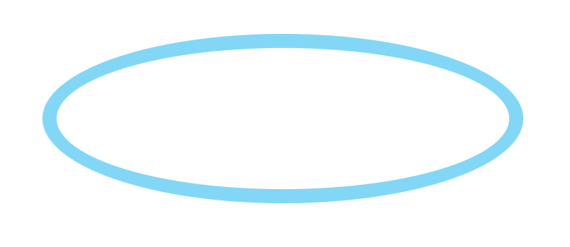
We'll start by creating the orbit class.
.orbit {
  height: 6.25rem;
  width: 20rem;
  border-radius: 50%;
  border: 0.625rem solid #61dafb;
}
This code is not used anywhere now. But we can quickly add all these classes to our main div element like this.
.react {
  @extend .orbit;
}
At this point, we have the primary orbit in place.
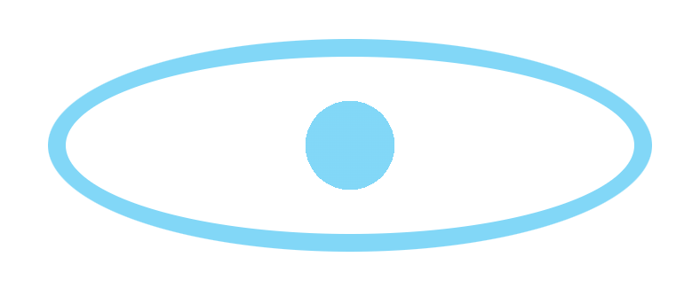
Before we add the other two orbit rings, let's first look at how we can add the dot in the center. This will have to be a background on this main element.
But we don't want to fill the whole thing. And we can leverage a radial gradient for this!
We saw a similar concept in the Dev.to logo where we had hard stops. By using transparent stops, we can set the center color.
.react {
  @extend .orbit;
  background: radial-gradient(circle, #61dafb 15%, transparent 15%);
}
As you can see, we start the gradient set to a circle at 15%, which will fill with the React blue. And then, we transition to transparent from 15% onwards.
And now, let's add the other two orbit rings.
We'll use the before and after pseudo elements.
.react {
  // Other classes
  position: relative;
  &:before,
  &:after {
    content: '';
    @extend .orbit;
    position: absolute;
    left: -0.625rem;
    top: -0.625rem;
  }
}
The main thing to note here, is that we extend the orbit again for the before and after.
Then we offset it by -0.625rem, which reflects the border width of the orbit.
And then, we can rotate each element a bit differently.
&:before {
  transform: rotate(60deg);
}
&:after {
  transform: rotate(120deg);
}
By now, we have our react logo as intended.

The last thing we wanted to add was the animation. The original logo can rotate around the orb.
Let's add a rotate animation to the main element.
.react {
  animation: rotate 15s infinite linear;
}
Some elements to note here:
rotate: This is the name of the animation we'll create in a second15s: How long each animation will take, 15 seconds in this caseinfinite: how often the animation runs (forever)linear: the type of animation, we want it to be equal over time, but you can also useease-in.
The animation itself (named rotate) we can add like this:
@keyframes rotate {
  to {
    transform: rotate(1turn);
  }
}
We say, animate to rotate exactly one turn (which equals 360 degrees).
And there you go, a one-div CSS React logo that animates.
Thank you for reading, and let's connect!
Thank you for reading my blog. Feel free to subscribe to my email newsletter and connect on Facebook or Twitter


