
CSS Logos: Nike logo

I'm a full-stack developer from South Africa 🇿🇦. I love writing about JavaScript, HTML and CSS.
In today's article, we'll recreate the iconic Nike swoosh logo.
For reference, this is what the logo looks like:

Analysing the logo
The Nike swoosh is quite iconic, and the main thing we see is one big ellipsis, with another one overlapping it.
This is all captured in a box so it won't show the overlap. To draw this out, this is what I mean.
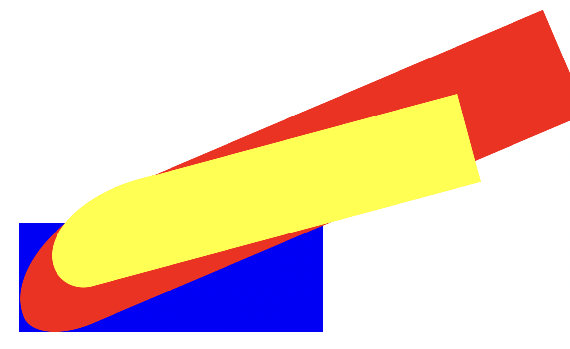
As we see in the image, the logo has three items.
blue box: The container, the only thing in here, will become visiblered element: This ellipsis shape will be our actual logoyellow element: This is what we'll use to cut out the excess inside the swoosh.
CSS Nike logo
To start, we'll only need one div, which makes things easier.
<div class="nike"></div>
We want to make this relative to the viewport for the blue box container so our logo will scale.
I'm using a custom aspect-ratio to get them off rectangle shape.
.nike {
  position: absolute;
  overflow: hidden;
  width: 50vmin;
  aspect-ratio: 14/5;
  position: relative;
}
Then we can start defining the red element, which will become our logo.
We want to make a box that is way bigger than our container.
We'll use the :before selector to create this element.
.nike {
  &:before {
    content: '';
    position: absolute;
    background: black;
    width: 37%;
    height: 550%;
    bottom: -134%;
    left: 70.5%;
    border-top-left-radius: 48% 17%;
    border-top-right-radius: 120% 40%;
    transform: rotate(-113deg);
    z-index: 1;
  }
}
As you can see, the primary magic here is in the border-radius. We are using the double border radius, which is quite tricky. And it took me a lot of tweaking to get the shape right.
If you want a more visual tester, I found this fantastic tool.
So far, we have the following in play.
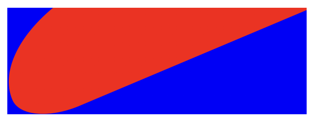
This is already looking great. The last thing we need is to cut out the inner part of the logo.
For this, we'll use the :after pseudo-selector.
.nike {
  &:after {
    content: '';
    position: absolute;
    background: white;
    width: 30%;
    height: 400%;
    bottom: -73%;
    left: 64%;
    border-top-left-radius: 64% 14%;
    border-top-right-radius: 125% 46%;
    transform: rotate(-105deg);
    z-index: 2;
  }
}
The setup is very similar as we use the double border-radius again and offset the element to the right position.
You can see the final result in this CodePen.
Thank you for reading, and let's connect!
Thank you for reading my blog. Feel free to subscribe to my email newsletter and connect on Facebook or Twitter



