
CSS Grid Item

We had our basic introduction into CSS Grid, The Grid Container, and today we are looking into the Grid Item.
HTML Structure
Let's start by making a grid template that is five by five.
<div class="grid">
  <!-- Row 1 -->
  <div class="item"></div>
  <div class="item"></div>
  <div class="item"></div>
  <div class="item"></div>
  <div class="item"></div>
  <!-- Row 2 -->
  ...
</div>
CSS Item
In our first introduction, we saw how to span an item over multiple blocks; let's dive deeper into that.
CSS Grid-column property
The property has multiple ways of describing the width of an item.
grid-column: 1 / 5;: Starts on column one end before column fivegrid-column: 1 / span 3;Start on column one and span three columnsgrid-column: 2 / span 3;Start on column two and span three columnsgrid-column: span 3;Span three from wherever it starts
Have a look at this Codepen:
CSS Grid-row property
As like the grid-column, we can also use the grid-row to stack over rows.
grid-row: 1 / 4;Start on row one and end on row fourgrid-row: 1 / span 2;Start on one and span two rowsgrid-row: span 2;Span two from anywhere
CSS Grid-area
We can also make a grid-area to span both columns and rows.
grid-area: 1 / 2 / 5 / 6; Meaning: Start on Row 1, Column 2 and end at Row 5 Column 6
That will result in the following Codepen:
CSS Grid Naming Areas
Another cool feature, is we can name areas!
.grid {
  grid-template-areas: 'Custom Custom . . .' 'Custom Custom . . .';
}
This will make two rows, with the names Custom columns and three unnamed columns.
And then on our item:
.item {
  grid-area: Custom;
}
This will result in the following:
Browser Support
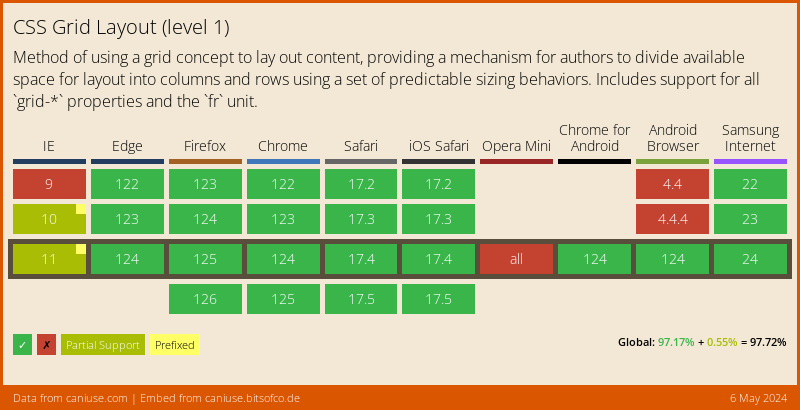
CSS Grid has support from all major browsers, we have some issues in IE, but they can be Polyfilled.
Thank you for reading, and let's connect!
Thank you for reading my blog. Feel free to subscribe to my email newsletter and connect on Facebook or Twitter
About the author
I'm a full-stack developer from South Africa 🇿🇦. I love writing about JavaScript, HTML and CSS.
Comments
Join the discussionThank you for taking out time to share amazing tips every day.
Thank you for reading my tips!



