
CSS Grid Introduction

Today we'll be looking at a flex competitor called CSS Grid!
As the name suggests, it's an awesome tool to make grids and layouts.
In general, a grid is build by having a container and some children inside it.
CSS Basic Grid
As for our HTML we are using the following setup
<div class="grid">
  <div class="item"></div>
  <div class="item"></div>
  <div class="item"></div>
  <div class="item"></div>
</div>
And to style this basic grid into four equal columns:
.grid {
  background: #1b9aaa;
  display: grid;
  grid-template-columns: 1fr 1fr 1fr 1fr;
  grid-gap: 1.5em;
}
.item {
  width: 100%;
  height: 200px;
  background: #06d6a0;
}
Note we add the grid-gap property, if we leave that out, the columns will be stuck to each other.
The template will work by defining it will have four small columns.
See and test it on Codepen.
Other Column Size
But what if we want the first item to span two columns? Then two small ones and the other way around for the second row?
<div class="grid">
  <!-- row 1 -->
  <div class="item item-col-2"></div>
  <div class="item"></div>
  <div class="item item-row-2"></div>
  <!-- row 2 -->
  <div class="item"></div>
  <div class="item item-col-2"></div>
</div>
For the CSS:
.grid {
  background: #1b9aaa;
  display: grid;
  grid-template-columns: 1fr 1fr 1fr 1fr;
  grid-gap: 1.5em;
}
.item {
  width: 100%;
  min-height: 200px;
  background: #06d6a0;
  &-col-2 {
    grid-column: span 2;
  }
  &-row-2 {
    grid-row: span 2;
  }
}
As you can see, we use grid-column to span the grid over two blocks horizontal.
And grid-row to span over two blocks vertical.
Feel free to play around with this Codepen.
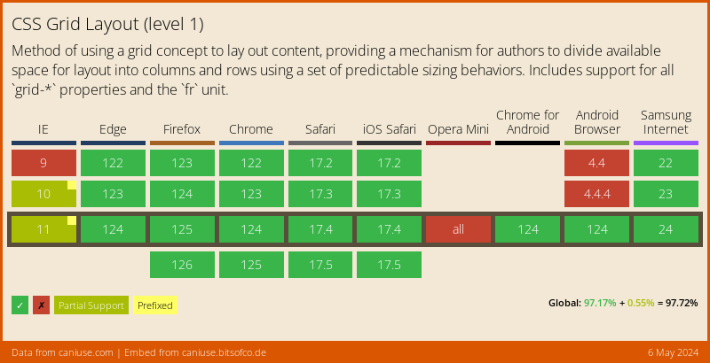
Browser Support
CSS Grid has support from all major browsers, we have some issues in IE, but they can be Polyfilled.
Thank you for reading, and let's connect!
Thank you for reading my blog. Feel free to subscribe to my email newsletter and connect on Facebook or Twitter
About the author
I'm a full-stack developer from South Africa 🇿🇦. I love writing about JavaScript, HTML and CSS.
Comments
Join the discussionNo comments yet. Be the first to comment.



