
CSS Grid Container

I'm a full-stack developer from South Africa 🇿🇦. I love writing about JavaScript, HTML and CSS.
Yesterday we had the first touch with CSS Grid. Today we will be diving more into the container part of the grid.
The container is the outer wrapper, and much like flex it has some awesome properties we can leverage.
You must think of the container is the element where you define your layout structure.
HTML Structure
In today's example we will be working with a three column, two row layout.
<div class="grid">
  <!-- Row 1 -->
  <div class="item"></div>
  <div class="item"></div>
  <div class="item"></div>
  <!-- Row 2 -->
  <div class="item"></div>
  <div class="item"></div>
  <div class="item"></div>
</div>
Grid Container
So let's start by making our container a grid:
.grid {
  display: grid;
  grid-template-columns: auto auto auto;
}
We define our columns layout and tell it to make three evenly spaced columns.
Grid Gaps
Let's add some gaps because these make it easier to see what's happening.
We can add a allround gap (column and row) or the separate ones.
.grid {
  grid-gap: 1em; // Around
  grid-column-gap: 1em; // Columns
  grid-row-gap: 1em; // Rows
}
By default, the gaps are off (not existing)
Different Column Setup
We can also change the column setup to be variant like this:
.grid {
  display: grid;
  grid-template-columns: 20px auto 100px;
}
The auto will fill to 100% setup.
Grid Rows
As we've seen now we are only defining the columns so rows will be made automatically, but we can influence them like so:
.grid {
  display: grid;
  grid-template-rows: 80px 200px;
}
You can see the above in the following Codepen.
Grid Alignments Justify-content
To align the grid, we can use several awesome functions:
Let's start with justify-content. This property will align on the horizontal axis.
Space the items evenly:
.grid {
  display: grid;
  justify-content: space-evenly;
}
Give them space around:
.grid {
  display: grid;
  justify-content: space-around;
}
Give them space between them
.grid {
  display: grid;
  justify-content: space-between;
}
Center the elements
.grid {
  display: grid;
  justify-content: center;
}
Move all blocks to the start
.grid {
  display: grid;
  justify-content: start;
}
Or to the end
.grid {
  display: grid;
  justify-content: end;
}
Have a play with this Codepen.
Grid Alignments Align-content
That was the horizontal axis, but we can also influence the vertical axis by using the align-content property.
Space the items evenly:
.grid {
  display: grid;
  align-content: space-evenly;
}
Give them space around:
.grid {
  display: grid;
  align-content: space-around;
}
Give them space between them
.grid {
  display: grid;
  align-content: space-between;
}
Center the elements
.grid {
  display: grid;
  align-content: center;
}
Move all blocks to the start
.grid {
  display: grid;
  align-content: start;
}
Or to the end
.grid {
  display: grid;
  align-content: end;
}
Play around with the following Codepen.
Perfectly Centered Grid
Ofcourse we can combine the two, let's make a centred grid:
.flex {
  display: flex;
  align-content: center;
  justify-content: center;
}
You can see this on the following Codepen.
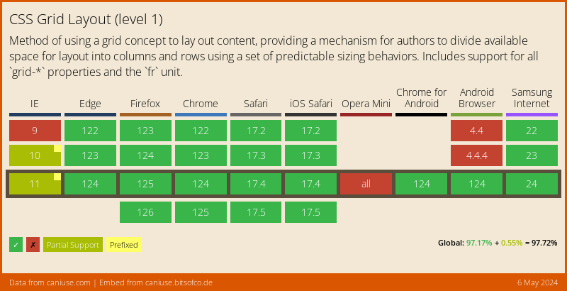
Browser Support
CSS Grid has support from all major browsers, we have some issues in IE, but they can be Polyfilled.
Thank you for reading, and let's connect!
Thank you for reading my blog. Feel free to subscribe to my email newsletter and connect on Facebook or Twitter


