
CSS focus powered dropdown menu

I'm a full-stack developer from South Africa 🇿🇦. I love writing about JavaScript, HTML and CSS.
Today we'll be making something slightly different. A full CSS powered dropdown menu!
No JavaScript required!
We will make use of a button, with a focus state we'll check if we need to show this menu.
The end result will look like this:
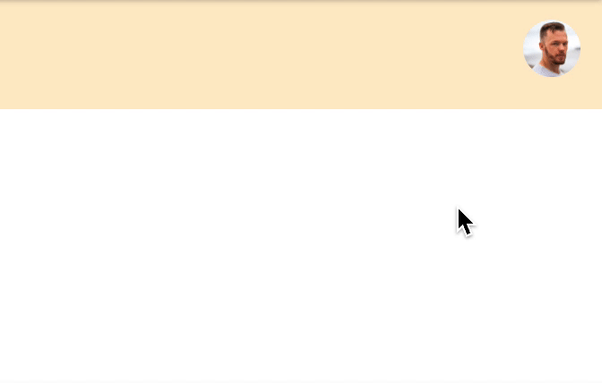
For this specific tutorial, I'm using Tailwind CSS to just focus more on the actual effect.
You can find my Tailwind article here.
HTML Structure
The HTML will be a navbar container, a logo and a user icon on the right.
Tailwind does the styling, and mainly focussed on using flex to align the items.
As you can see we have a button with the ID user-menu next to it we have a div with the ID user-menu-dropdown this will be the dropdown we'll show once we focus the button.
<nav class="flex items-center justify-between h-full p-3 m-auto bg-orange-200">
  <span>My Logo</span>
  <div class="relative">
    <button id="user-menu" aria-label="User menu" aria-haspopup="true">
        <img class="w-8 h-8 rounded-full" src="https://scontent.fcpt4-1.fna.fbcdn.net/v/t1.0-1/p480x480/82455849_2533242576932502_5629407411459588096_o.jpg?_nc_cat=100&ccb=2&_nc_sid=7206a8&_nc_ohc=rGM_UBdnnA8AX_pGIdM&_nc_ht=scontent.fcpt4-1.fna&tp=6&oh=7de8686cebfc29e104c118fc3f78c7e5&oe=5FD1C3FE" />
    </button>
    <div id="user-menu-dropdown" class="absolute right-0 w-48 mt-2 origin-top-right rounded-lg shadow-lg top-10 menu-hidden">
      <div class="p-4 bg-white rounded-md shadow-xs" role="menu" aria-orientation="vertical" aria-labelledby="user-menu">
        <a href="#" class="block px-6 py-2 mb-2 font-bold rounded" role="menuitem">My profile</a>
        <a href="#" class="block px-6 py-2 font-bold rounded" role="menuitem">Logout</a>
      </div>
    </div>
  </div>
</nav>
CSS menu on focus
To add the effect, we need to target the focus on the button. But first, let's hide our dropdown and add a small effect.
Note: We could use @apply, but codepen doesn't support this
#user-menu ~ #user-menu-dropdown {
  transform: scaleX(0) scaleY(0);
  transition-timing-function: cubic-bezier(0.4, 0, 1, 1);
  transition-duration: 75ms;
  opacity: 0;
  top: 3.25rem;
}
For the dropdown we add a transform to make it animate from the corner, then we add an opacity of 0 to hide it.
Now we need to target the hover.
We make use of the #user-menu:focus and then target the next (~) dropdown.
We also add a focus-within in case someone clicks a link in the dropdown, the menu will stay active then.
#user-menu ~ #user-menu-dropdown:focus-within,
#user-menu:focus ~ #user-menu-dropdown {
  transform: scaleX(1) scaleY(1);
  transition-timing-function: cubic-bezier(0, 0, 0.2, 1);
  transition-duration: 100ms;
  opacity: 1;
}
You can see the full example on this Codepen.
Thank you for reading, and let's connect!
Thank you for reading my blog. Feel free to subscribe to my email newsletter and connect on Facebook or Twitter


