
CSS equal height columns

If you are an old-school person like myself, you might remember the days of struggling with stupid designs.
Especially columns that needed to be equal; in some cases, you were even using JavaScript to make equal height columns.
Nowadays, luckily, we have flexbox and grid options.
Today I'm going to show you a cool solution to equal height cards using flexbox.
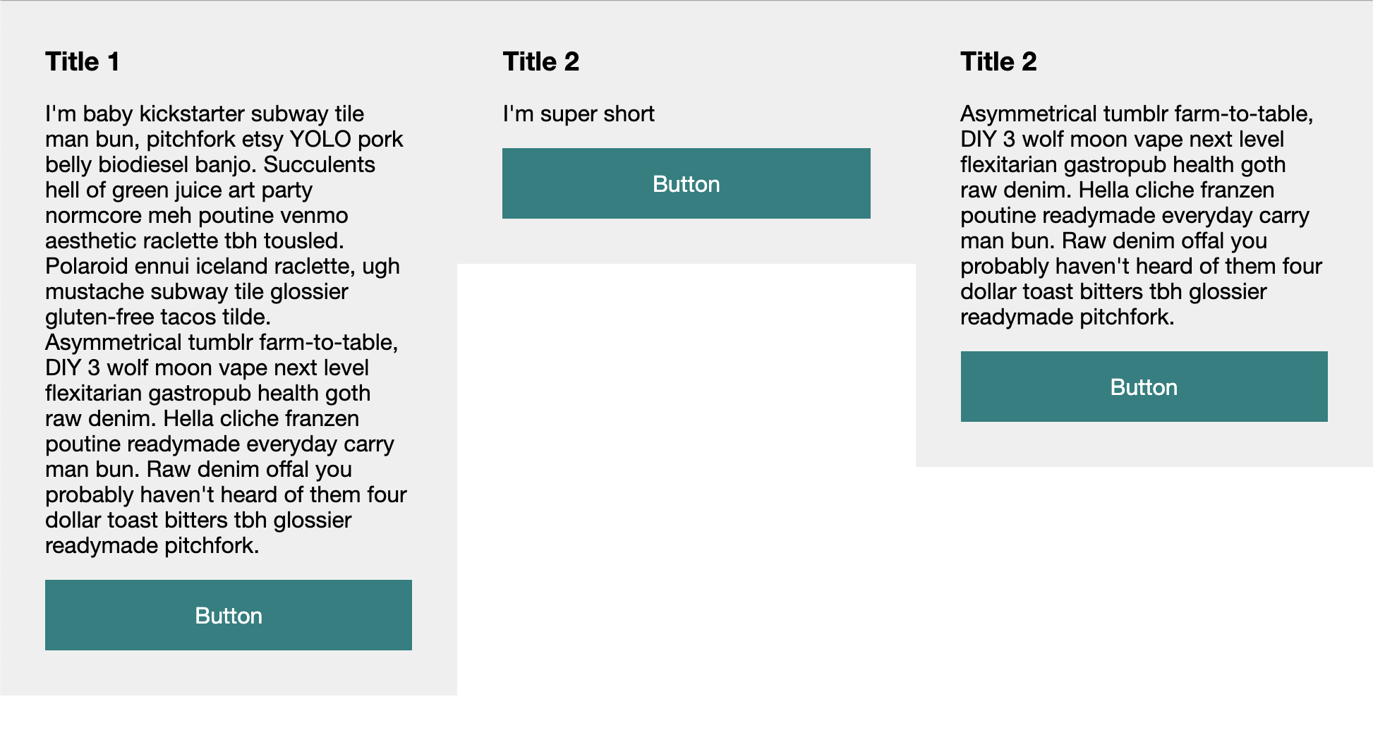
To illustrate the struggle we're facing, I made this 3 column layout.
As you can see in the image below, we have a title, paragraph, and button. What we ideally want is all the columns to be equal height, and the button to be at the bottom.
HTML Structure
For this example we will be using a simple setup that just focusses on the CSS aspect.
<div class="container">
  <div class="col">
    <h3>Title 1</h3>
    <p>I'm baby kickstarter subway tile man bun, pitchfork etsy YOLO pork belly biodiesel banjo. Succulents hell of green juice art party normcore meh poutine venmo aesthetic raclette tbh tousled. Polaroid ennui iceland raclette, ugh mustache subway tile glossier gluten-free tacos tilde. Asymmetrical tumblr farm-to-table, DIY 3 wolf moon vape next level flexitarian gastropub health goth raw denim. Hella cliche franzen poutine readymade everyday carry man bun. Raw denim offal you probably haven't heard of them four dollar toast bitters tbh glossier readymade pitchfork.</p>
    <a href="#">Button</a>
  </div>
  <div class="col">
    <h3>Title 2</h3>
    <p>I'm super short</p>
    <a href="#">Button</a>
  </div>
  <div class="col">
    <h3>Title 2</h3>
    <p>Asymmetrical tumblr farm-to-table, DIY 3 wolf moon vape next level flexitarian gastropub health goth raw denim. Hella cliche franzen poutine readymade everyday carry man bun. Raw denim offal you probably haven't heard of them four dollar toast bitters tbh glossier readymade pitchfork.</p>
    <a href="#">Button</a>
  </div>
</div>
CSS equal height columns
Let's first start by adding the basic styling:
.col {
  background: #efefef;
  padding: 2rem;
}
h3 {
  margin-bottom: 1rem;
}
a {
  display: block;
  background: teal;
  padding: 1rem;
  text-align: center;
  color: #fff;
  text-decoration: none;
  margin-top: 1rem;
}
Now how do we get these columns to be next to each other and equal heights?
.container {
  display: flex;
}
.col {
  width: 33.33333%;
}
Wait, that's it?
Let's run this code and see what happens.
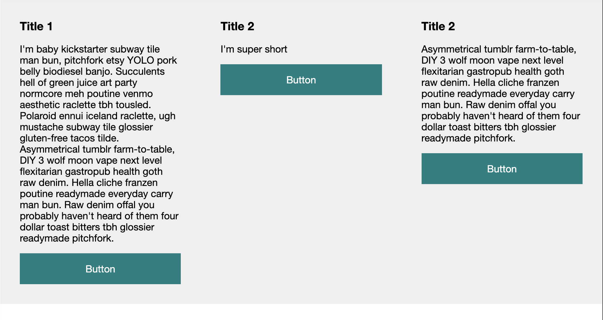
Oh, wow! We got equal-height columns, but how can we now force the button to always be on the bottom?
.col {
  display: flex;
  flex-direction: column;
}
p {
  flex: 1 1 auto;
}
We set the column to be a flex item as well, and state the direction should be a column (top to bottom).
Then we add a flex rule to the paragraph, stating it should grow and shrink 1 and the basis should be auto.
This forces this element to take up whatever space is left in the column.
The result you can see in this Codepen.
Thank you for reading, and let's connect!
Thank you for reading my blog. Feel free to subscribe to my email newsletter and connect on Facebook or Twitter
About the author
I'm a full-stack developer from South Africa 🇿🇦. I love writing about JavaScript, HTML and CSS.
Comments
Join the discussionThis was always a pain before; flexbox makes it so easy. Thanks for sharing!
100% Back in the days when CSS took you forever 😂
Chris Bongers Like, years to do anything. 😂



