
CSS Drop Shadow vs Box Shadow

The other day Josh made a super cool tweet about drop-shadow supporting PNG's; I didn't know it supported PNG's, so I decided to give it a go.
HTML Structure
For my example we are using my favourite Pokémon "Eevee" and will place our three Eevee png's in a container.
<div class="container">
  <img src="https://i.imgur.com/q3SXJQf.png" />
  <img src="https://i.imgur.com/q3SXJQf.png" class="box-shadow" />
  <img src="https://i.imgur.com/q3SXJQf.png" class="drop-shadow" />
</div>
As you can see one is going to be a raw example, one will have a box-shadow and the third will have the drop-shadow.
CSS Box Shadow
You probably have seen and used the box-shadow before, it's a cool feature and adds a shadow to our "box".
It works like this:
.box-shadow {
  box-shadow: 0px 0px 10px #000;
}
It puts a shadow on the image, but on the box of it.

CSS Drop Shadow
Then there is a CSS Filter which is amazing when it comes to contouring a PNG!
.drop-shadow {
  filter: drop-shadow(0px 0px 10px rgba(0, 0, 0, 0.5));
}

This all will result in the following Codepen.
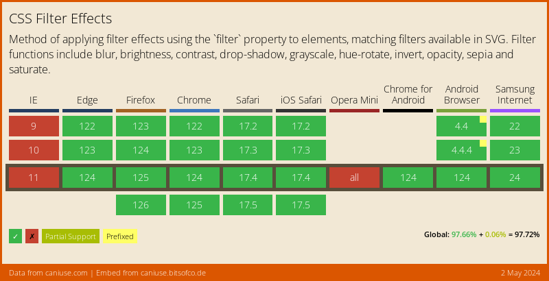
Browser Support
As mentioned before, CSS Filters are cool, but not widely supported yet 😩.
There is a polyfill, but also limited.
Thank you for reading, and let's connect!
Thank you for reading my blog. Feel free to subscribe to my email newsletter and connect on Facebook or Twitter
About the author
I'm a full-stack developer from South Africa 🇿🇦. I love writing about JavaScript, HTML and CSS.
Comments
Join the discussionNo comments yet. Be the first to comment.



