
Creating a 3D Pyramid shape in CSS

I'm a full-stack developer from South Africa 🇿🇦. I love writing about JavaScript, HTML and CSS.
In the previous article, we looked at creating a dice in CSS. Let's take that learning and see how we can create a pyramid.
In essence, a pyramid shape looks a lot like a cube. However, it doesn't need a top side. Each side is slanted and cut off.
The result for today will be this funky-colored pyramid made with CSS.

HTML Structure
As for the HTML, we can go for quite a basic setup again. We'll have the base layer and four sides to create the angled pyramid sides.
<div class="pyramid">
  <div class="base"></div>
  <div class="side one"></div>
  <div class="side two"></div>
  <div class="side three"></div>
  <div class="side four"></div>
</div>
Let's apply some basic styling, so we place everything in the center of the page.
body {
  display: flex;
  justify-content: center;
  align-items: center;
  min-height: 100vh;
}
Styling a pyramid in CSS
Now it's time to start creating our pyramid.
First up is the main pyramid wrapper.
.pyramid {
  position: relative;
  width: 200px;
  height: 200px;
  transform-style: preserve-3d;
  transform: rotateY(326deg) rotateX(2deg) rotateZ(359deg);
}
The critical part here is to create a relative box; we'll use positioning the sides with an absolute position, so that's a key element.
Then we also apply the 3D transform and offset the pyramid in 3D already.
We don't see anything yet, so let's apply some base styling for our sides.
We start with the sides as they are the tricky part.
.side {
  width: 0;
  height: 0;
  position: absolute;
  opacity: 0.7;
  border: 100px solid transparent;
  border-bottom: 200px solid red;
  border-top: 0px;
}
For those who followed my CSS shapes article, you might see we use the border hack to create the triangle.
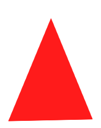
So far, we get this triangle in perspective.
All our triangles are now stuck on top of each other so let's change that.
.one {
  transform: rotateX(30deg);
  transform-origin: 0 0;
}
This will put the first one at a 30-degree angle to mimic a pyramid. It doesn't need any further movement.
For the second one, we can use the following code.
.two {
  transform-origin: 100px 0;
  transform: rotateY(90deg) rotateX(-30deg);
  border-bottom-color: purple;
}
This one is hard to see, but it rotates the panel 90 degrees. We then use the transform-origin to put it in the right place.
The third one uses the same approach, but we spin it around 270 degrees to offset it to the far end.
.three {
  transform-origin: 100px 0;
  transform: rotateY(270deg) rotateX(-30deg);
  border-bottom-color: hotpink;
}
The last one doesn't need any rotation, only a transform offset.
.four {
  transform-origin: 100px 0;
  transform: rotateY(0) rotateX(-30deg);
  border-bottom-color: yellow;
}
So far, you should already see a pyramid come to life.
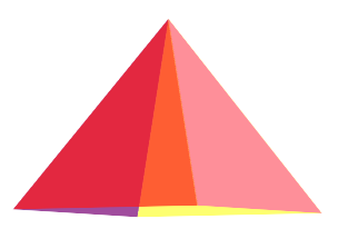
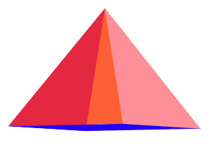
Let's add a base plate to make it close at the bottom now.
.base {
  position: absolute;
  width: 100%;
  height: 100%;
  transform: translateY(73px) rotateX(90deg);
  border: 0;
  background: blue;
}
This place is rotated on the x-axis and transformed slightly lower than the other panes.
Animating the pyramid
Much like the dice, it's fantastic actually to animate these 3D objects. So let's add some animation, so it spins around.
@keyframes rotate {
  from {
    transform: rotateY(0) rotateX(30deg) rotateZ(30deg);
  }
  to {
    transform: rotateY(360deg) rotateX(30deg) rotateZ(30deg);
  }
}

.pyramid {
  animation: rotate 5s linear infinite;
}
You should end up with a rotating pyramid, as shown in the CodePen example below.
Thank you for reading, and let's connect!
Thank you for reading my blog. Feel free to subscribe to my email newsletter and connect on Facebook or Twitter


