
Bringing perspective to CSS

I'm a full-stack developer from South Africa 🇿🇦. I love writing about JavaScript, HTML and CSS.
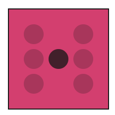
The other day I started exploring 3D in CSS and began with a dice. The dice is excellent in 3D. However, it has no perspective, so it's still 2D in 3D.
Let's fix that and bring some perspective to 3D.
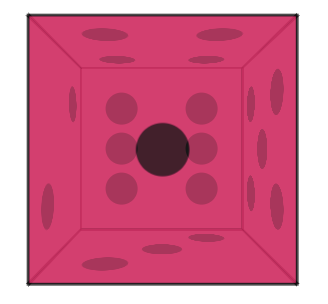
If we stop the rotation on the dice and look at it from the front, you can see the overlap, but all sides are equally big.
This is a bit weird, as the back panel should be smaller as it sits more to the back.
CSS perspective
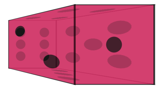
That's precisely where the perspective style can come into play.
Let's apply the following style to the body tag:
body {
  perspective: 400px;
}
A crazy difference already, right?
You can play around with the value. The lower you go, the more intense the 3D becomes.
We also get perspective-origin, which can define from which angle you are looking at an object.
The default value is 50% 50%, and we can use values we know from position to set it.
body {
  perspective-origin: left;
}
This will set the perspective to the left.
As you can see, this becomes a bit weird, and you can make the perspective a bit bigger to get the correct display.
Playing with perspective can give your 3D css that next-level feeling.
Feel free to play around with the adjusted dice.
Thank you for reading, and let's connect!
Thank you for reading my blog. Feel free to subscribe to my email newsletter and connect on Facebook or Twitter


