

During my writing streak, I'm sure I covered a tab layout before.
And looking at that from an accessibility point of view, I could see many things to improve on!
The most basic form tabs are simple. A restructure of a table of contents and some headings.
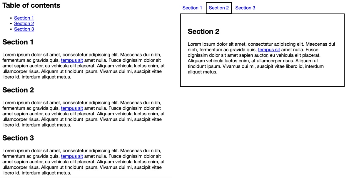
The image above shows both a table of contents page and a tabbed version. The tabbed version is more of a visual representation to make content appear slimmer.
Creating accessible tabs
The big downside with the table of contents setup is that we have to tab through all links to get to the content.
You can try it out on this CodePen.
While this method has some downsides, let's see what we need to convert this into fully accessible tabs:
- Show the navigation horizontal
- Show the content as actual tab content
- Tabs navigation should not be controlled by tab but rather by the left and right arrows
- Active tabs should have an aria indication
This seems like a lot to re-create, so let's take it to step by step and do this together.
The significant part is we can already use what we have but remove the nav wrapper.
Then we can leverage some native roles to define what each section should act as.
Let's start with the tab navigation. From our previous implementation, we can already remove the nav part. The next step is to set some aria labels to define each item's role and set the first one to be the default open one.
<ul role="tablist">
  <li role="presentation">
    <a href="#section1" role="tab" id="tab1" aria-selected="true">Section 1</a>
  </li>
  <li role="presentation">
    <a href="#section2" role="tab" id="tab2" tabindex="-1">Section 2</a>
  </li>
  <li role="presentation">
    <a href="#section3" role="tab" id="tab3" tabindex="-1">Section 3</a>
  </li>
</ul>
As we can see, the list is turned into a tablist, and each link inside gets the tab role. Furthermore, we use aria-selected to indicate which element is active. The other ones should not be accessible by tabbing, so we use tabindex="-1" for this.
Let's add some CSS to make them look nice next to each other and highlight the active ones. The cool part is that we can use the roles to define this styling!
[role='tablist'] {
  padding: 0;
  margin: 0;
}
[role='tablist'] li,
[role='tablist'] a {
  display: inline-block;
}
[role='tablist'] a {
  padding: 0.5rem;
  text-decoration: none;
}
[role='tablist'] [aria-selected] {
  border: 2px solid black;
}
We should have our tabs sit horizontal and the active one with a black border.
Let's move on to the sections. These are even easier to fix.
We need to give them a role as a tab panel and label them by their identifying tab.
We should also use aria-hidden and hidden for those that should not be visible.
<section
  id="section1"
  role="tabpanel"
  aria-labelledby="tab1"
  aria-hidden="false"
  tabindex="-1"
>
  ...
</section>
<section
  id="section2"
  role="tabpanel"
  aria-labelledby="tab2"
  aria-hidden="true"
  tabindex="-1"
  hidden
>
  ...
</section>
<section
  id="section3"
  role="tabpanel"
  aria-labelledby="tab3"
  aria-hidden="true"
  tabindex="-1"
  hidden
>
  ...
</section>
For the CSS, let's keep it simple and add a border and some padding to the element.
[role='tabpanel'] {
  border: 2px solid;
  padding: 1.5rem;
}
Pretty cool. We should have our tab list visible now.
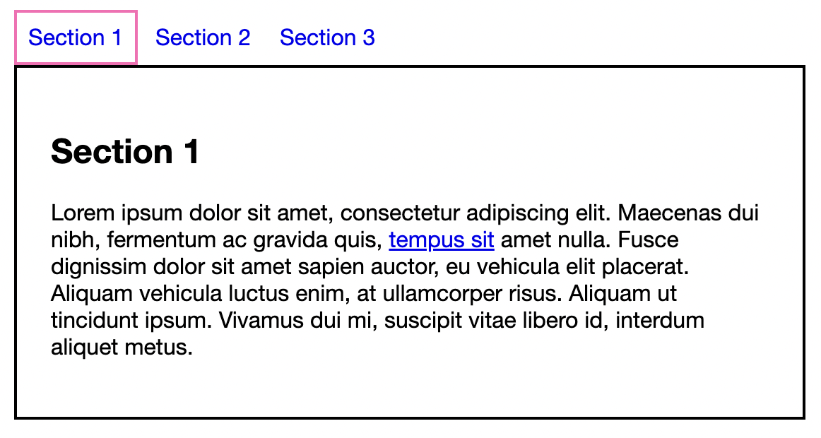
But, nothing happens when we try and click on the tabs or tab! This is because there is no native way of focusing on each tab.
We need some JavaScript to help us out here.
First, we need to retrieve the elements we should interact with. This is the list, the items inside, and the sections.
const tablist = document.querySelector("ul[role='tablist']");
const tabs = Array.from(tablist.querySelectorAll('a'));
const panels = document.querySelectorAll("section[role='tabpanel']");
Note: We use Array.from to convert the nodeList into an array
Then we want to loop over each of the tabs to add some functionality to each tab.
tabs.forEach(function (tab, i) {
  // Do some magic
});
The first thing we want to do is fix the click for mouse users, they should be able to click a tab, and it should set that tab as active.
tabs.forEach(function (tab, i) {
  tab.addEventListener('click', (e) => {
    e.preventDefault();
    let currentTab = tablist.querySelector('[aria-selected]');
    if (e.currentTarget !== currentTab) {
      switchTab(currentTab, e.currentTarget);
    }
  });
});
In this function, we check if the currently selected tab is not the one we are clicking on. If that's not the case, we switch the tab.
Let's see what this switchTab function looks like.
const switchTab = (oldTab, newTab) => {
  newTab.focus();
  newTab.removeAttribute('tabindex');
  newTab.setAttribute('aria-selected', 'true');

  oldTab.removeAttribute('aria-selected');
  oldTab.setAttribute('tabindex', '-1');

  panels[tabs.indexOf(oldTab)].hidden = true;
  panels[tabs.indexOf(newTab)].hidden = false;
};
We set focus to the new tab, make it tabbable and set it as selected. Then we start to remove the opposite from the previous tab.
And we also removed the hidden attribute from the new focusing tab and set it for the old one.
With this in place, a mouse user can use our tabs as intended!
However, for keyboard users, it's still impossible to switch tabs! We want to add a keydown listener to the tabs to switch when the users use the left and right arrows.
tabs.forEach(function (tab, i) {
  tab.addEventListener('keydown', (e) => {
    const index = tabs.indexOf(e.currentTarget);

    if (e.keyCode === DOWN_ARROW) {
      e.preventDefault();
      panels[i].focus();
    }

    if (e.keyCode === LEFT_ARROW) {
      e.preventDefault();
      if (tabs[index - 1]) {
        switchTab(e.currentTarget, tabs[index - 1]);
      }
    }

    if (e.keyCode === RIGHT_ARROW) {
      e.preventDefault();
      if (tabs[index + 1]) {
        switchTab(e.currentTarget, tabs[index + 1]);
      }
    }
  });
});
I've kept this unoptimized, so it would be a bit more readable for newcomers. It can be completely optimized to use shorthands or a switch case.
However, we can see that on the down click, we focus on the active panel, then on left or right, we switch tab based on the active index minus or plus one.
And that's it. We created accessible tabs! They are not the full-blown version, as we could even enhance them more for mobile or add more key listeners, but I'll leave that up to you to decide what your tabs need.
You can try them out in this CodePen demo.
I could not have written this article without these amazing articles as a resource:
Thank you for reading, and let's connect!
Thank you for reading my blog. Feel free to subscribe to my email newsletter and connect on Facebook or Twitter
About the author
I'm a full-stack developer from South Africa 🇿🇦. I love writing about JavaScript, HTML and CSS.
Comments
Join the discussionNo comments yet. Be the first to comment.
A11Y 101
In this series I'll explore the basics of accessibility and you can join me on this learning trip.



