
A11Y 101: Analysing my website issues

I'm a full-stack developer from South Africa 🇿🇦. I love writing about JavaScript, HTML and CSS.
We evaluated the website by using all kinds of accessibility tools. It's good to go through the issues we found and see what they mean.
We'll do this point by point by taking the main issues we discovered in the previous article.
This article is more about understanding each element rather than providing the ultimate fix. I'll be writing more in-depth solutions for each point, as often multiple solutions might be applicable.
Double focus issue
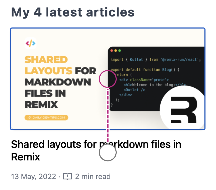
The first issue that surfaced was the double focus issue. We found this issue by simply using the screen reader and tabbing through the items.
I'm using Accessibility insights to show the visible focus in the image below. You can see it moves from the title to the image focus.
This is weird from two sides:
- This should be one big element (as a navigation element)
- The image should show first
There are multiple fixes here, so let's dive into more details in another article.
For future reference, some options are:
- Making the whole section one big link.
- Setting tab index of -1 on the image
Color contrast
Another issue we found in all of the tools is color contrast. This one might be easiest to test in Lighthouse as it's the quickest to run.
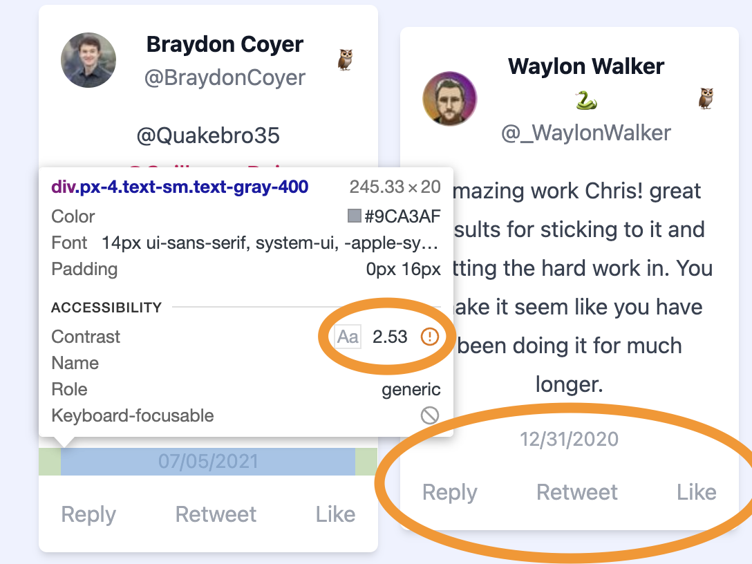
I've highlighted some sections where the contrast is awful in the image above. We see a super light-grey text on white background, which is hard to see (even for non visually impaired people).
We need to get the color at least to an AA standard to fix this. If you like to have some help finding the right colors, here is an amazing tool to help you:
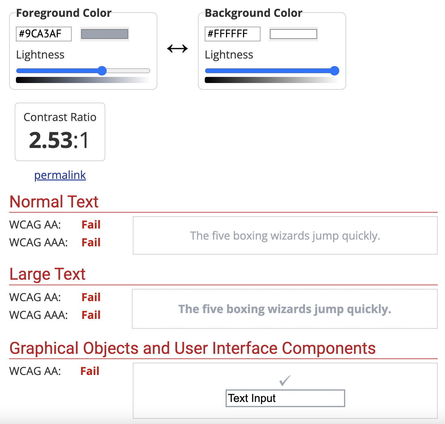
In the image above, we see the contrast, which I have an issue with. You can then play around with the slider to get to a AA acceptable color ratio.
Document missing main landmark
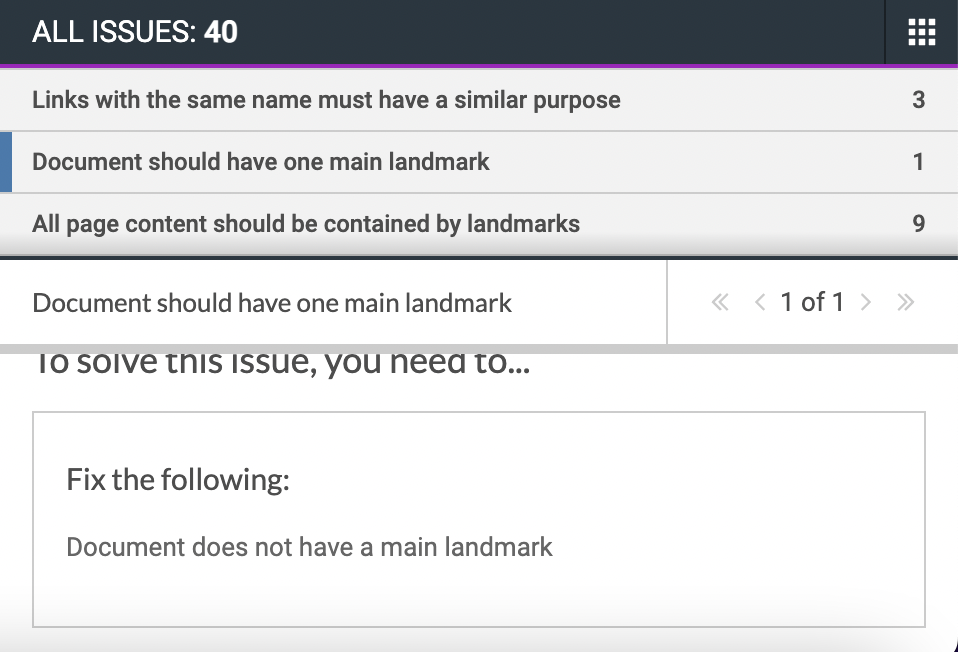
When we ran Axe DevTools, we saw that I stated: "Document should have one main landmark".
For me, this was a bit of a vague description, and even in the more content section, it wasn't super clear:
However, after talking to Abbey about this and doing some more research, I was not using the <main> tag on my page, which is required.
Instead, I wrapped my whole page in a <article> tag.
So the fix here is simple, replace that article tag with the main tag, and we are good to go.
Ensure landmarks are unique
When we ran the Axe DevTools on an article page, we saw that it gave the error that some landmarks are not unique.
After some investigation, it shows two <nav> elements on the page.
However, they are not identifiable by screen readers.
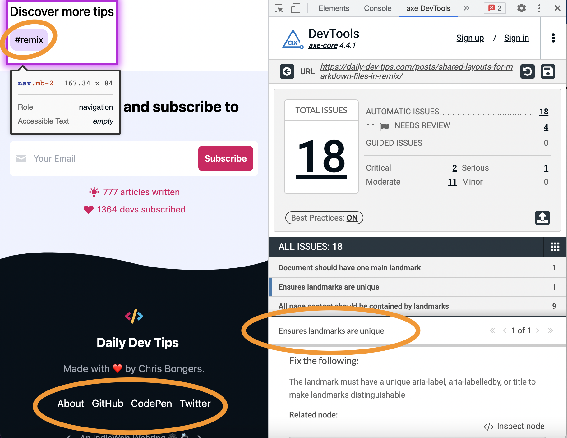
The solution here is to make them unique. We have multiple options to do this, including:
- aria-label
- aria-labelledby
- title
We'll dive more into details about these elements in a later stage.
Summary is not a valid element
The tools did not pick this one up, but I used a <summary> element on my website for the TLDR sentence.
However, we should, of course, only use this in combination with a details element. (To make the native accordion).
To address this, we can switch to another element. In this case, a div might be the best option.
Thank you for reading, and let's connect!
Thank you for reading my blog. Feel free to subscribe to my email newsletter and connect on Facebook or Twitter