
A look at HSL colors

For this article, I want to explore HSL colors, which I never really used before but want to explore.
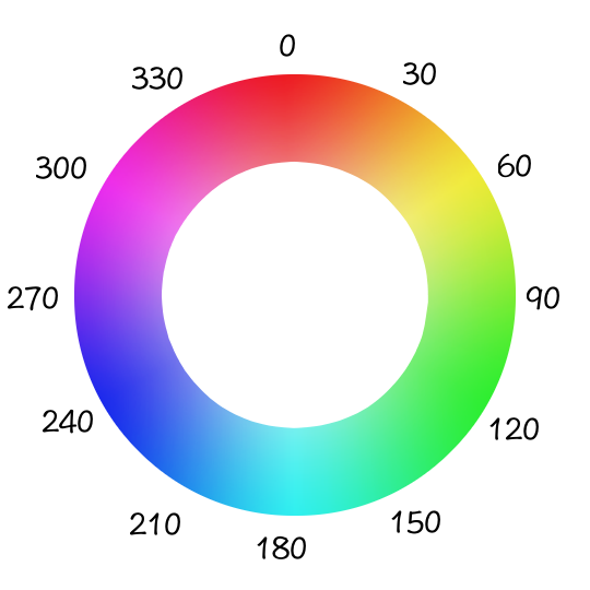
HSL stands for hue, saturation, and lightness, where the following values can be used.
hue: is 360 degrees on the color wheel, so it goes from 0 to 360.saturation: is a percentage from 0% to 100% where 100 equals the full color.lightness: is also a percentage where 0% is black, and 100% is white.
Using HSL colors in CSS
We can write the following syntax to use this color variant in CSS.
body {
  background-color: hsl(120, 50%, 50%);
}
Which will give us a green background.
A compelling element to using HSL is that it's super easy to use the same level of tints across the board.
Let's say you are developing a theme with full-color versions and a lighter tint for secondary elements.
With HSL you can ensure that you use the same tints no matter which color you pick.
For example, let's set up a header with a secondary body.
<header class="primary">
  <div class="secondary logo"></div>
  <nav>
    <ul>
      <li class="secondary"></li>
      <li class="secondary"></li>
      <li class="secondary"></li>
    </ul>
  </nav>
</header>
<main class="secondary">
  <nav>
    <ul>
      <li class="primary"></li>
      <li class="primary"></li>
      <li class="primary"></l>
    </ul>
  </nav>
</main>
This would give us an actual example. Let's start by making all the primary elements black and the secondary white. We would end up with the following layout.
.primary {
  background-color: black;
}
.secondary {
  background-color: white;
}
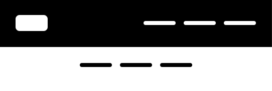
However, we don't want it just black and white and want a theme switched even. It will become challenging to get all the available themes in the right shades, right?
Well, not with HSL!
Let's define some HSL variables we can easily reuse.
:root {
  --primary-h: 4;
  --primary-s: 73%;
}
I've decided to make the hue and saturation the same, and it will be the lightness we play with to make the variants of the color.
In the above example, we use four as the hue, which is a red color.
Now we can add it to our primary and secondary colors to see what happens.
.primary {
  --primary-l: 54%;
  background-color: hsl(var(--primary-h), var(--primary-s), var(--primary-l));
}
.secondary {
  --primary-l: 93%;
  background-color: hsl(var(--primary-h), var(--primary-s), var(--primary-l));
}
As you can see, the primary is about as true to the color, whereas the secondary is more to the white side.
It will result in the following image.
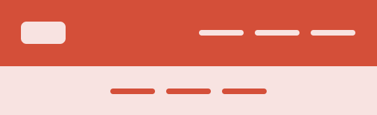
And what's cool is that we can change the root --primary-h value to adjust the theme.
Let's try and set it to 304.
:root {
  --primary-h: 304;
}
And now, let's see what our app would look like.
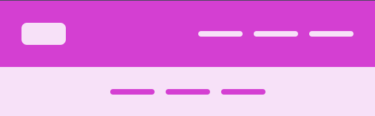
As you can see, the vibe of the theme is the same, we just swapped the hue, so it still feels familiar.
You can also play with this example on this CodePen.
Testing HSL out
Let's create a super quick demo to try out all HSL variants.
I've created three sliders in HTML, respective of the values for the HSL. Then I've added these as variables in our CSS like this.
:root {
  --primary-h: 4;
  --primary-s: 50%;
  --primary-l: 50%;
}
body {
  background-color: hsl(var(--primary-h), var(--primary-s), var(--primary-l));
}
And added some magic CSS to listen to all the changes on the sliders so we can adjust the values.
const hue = document.querySelector('#hue');
const saturation = document.querySelector('#saturation');
const lightness = document.querySelector('#lightness');

hue.addEventListener('input', function () {
  document.documentElement.style.setProperty('--primary-h', this.value);
});
saturation.addEventListener('input', function () {
  document.documentElement.style.setProperty('--primary-s', `${this.value}%`);
});
lightness.addEventListener('input', function () {
  document.documentElement.style.setProperty('--primary-l', `${this.value}%`);
});
With this in place, you'll be able to play around with the values to see what happens.
Thank you for reading, and let's connect!
Thank you for reading my blog. Feel free to subscribe to my email newsletter and connect on Facebook or Twitter
About the author
I'm a full-stack developer from South Africa 🇿🇦. I love writing about JavaScript, HTML and CSS.
Comments
Join the discussionNo comments yet. Be the first to comment.



