# SVG Sprites
The other day we looked at using [SVG Fontawesome icons](https://daily-dev-tips.com/posts/fontawesome-svg-alternative/), and this method of using an SVG Sprite can be used in more ways!
So let's dive deeper into using SVG Sprites.
From the oldskool terms, a sprite is one image that includes multiple images; we then define which area resembles which icon and can use it in such away.
## Defining our SVG Sprite
To define our sprite we start by defining a inline SVG at the top of our document
```html
```
Inside the SVG we have a `defs` element which in turn includes the symbols. Inside each symbol we have the code for the actual SVG, we can get this code from illustrator or online tools as [icomoon](https://icomoon.io/).
We made the SVG "invisible" by giving it no height and width.
## Using the Defined SVG Sprite Icons
To actually use the icons we can use a code as follows:
```html
```
We define another SVG area, where we can add a specific class if needed. And then make use of the `use` element and `Xlink` to the icon ID defined in the `symbol`.
Then we can style the icons as such:
```css
.icon {
max-width: 50px;
max-height: 50px;
&-check {
fill: #caffbf;
}
&-chevron {
fill: #9bf6ff;
}
}
```
This will turn into the following Codepen.
%[https://codepen.io/rebelchris/pen/bGEzrxx]
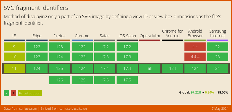
## Browser Support
The support is pretty strong!
### Thank you for reading, and let's connect!
Thank you for reading my blog. Feel free to subscribe to my email newsletter and connect on [Facebook](https://www.facebook.com/DailyDevTipsBlog) or [Twitter](https://twitter.com/DailyDevTips1)