# Styling the header and footer - part 4
Now that we have our basic layout let's spend this article on styling the header and footer to resemble the design.
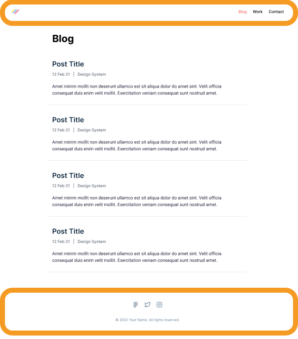
As a reminder, the design I picked looks like this. You can see the circled header and footer.
## Styling the header
Let's start with the header.
Before we start jamming away, let's create a new component that will help make our code look cleaner.
You can add the `header.js` file to the components directory.
I like to work based on mock values, which helps me first set up the rough outline.
```js
export default function Header() {
return (
);
}
```
This will roughly be our main structure. I added the logo as an SVG, but you can also use an image tag.
Let's also change the layout we created yesterday to use this component.
```js
import Header from './header';
export default function Layout({ children }) {
return (
<>
{children}
);
}
```
If you now run the project, you'll see the header doesn't look like anything, but all the elements are there.
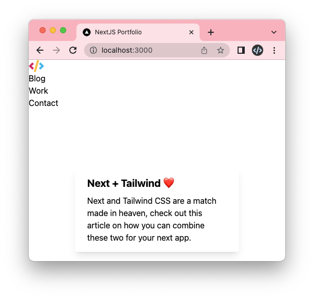
Let's make it a bit more attractive by adding some Tailwind classes.
We can add the container by using the following classes on the header element.
```html
```
Then we want to split the logo to the left and the menu to the right using a flexbox.
```html
```
And lastly, we want to set the height and center the elements vertically.
```html
```
This already looks pretty good!
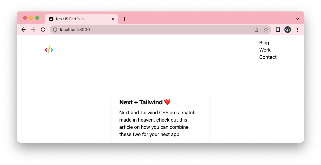
The logo looks in a good spot. We, however, need to style the menu items a bit better.
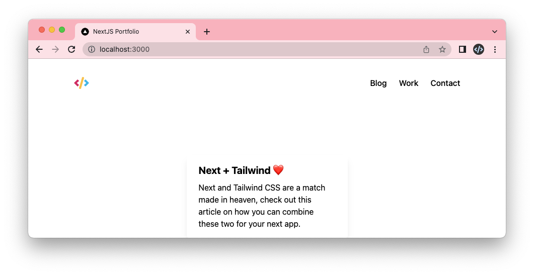
The first thing we want to change is to have the items next to each other instead of below each other.
```html
```
Yep, it's as simple as using a flexbox.
The next part is to give them a bit more space. For this, we have several options, but the easiest one is to use a gap.
```html
```
And lastly, we see it's a medium font size so let's add that to our ul.
```html
```
And yes, it's minimal styling, but our header already looks great!
> Note: We haven't done responsive styling yet, which we'll tackle later.
## Styling the footer
Alright, with the header done, let's move on to the footer.
Start by creating the `footer.js` file.
```js
export default function Footer() {
return (
);
}
```
> Note: I found these SVGs online on [icons8 website](https://icons8.com/icon/set/social-media/small). You can find the full SVG code in the GitHub repo.
Now import this footer into your layout.
```js
import Header from './header';
import Footer from './footer';
export default function Layout({ children }) {
return (
<>
{children}
);
}
```
It also looks like everything is there but unstyled again.
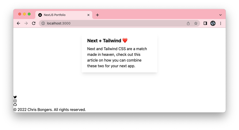
The first thing we want to do is add the container and center everything inside of the footer.
I choose flexbox to center things as it gives us more freedom later.
```html
```
Now let's make sure the social icons are above the text. We can achieve this by setting the flex-direction.
```html
```
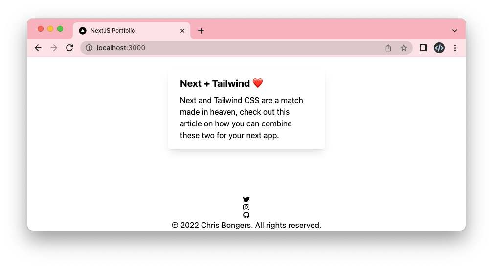
This, again, looks pretty good already. Let's adjust and set a height for the footer to give it more space.
```html
```
Now let's make sure the social icons are next to each other.
And while we are here, also add the gap again.
```html
```
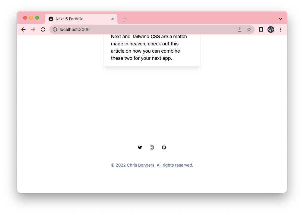
Now let's go back to our footer element and also add a gap here to space between the icons and the text.
```html
```
And now, all that's left is to style the text differently.
We will change the color and size.
```html
```
And that's it. Our footer now looks similar to the design.
You can also find the complete code with all SVG markup on [GitHub](https://github.com/rebelchris/next-portfolio/tree/part-4).
### Thank you for reading, and let's connect!
Thank you for reading my blog. Feel free to subscribe to my email newsletter and connect on [Facebook](https://www.facebook.com/DailyDevTipsBlog) or [Twitter](https://twitter.com/DailyDevTips1)