# Storybook - writing stories
Let's take a closer look at writing our own stories with Storybook.
Before we dive into the details of creating these stories, let's describe what a story is.
A story defines the rendered state of a UI component. It's a function that returns the result of your component based on a set of arguments.
Stories live next to your original components. For instance, if you have a `button.tsx` file, your account would be in the same folder but called `button.stories.js`.
Do note stories can be written in any set of languages. You are not bound to plain javascript or typescript. These are the supported formats.
- `js`
- `ts`
- `jsx`
- `tsx`
- `mdx`
## Format of a story file
Now that we have a broad understanding of stories let's look at the analogy of the story file.
First, we have a default export that defines how the story will be listed in the sidebar.
Let's take this example story:
```js
// Button.stories.js|jsx
import React from 'react';
import { Button } from './Button';
export default {
title: 'Button',
component: Button,
};
```
This alone won't do much, as we haven't defined an actual story for this component. (Remember, it's a rendered state).
So let's add a primary button state story.
```js
export const Primary = () => (
);
```
As you can see, we can define named exports that return the component with a set of props.
In this case, we return a primary button with a fixed label.
If you open the Storybook, you should see this component under the button.
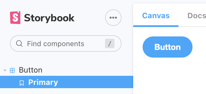
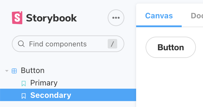
So, we can now add a secondary story, which will render our button component in its secondary state.
```js
export const Secondary = () => ;
```
Which will render the button like this:
## Additional options for a story
A story can do a bit more than render one specific state.
We won't go into all the details in this article as we will explore them further throughout the following ones, but let's take a high-level look at them.
- `args`: Define the components options so we can easily reuse them to clean our code
- `play function`: Test specific user flows automatically
- `parameters`: Test external impact on your component. For instance, a theme switcher is one example.
- `decorators`: Provide a way to wrap your component
- `combined`: We can even combine multiple components into one story
- `loaders`: an experimental feature where we can load external data
These are the options for a story. Very high-level, we'll dive into them in more detail in the following articles, so be sure to subscribe to the newsletter.
### Thank you for reading, and let's connect!
Thank you for reading my blog. Feel free to subscribe to my email newsletter and connect on [Facebook](https://www.facebook.com/DailyDevTipsBlog) or [Twitter](https://twitter.com/DailyDevTips1)