
Storybook - Additional integrations

I'm a full-stack developer from South Africa 🇿🇦. I love writing about JavaScript, HTML and CSS.
Besides the many excellent examples we saw in the previous article, there are also amazing integrations we can add to our Storybook.
These integrations vary from themes to specific tests to organizing tools.
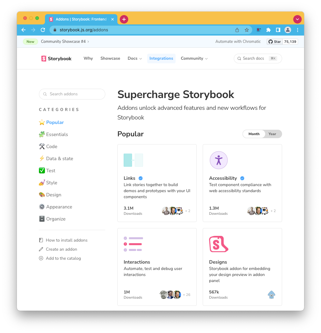
The website itself has them categorized into the following categories:
- Popular
- Essentials
- Code
- Data & state
- Test
- Style
- Design
- Appearance
- Organize
And for each, we can quickly see a description and how many downloads that integrations have.
What do we need?
Many extensions are already available if you use the default installation. For instance, the Essentials are shipped with the base installation, so we don't have to go into further details for those.
Then depending on your needs you might want to look into some specific ones.
This could be either for your specific code base (React, Angular, Bootstrap, and so on) or extensions. Or maybe more global extensions like accessibility, snapshots, pseudo-states, etc.
And besides all of those, we can get some new themes to make our Storybook more unique.
Using integrations
So how do we use these integrations?
They are covered as add-ons so that we can install them.
npm install -D @storybook/{addon-name}
And once installed, we can modify our .storybook/main.js file to include it.
module.exports = {
  addons: [
    // Other Storybook addons
    '@storybook/{addon-name}',
  ],
};
And that's it. If we spool up our Storybook, we should now have access to the additional integration.
I'd recommend you look at all the fantastic integrations available, as they could help your Storybook become more outstanding.
Thank you for reading, and let's connect!
Thank you for reading my blog. Feel free to subscribe to my email newsletter and connect on Facebook or Twitter


