
🛑 Stop using pixels in CSS

I may be the worst advocate for actually doing this, but let me try and be a better person from now on.
And please, you too!
Let's all get away from pixels
But, don't take just my word for it:
Why no pixels?
From back in the days, we started using pixels for web development, and for a long time this was good enough.
So what makes them so bad you ask?
- A pixel in font size is not actually a pixel on the screen
- Accessibility becomes better if we as developers don't define what the "default" font-size must be
- There are nowadays pixels densities (retina etc)
Ok, then what?
Well, we can choose between em and rem for font-size.
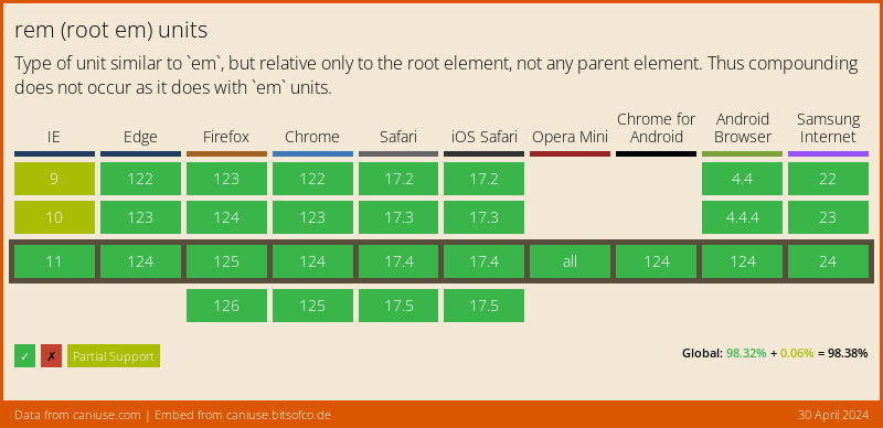
CSS3 came with rem which is a relative size to the root html element and is supported by 98,22% of the browsers!
So the cool part about this is people can have their default browser setting set to something else, then the defined 16px's, and we will just scale for them.
Side note: REM is also a cool band!
Converting pixels to rem
To calculate the pixels to rem we have to understand that the default font size for an HTML document is 16 pixels...
We as developers, should never update that. It's something the user can do.
So talking that in account it means that 1rem = 16px, and 2rem = 32px.
To make it super easy. I made this calculator for you guys:
Let us please all be aware this is the future 🛸.
Browser Support
The cursor is pretty well supported! The function has been around, some mobile browsers don't go about it, but you must see this as an "extra".
Thank you for reading, and let's connect!
Thank you for reading my blog. Feel free to subscribe to my email newsletter and connect on Facebook or Twitter
About the author
I'm a full-stack developer from South Africa 🇿🇦. I love writing about JavaScript, HTML and CSS.
Comments
Join the discussionShould we also be using rems for margins, borders, padding, and basically everything else as well? Or just for font size?
I use it for font-size/margin
But for borders/border-radius and media-queries I still use pixels.
I'm actually not 100% sure on the "best" answer, but this is my gut feeling and it works well.
Chris Bongers I was thinking the same thing. Border radius would probably give some wacky results if using rems. And media queries probably wouldn't work very well either. Thanks for the response :)
Great article... 👍
I would also suggest everyone to check Responsive Font Size (a.k.a. RFS). It's a unit resizing engine which resizes fonts (and more) based on viewport width. Bootstrap also provides an option to enable it.
Awesome, that's some cool stuff!
I don't understand. If rem is directly proportional to px, what advantage does it possibly hold? I've been using px only for borders and %, vw & vh for the rest.
Good question Prateek Aher it comes down to accessibility.
So if you set your browser default to be 20px because of your bad eyes or whatever reason. rem is a way better solution, then us defining what would be best for you.
For borders and media queries however it is still a valid point of using px.
Also can't live without vw and vh :D
Yeah, it's the zooming (manually or by default) which wouldn't change using px values.
if rem is directly proportional to px, what advantage does it possibly hold
The answer is that it isn't directly proportional. It depends on the font size. The formulas and converter work under the assumption of default font size.
It's like those measuring cups that have kg and liters, do you have one in your kitchen? They only measure liters, so the kg is a misleading lie. But because most kitchen-liquids have density close to that of water, it's a sort-of-useful trick anyway.
Same with rem and px: most users will be using 16px = 1rem so it's a good starting point, but the whole reason rem is better is because sometimes 1rem != 16px.
Mark Exactly is based on the root font-size (HTML) so hence I included that in my calculator.
You must keep in mind screenreaders and some mobile devices have a bigger font-size by default.
People could also use accessibility tools that don't necessary use the zoom function.
Amazing Post on CSS. Purely loved it. bookmarked. I just love to read short, cool and informative posts. Nice one. 🤘👍
Wow, thank you Rahul, means a lot to me. Especially coming from you. 🤟
Chris Bongers Haha.



