
Modifying an SVG path with CSS
I'm a full-stack developer from South Africa 🇿🇦. I love writing about JavaScript, HTML and CSS.
In the previous article, we learned that we could animate a CSS path, which led me to discover something even more mind-blowing!
We can modify the CSS path! (only supported in Chromium browsers).
Let's check this out and see how it works.
Modifying SVG path with CSS
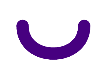
To start, we'll need an essential SVG element again. I started with this curved line.
<svg viewBox="0 0 7 9">
  <path d="M1,3 C1,6 6,6 6,3" />
</svg>
Which would result in something like this:
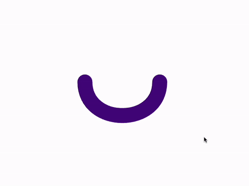
So how can we modify the path now? And you'll be surprised, but it's accessible with CSS like this.
svg:hover path {
  d: path('M1,6 C1,3 6,3 6,6');
}
It looks familiar, right? We can modify the path there. In my instance, I changed it to become the opposite angle of the curve, so it turned upside down.
I also added a transition effect on the path so it will animate smoothly.
svg path {
  fill: transparent;
  stroke: indigo;
  stroke-linecap: round;
  stroke-linejoin: round;
  transition: 0.2s;
}
And now we're able to hover it and see the path change! This blew my mind and is so cool.
You can see its effect here.
Or if you are on Chromium, check it out on this CodePen.
Let's hope this gets better browser support, as it's fantastic to have this ability.
Thank you for reading, and let's connect!
Thank you for reading my blog. Feel free to subscribe to my email newsletter and connect on Facebook or Twitter


